Configuring Containers
A container is used to organize and display multiple charts within one widget. You can group related charts together, uniformly adjust their layout and style, and configure data filtering and measurement filtering for the charts within the container.
Container Types
Containers are divided into basic containers and array containers. A basic container is suitable for organizing a group of charts within a fixed area; an array container is suitable for using the same chart layout to batch-compare data across multiple devices, sites, months, or years.
Basic Container
A basic container can place charts into one or more tabs. Based on the default tab style setting, it is divided into the following types:
Type |
Applicable Scenario and Display Method |
|---|---|
Default |
By default, no tab switching entry is displayed; charts within the container are displayed uniformly in a grid layout. |
Tab |
Switch between different groups of charts by using tabs. |
Button |
Switch between different groups of charts by using buttons. |
Dropdown |
Select the group of charts to display by using a dropdown. |
Card |
Switch and display different groups of charts by using cards. |
All five basic container types share the same set of tab configurations, so you can switch between them during configuration. When choosing a type, decide the style of the tab entry based on the switching method most suitable for the end user.

Array Container
An array container automatically tiles multiple container cards, and each card can hold multiple charts. It is suitable for horizontally comparing objects using the same layout, for example, generating cards by device, site, or month.

Prerequisites
You have editing permission for the page. For more information, see DTV Permission Overview.
You have added at least one container to the page. In the page editing state, hover over the container and select the Edit icon in the upper-left corner, to open the Container Configuration popup. For more information, see Adding Widgets in Single-Page Applications or Adding Widgets in Dashboards.
Configuring a Basic Container
A basic container contains four tabs: Basic Options, Container Style, Filter Settings, and Measurement Filter Settings. Follow the instructions below to complete the configuration.
Configuring Basic Options
In the Basic Options tab, configure the container’s appearance and interaction through Title, Widget, and Others, respectively.
Title
In Title, configure the container title and its display effect. The title is displayed in the upper-left corner of the container, using the same configuration method as chart titles. See Title.
Configuration Item |
Description |
|---|---|
Title |
Set the container title text. |
Title Layout |
Set the alignment and arrangement of the title within the title bar. |
Title Font |
Set the font, font size, color, and other style properties of the title. |
Title Padding |
Set the spacing between the title text and the edge of the title bar. |
Header Height |
Set the height of the title bar. |
Header Background |
Set the background style of the title bar. |
Widget
In Widget, configure the size, grid, and visual style of the container itself. Use the same configuration method as chart widgets. See Widget Size.
Configuration Item |
Description |
|---|---|
Widget Size |
Set the width and height of the container on the page. |
Widget Padding |
Set the spacing between the container’s edge and the charts inside it. |
Rounded Corners |
Set the rounded corner effect for the container’s border. |
Decoration |
Set decorative elements for the container. |
Widget Background |
Set the container background. |
Grid Amount |
Set the number of grid columns or arrangement quantity for charts within the container. |
Widget Spacing |
Set the spacing between charts within the container. |
Grid Height |
Set the height of each chart grid. |
Others
In Others, configure the container’s interaction method, rendering strategy, and supplementary information.
Configuration Item |
Description |
|---|---|
Title Interaction |
Configure interactive actions for the container title. See Title Interaction for details. |
Maximize Widget |
When enabled, end users can display the container in full screen. |
Custom Interaction |
Add interactive actions such as display method, trigger action, jump method, and URL for the container, or dispatch an update to a global variable through the SDK. When the end user clicks the container title or a custom area, the data identifier of the current card/container (such as site_id) can be assigned to a global variable, which then drives data linkage in other charts or panels outside the container. |
Rendering Type |
Set the rendering timing of the tabs within the container: Direct Rendering renders all tabs at the same time; Rendering with Delay renders tabs sequentially at a set time interval; Rendering on Click only renders a tab when the user opens the corresponding tab. When there are many tabs or the charts are complex, prioritize delayed or on-click rendering to reduce the initial loading time. |
CageCode |
Set a unique identifier for the container. When an event is dispatched externally through the DTV SDK, only widgets with a matching CageCode will respond. |
Description |
Add a description for the container; end users can view it when hovering the mouse over the container title. |
Configuring Container Style
In Container Style, configure the organization method, switching entry, and visual style of the chart tabs.
Configuration Item |
Description |
|---|---|
Hide Tabs |
Hide the tab switching entry. When enabled, Tab Name and Tab Display Method are no longer displayed to end users; end users can still switch tabs through filters or navigators. |
Tabs |
Select + Add to create a tab, and set a name for each tab. After placing charts into different tabs, end users can switch between chart groups by tab. |
Display Method |
Set the display and switching rules for tabs. When Default Configuration is selected, you can specify the Displayed Tab shown when the page is first opened and no filter has been applied; when Associate to Navigator is selected, you can display the corresponding tab based on the navigator parameter value. For example, when the navigator parameter “Time Interval” is “Day,” Tab 1 is displayed; when it is “Month,” Tab 2 is displayed, without manually switching tabs. For more information, see Adding Linkage Between Widget and Navigator. |
Tab Style |
Set the display method and position of the tab entry. When Button or Card is selected, you can also set the tab size, color, font, and other styles. |
Tab Font Size |
Set the font size of the tab name. |
Hide Child Widget Title |
Hide the titles of all charts within the container, to reduce duplicate information and save display space. |
Configuring Filters
A container filter is displayed as a filter control in the upper-right corner of the container, and is used to pass the condition selected by the user to the linked charts within the same container. It does not automatically filter the charts; you must configure Chart Refresh Condition for any charts that need to be linked, so that the corresponding data refreshes after the user switches an option.
Follow these steps to add a container filter:
Go to the Filter Settings tab, and select Add Filter.
Configure the basic information of the filter:
Title: Set the filter name seen by the end user, for example, “Site” or “Time Granularity.”
Key: Set a stable identifier for the filter in the configuration, for example,
site_name. The key is not displayed as an interface title, and does not directly determine the filtering result of the chart; the actual filtering is jointly determined by the user-selected dropdown option value and the chart’s refresh condition. It is recommended to use a clear and stable name, to make it easy to distinguish and maintain multiple filters.Hide: Hide the filter title, keeping only the filter control. Use this option when space is limited and the meaning of the filter is already sufficiently clear.
Filter Type: Select the filter control type. Different types may require different configuration content. When Multi-Select Dropdown is selected, a control without a configured title displays “Please select”; once a title is configured, the control displays that title.
Select Configure Filter to set the source of the dropdown options and default behavior.
In Dropdown Options Source, select a source:
Self-Defined: Select + Add, and fill in the Dropdown Display Name and Dropdown Value for each item. The display name is the text seen by the end user; the dropdown value is the actual value passed to the chart refresh condition. These two can be the same or different, for example, displaying “East Region” while passing
east.From Data Source: Select the Data Source and Dataset used to generate the options; then separately select the data fields to be used as the Dropdown Display Name and Dropdown Value.
If you need to pass additional fields when the filter requests data, add data fields in Additional Request Data Fields. For example, when the dropdown options are requested asynchronously, you may need to attach a context parameter to avoid pulling data the user is not authorized to see.
After selecting Show All Options, an “All” option will be added to the control, allowing end users to revert to viewing all data.
In Default Selection, select the option that is selected by default when the filter first loads.
In Chart Refresh Conditions, configure which charts respond to this filter, and how the selected value is used to filter the data:
In Refreshed Widgets, select the charts that need to be linked and refreshed; the selected charts will be listed as tags.
Expand each chart’s Refresh Conditions one by one, and select the Chart Data Item, Condition (operator), and Dropdown Value. These three items together define the filtering rule. For a description of operators, see Operators. For example, for the “Energy Usage” chart, set Chart Data Item to “Site Name” and Condition to “=”. When the end user selects a site in the filter, this chart only displays data where “Site Name” equals the selected dropdown option value.
Select OK to return to the container configuration popup, and continue to adjust styles such as the filter font as needed.
If you want end users to be able to quickly clear the selected condition, Enable Clearing All, so a × clear button is displayed in the filter.
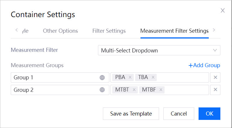
Configuring Measurement Filter
A measurement filter is used to control which metric data fields end users can view within the container, for example, “Number of Alarms” or “Total Duration of Closed Alarms.” It differs from a container filter: a container filter filters data records by conditions such as site or time; a measurement filter is used to switch or hide the metrics to be displayed.
Follow these steps to configure the measurement filter:
Go to the Measurement Filter Settings tab.
In Measurement Filter, select the filtering method:
Single-Selection Dropdown: The end user can only select one metric at a time. Suitable for scenarios where you need to switch between viewing different metrics at the same chart location.
Multi-Selection Dropdown: The end user can select multiple metrics at the same time. Suitable for scenarios where you need to compare multiple metrics side by side.
Once enabled, a measurement filter entry will be displayed in the upper-right corner of the container. After the end user opens the entry, they can select metrics according to the chosen method; their selection will be saved and retained the next time they enter the page.
In Measurement Groups, organize the metrics available for selection according to their business meaning. After selecting + Add Group, complete the following configuration in each row:
Left input box: Enter the group name, for example, “Alarm Metrics” or “Handling Duration.” This name is used to help end users understand the business meaning of metrics within the same group. Select the globe icon to configure internationalized text for the group name.
Right dropdown: Select one or more metrics that belong to this group. Selected metrics are displayed as tags; only metrics added to a group will appear in the end user’s measurement filter entry.
× icon: Delete a metric group that is no longer needed.
For example, you can create an “Alarm Metrics” group and select “Number of Alarms” and “Total Duration of Closed Alarms”; end users can then view these metrics under the same group, using either single-select or multi-select.
Select OK to save the configuration.
Adding Charts to a Basic Container
After adding a container to the page or panel, you can follow these steps to add a chart to the container in that panel:
Select the chart you want to add, and select the Add to Container
 button in the upper-left corner of the chart.
Select the container and container tab. Note: In a single-page application, a chart can only be added to a container within the same panel.
Removing a Chart from a Container
Move the mouse to the chart you want to remove from the container, and select the Remove from Container  button in the upper-left corner of the chart, to remove the chart from the container it is in.
Configuring an Array Container
An array container contains five tabs: Basic Options, Array Configuration, Card Style, Container Style, and Filter Settings. Array Configuration is used to determine which cards are generated and the data corresponding to each card; Card Style is used to configure the layout and display effect of widgets within a card.
Configuring Basic Options
In the Basic Options tab, configure the title and supplementary description of the array container.
Configuration Item |
Description |
|---|---|
Title |
Set the array container title text. |
Hide Title |
Do not display the container title. |
Title Font |
Set the font, font size, color, and other style properties of the title. |
Description |
Add a description for the container; end users can view it when hovering the mouse over the container title. |
Configuring Array Configuration
In the Array Configuration tab, first select how cards are generated, then configure the sorting, data filtering, and title jump for the cards.
Depending on the selected Array Method, the array settings differ as follows:
When Data Source is selected, configure the data used to generate cards according to the following:
Configuration Item |
Description |
|---|---|
Data Source |
Select the data source used to generate the container cards. |
Category |
Select the category within the data source. |
Array Field |
Select the field used to generate cards. Each distinct value of this field generates one card, and is used as the card name. For example, if you select “Site Name,” the system generates one card for each site name. |
Sort Field |
Set the default, ascending, or descending order for arranging cards by the specified field. |
Title Interaction |
Set the interactive action for each card title. See Title Interaction for details. |
Card Layout |
Set the number of cards displayed per row and column. |
When Calendar is selected, container cards are generated based on time, and you configure the time range and display name represented by each card:
Configuration Item |
Description |
|---|---|
Interval |
Set the time unit for generating cards, such as day, week, month, or year. |
Show Working Days |
Set whether to only display cards corresponding to workdays. |
Week Start Dates |
Set the starting day of each week in the calendar. |
Date Format |
Set the display format of the date in the card name. |
Title Interaction |
Set the interactive action for each card title. See Title Interaction for details. |
If you need to configure a linked data source for the data in the container, to achieve dynamic binding and interactive response between the data and the array structure, configure Linked Data Source:
Data Source/Dataset: Specify the backend database or API interface from which this business data is obtained.
Data Field: The main content displayed in the calendar cell, usually a specific business metric or value, such as the number of equipment faults for a given day, output, or the shift roster.
Start Data Point/End Data Point: Used to define the time span of a business event, such as the start time and end time of an equipment maintenance plan, or a work order execution cycle; tells the calendar which day to start rendering data, and which day to continue through.
Configuring Card Style
In the Card Style tab, configure the arrangement of widgets within the card, and the card’s appearance.
Configuration Item |
Description |
|---|---|
Widget Layout |
Set the arrangement of widgets within a card. |
Name Font |
Set the font, font size, color, and other style properties of the card name. |
Show Array Name |
Control whether the card name is displayed. |
Card Decoration |
Set the card title decoration, top decorative line, bottom decorative line, card color, and card spacing. |
Widget Spacing |
Set the spacing between widgets within a card. |
Configuring Container Style
The array container style is added and configured using the same method as the basic container. See Configuring Container Style for details.
Configuring Filters
Array container filters are added and configured using the same method as the basic container. See Configuring Filters for details.
Adding Charts to an Array Container
All cards in an array container share the same widget layout. After configuring the array container, follow these steps to add a chart to the cards:
In the first card within the container, select + Add Widget.
Select a chart type from the Basic Widgets, Custom Widgets, Widget Templates, or other tabs.
Once added, the widget configuration panel opens automatically. See Configuring Charts to complete data and style configuration.
Note
The editing state only displays the first card as a configuration sample. To view all cards and their actual data, select Preview, or check the page after publishing.