Common Configurations for Charts
Charts are the most important part of DTV. They are powerful visualization tools that can be used to present data in many different ways.
The configuration panel of every chart contains a set of common configuration items, which are described in this topic. For the configuration items specific to an individual chart, see the documentation page of that chart.
Note
The DTV chart configuration panel is being upgraded continuously. For common configurations and for charts that have already been upgraded, this documentation describes the new panel by default. For charts that have not been upgraded, it still describes the old panel. For the list of upgraded charts, see Chart New Configuration Guide.
Configuring Data
The first step in configuring a chart is configuring its data. Follow the steps below to configure the data source of a chart:

Prerequisite
A newly added chart uses demo data by default. To use your own data, select Select Data Source and then update the data fields as described in the following steps.
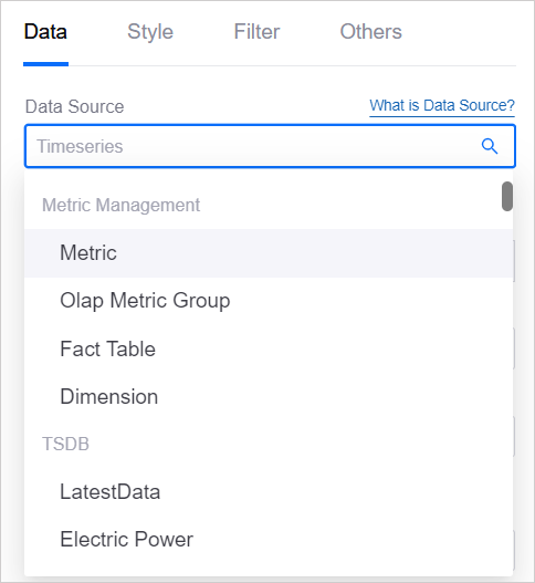
Step 1: Selecting Data Source
In Data Source, specify 1 data source for the chart as the channel through which the chart retrieves data. For the data source types that DTV supports and how to use them, see Data Source Overview.
Step 2: Selecting Category
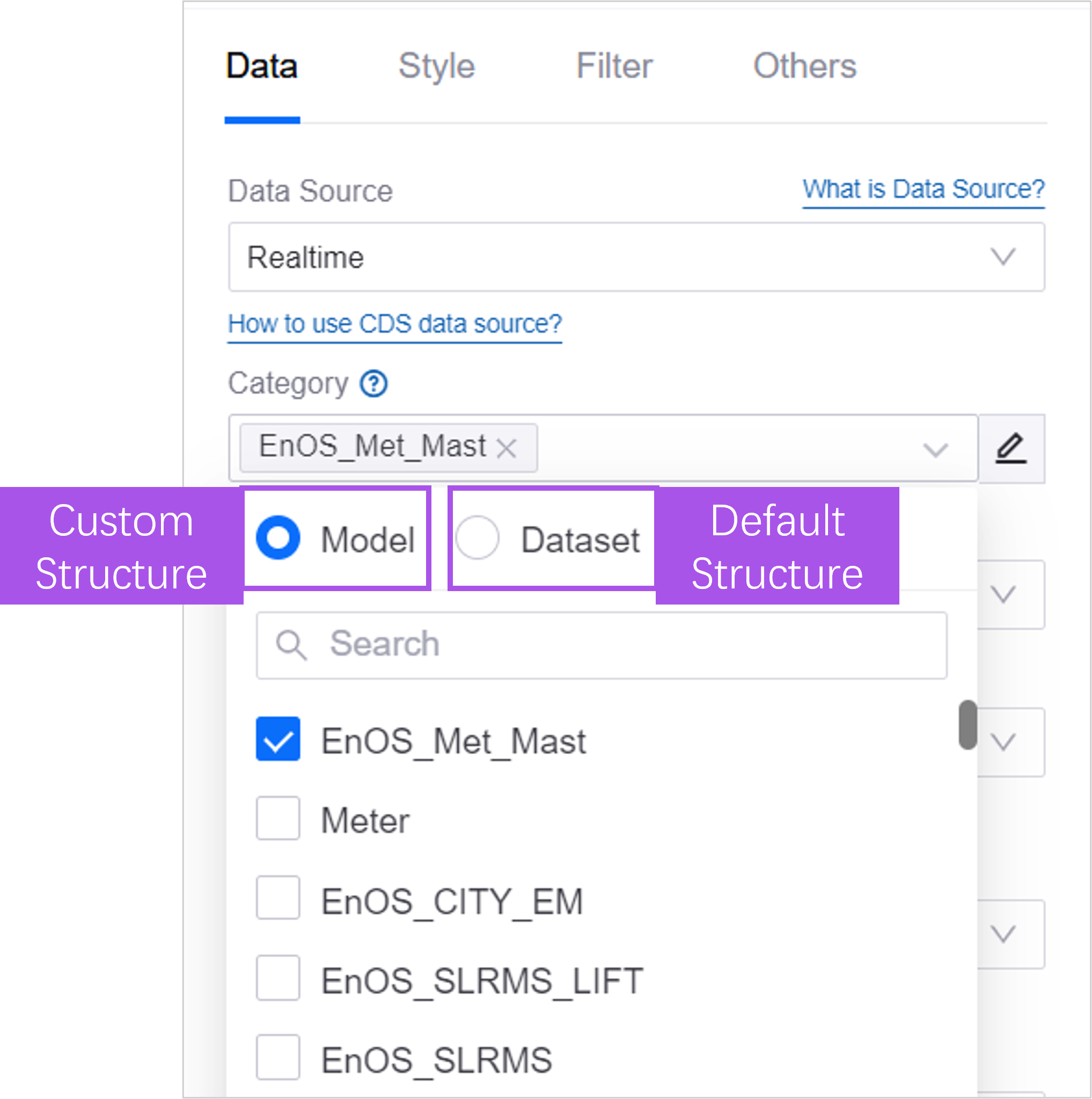
In Category, further define the request structure and the return parameters of the data. For more information, see Categories of Data Source.
Default category: Select a default category such as Model Management to use the default data structure of the data source. When the chart requests data, it must provide the default request parameters of the data source. The chart can display the attributes, metrics, and measurement points associated with the model.
Dataset: When no default category meets your needs, create a dataset to customize the request parameters and the return structure. When configuring the chart, you can then specify the values of the request parameters and choose which data fields are returned.
Step 3: (Optional) Configuring Data Source Parameters
When the selected data source defines request parameters, you can specify values for the data source parameters to further define how the data is requested, the time range, and so on.
Below Aggregation, select Expand.
Configure the values of the required parameters according to the following:

Step 4: Adding Data Fields
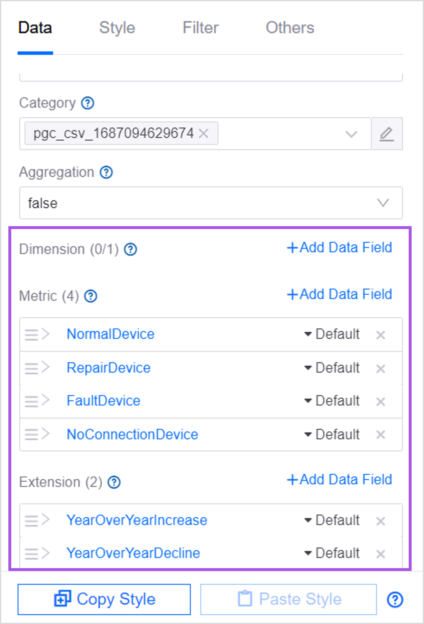
Data fields are the return parameters provided by the data source. In the chart, you define which return parameters the chart displays and how they are displayed.
Select Add Data Field under Dimension, Comparison, Measurement, and Extension in turn to add 1 or more data fields to the corresponding position. For the relationships between dimension, comparison, measurement, and extension, see Data Source Overview.
If no existing data field meets your requirements, select + Add Calculated Field in the Add Data Field dialog box to build a new data field from a simple calculation on existing data fields. For more information, see Calculated Fields.
Once added, the data fields are listed in the panel.
Note
If you change the Category, the data fields already configured become invalid but are not cleared automatically. Hover the mouse over the name of a selected data field and replace it to keep the chart style. Or select the × next to the data field to remove it and reconfigure the chart style from scratch.
Where Extension Fields Take Effect
Unlike dimension and measurement fields, an Extension field does not directly generate chart elements such as slices, bars, or rows. Instead, the chart must provide a configuration item in Style that references it. Whether an extension field takes effect therefore depends on the individual chart.
The charts that currently consume extension fields are:
Chart |
How the extension field is used |
|---|---|
Metric Card |
Description displays the value of the extension field below the metric value; Total Proportion Value specifies the total used when calculating proportions. |
Single-Metric Card |
Total Proportion Value specifies the total used when calculating proportions. |
Pie Chart |
Display Extension replaces the center total or the values in the legend. See Pie Chart. |
Horizontal Bar Chart |
Data Shown on Hover replaces the measurement value in the tooltip. See Horizontal Bar Chart. |
Table |
Acts as the data source of the Subtable. Extension fields do not generate columns in the main table. See Table. |
Progress Bar |
Data Field determines the condition under which the icon is displayed; Bar Name specifies the name of the label on the left (requires a comparison field). |
Stacked Progress Bar |
Summary Name specifies the name of the summary item (only takes effect when Title Layout is set to bottom). |
Bar chart, line chart, scatter chart, and so on |
Acts as the source of the matching data for Highlight Area, and as the size source for bubble series. These charts do not show extension fields in the tooltip. |
Timeline |
Once selected in Extra Display Fields, appears in the tooltip, the table view, and exported files. |
Note
Charts not listed above still show the Extension data field entry in their configuration panel, but they have no configuration item that references an extension field. Adding one has no effect on the chart.
Step 5: (Optional) Other Configurations
You can go on to configure how data values are aggregated, the order in which they are displayed, and so on.
Display Aggregated Data
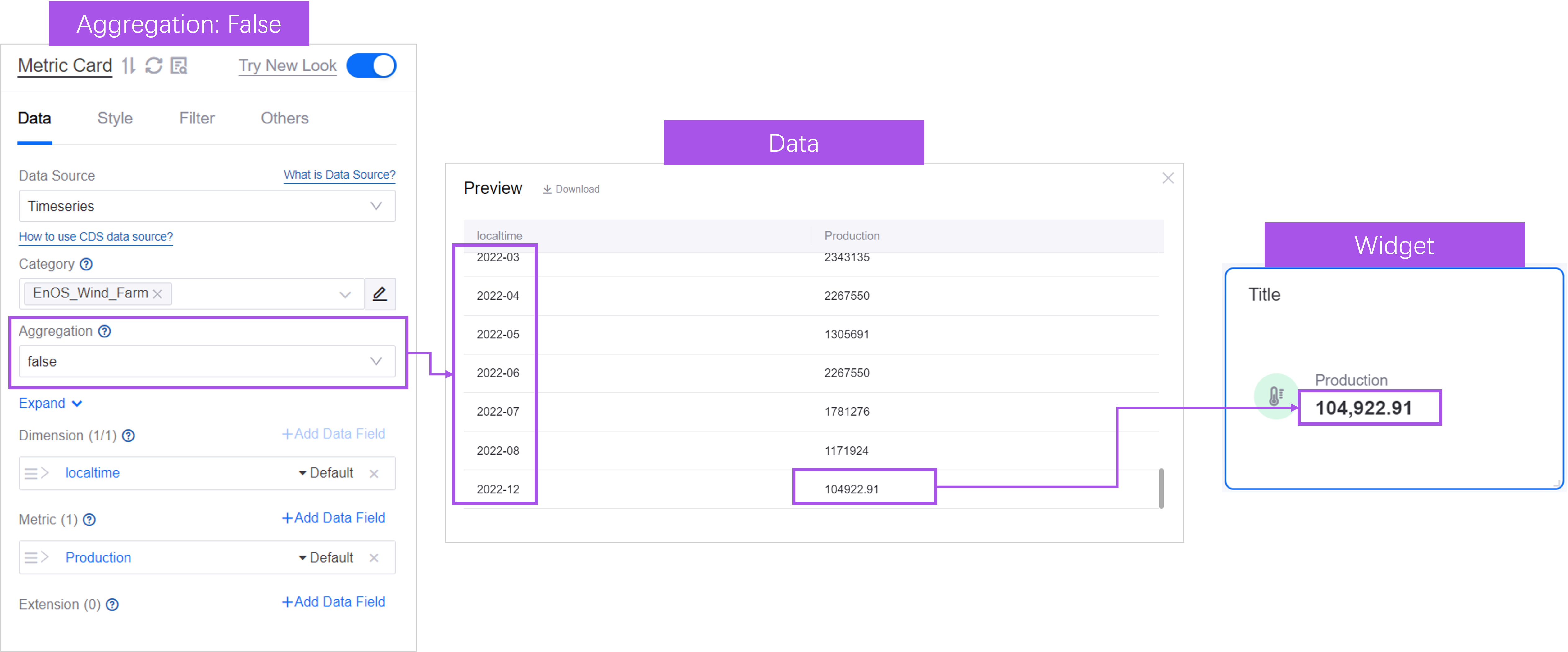
Aggregation lets you aggregate the data displayed in the chart from different perspectives. When you have configured a Comparison or Dimension data field for the chart, you can aggregate the measurement values that share the same dimension or comparison value.
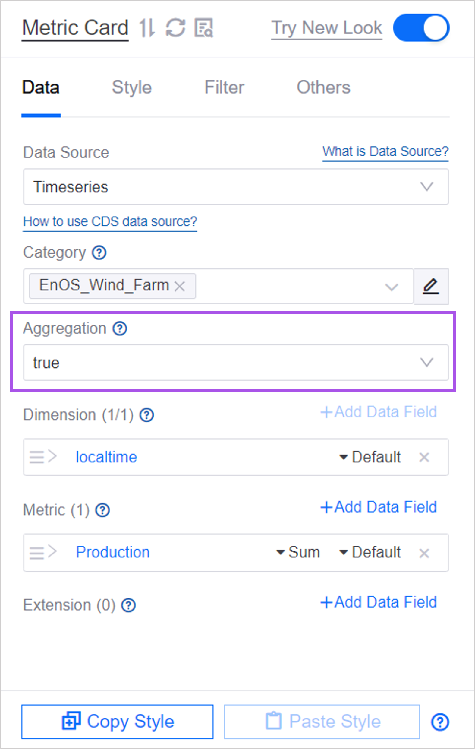
For example, suppose Dimension is set to localtime and several measurement values have a localtime of 2022-12. Without aggregation, the data is sorted in ascending order by dimension by default, and the chart displays the last measurement entry.
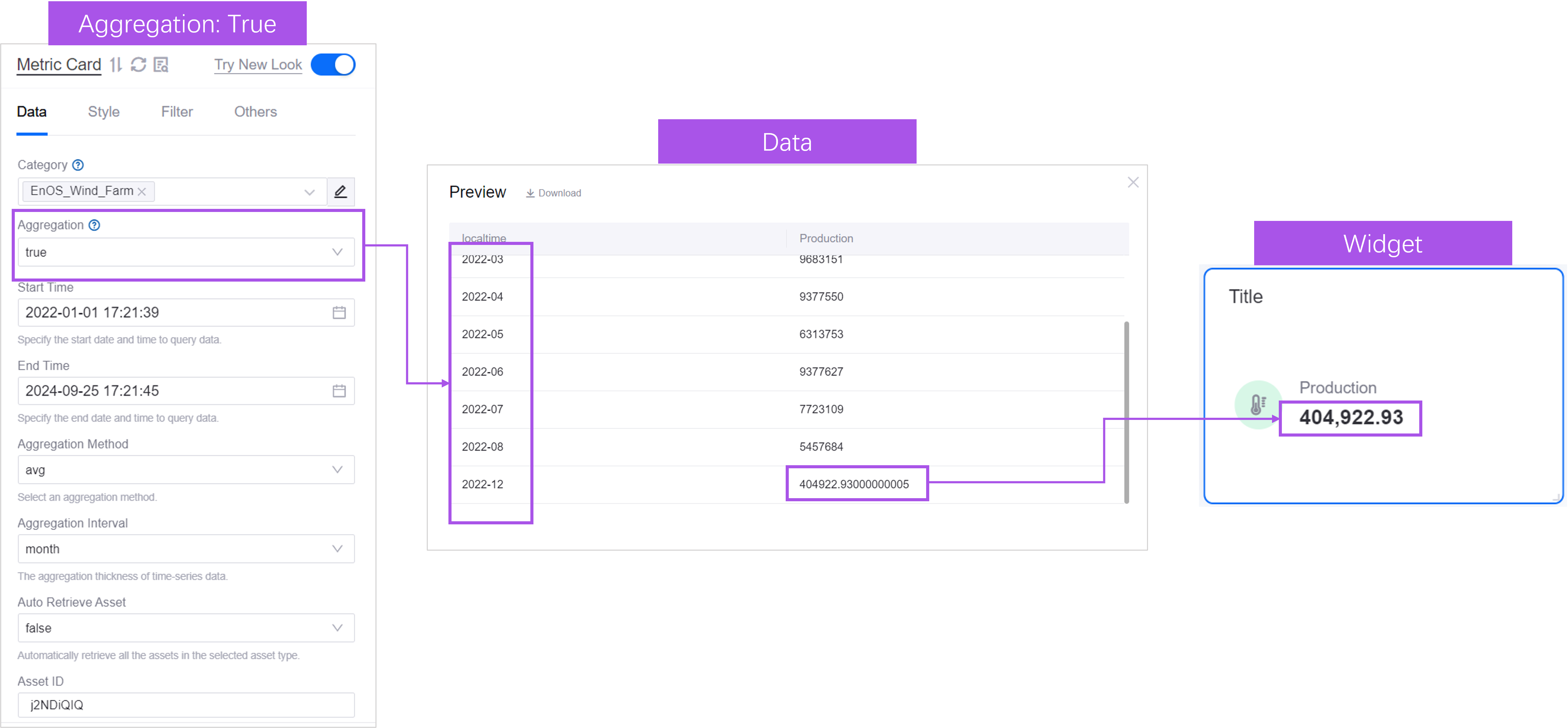
Once Aggregation is configured, the measurement values that share the dimension 2022-12 are aggregated. By default they are aggregated with Sum, sorted in ascending order by dimension value, and the chart displays the last entry.
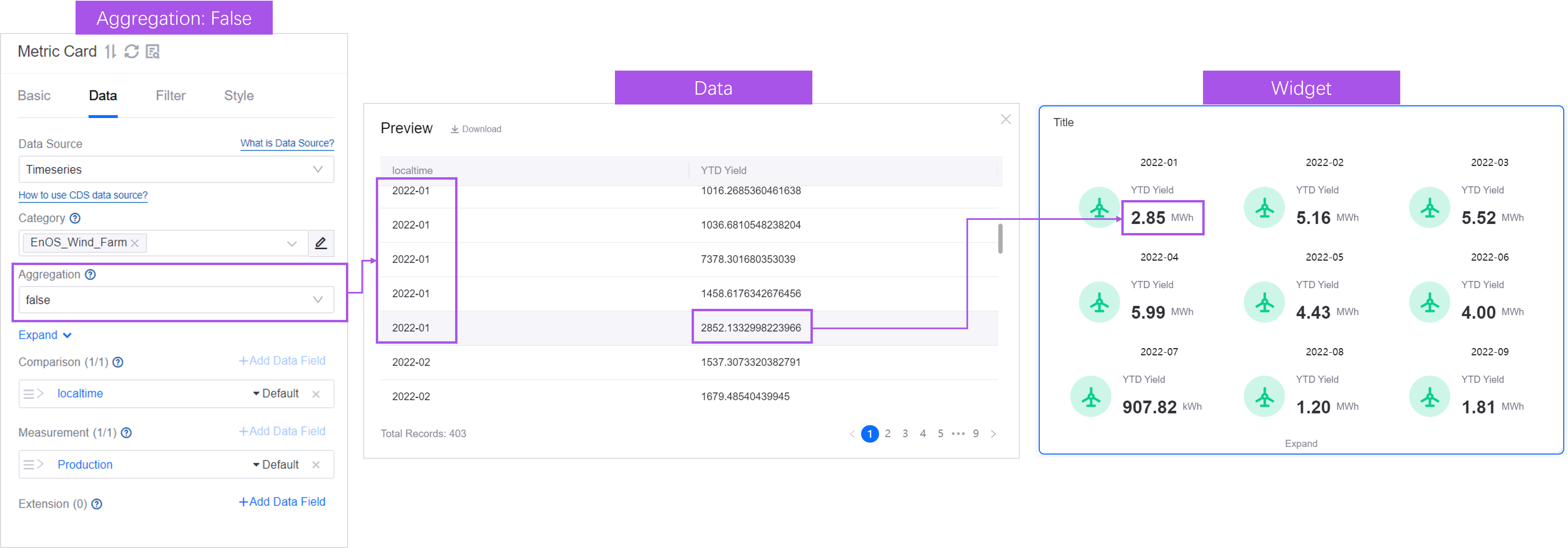
As another example, suppose Comparison is set to localtime and several measurement values have a localtime of 2022-12. Without aggregation, the data is sorted in ascending order by comparison by default, and the chart displays the last measurement entry for each comparison value.
After aggregation, the measurement values that share the comparison value 2022-12 are aggregated. By default they are aggregated with Sum, sorted in ascending order by comparison value, and the chart displays the last entry.
If needed, select the Sum label next to a data field to switch to another aggregation method.
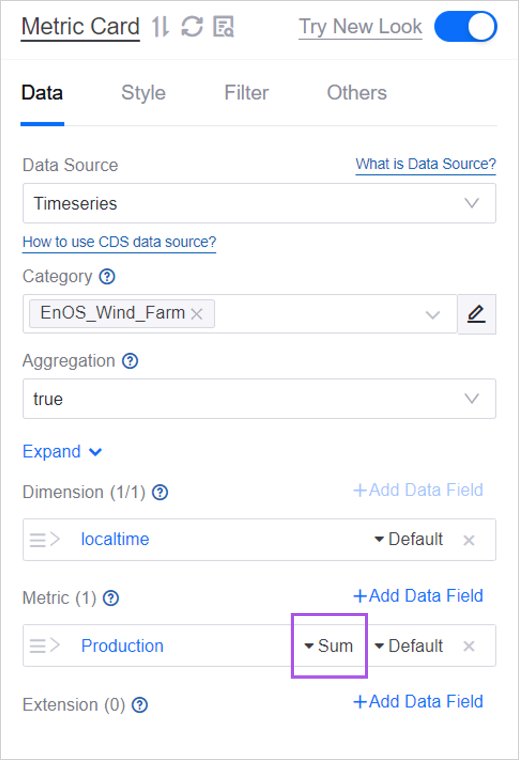
DTV supports the following aggregation functions:
Function |
Description |
|---|---|
Sum |
Displays the unweighted total of the measurement values. |
Average |
Displays the average of the measurement values. |
Effect Average |
Displays the average of the non-null measurement values. For example, if there are 10 values and 6 of them are non-null, Effect Average returns the average of the 6 non-null values, whereas Average returns the average of all 10 values. |
Max |
Displays the largest value of the measurement in the returned data. |
Min |
Displays the smallest value of the measurement in the returned data. |
First |
Displays the first measurement value. |
Last |
Displays the last measurement value. |
Count |
Displays the number of data entries of the measurement under the dimension. |
Distinct Count |
Displays the number of distinct data entries of the measurement under the dimension. |
Ordering Value
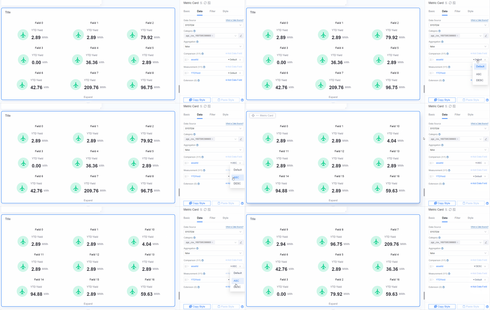
When a data field displays multiple values, the values can be sorted in ascending or descending order. Ascending order is the default.
When a sort order is set for more than one category, the sorting priority is Comparison > Dimension > Measurement > Extension: the data is sorted by the category with the highest priority first, and where those values are equal, by the sort order of the following categories in turn.
If a category contains multiple data fields, the first data field added is sorted first.
Data fields for which no sort order is set do not take part in sorting; the priority passes to the next data field that has a sort order.
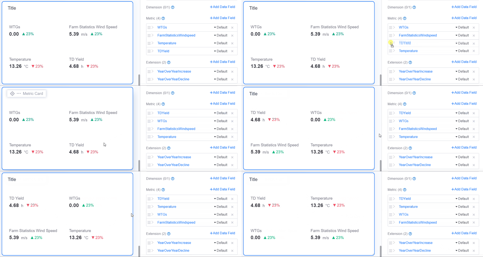
Ordering Data Fields
When there are multiple data fields, drag them to adjust the order in which they are displayed.
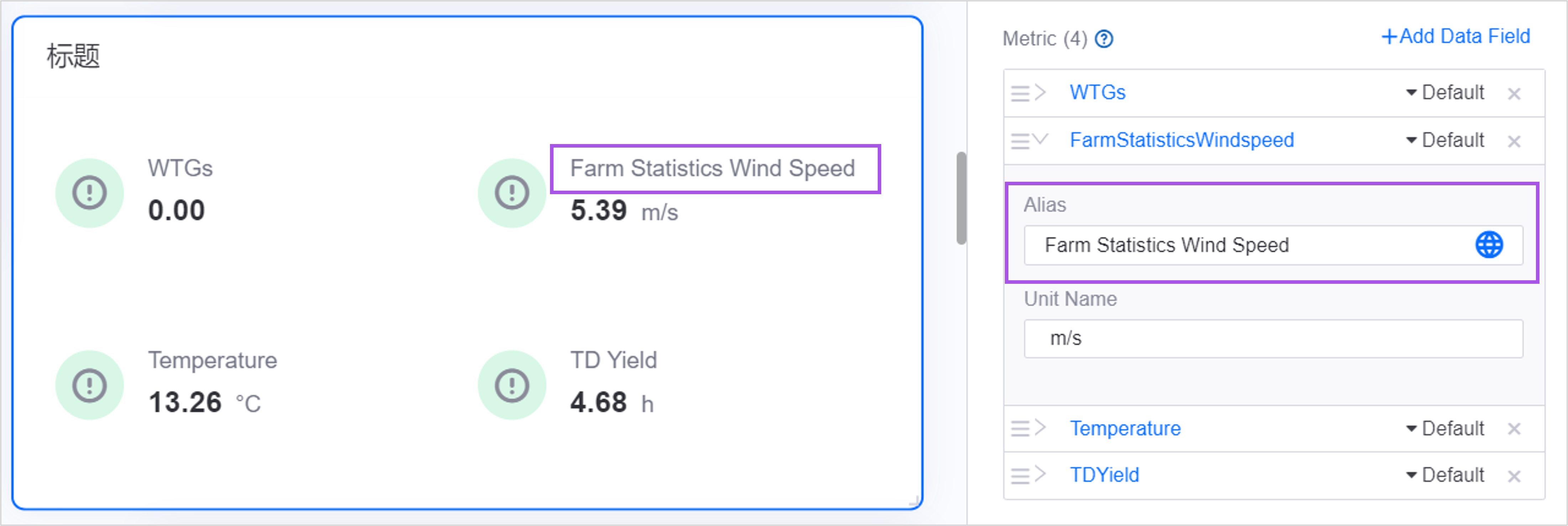
Alias
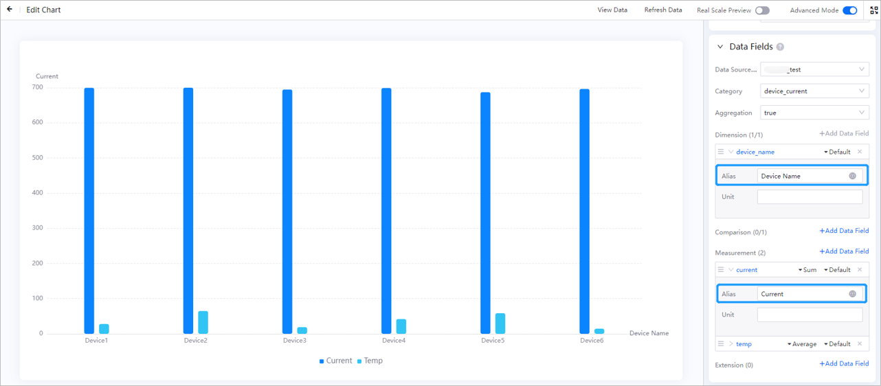
After a data field is added, the chart uses the name of the data field as the display name by default. You can customize the display name with Alias.
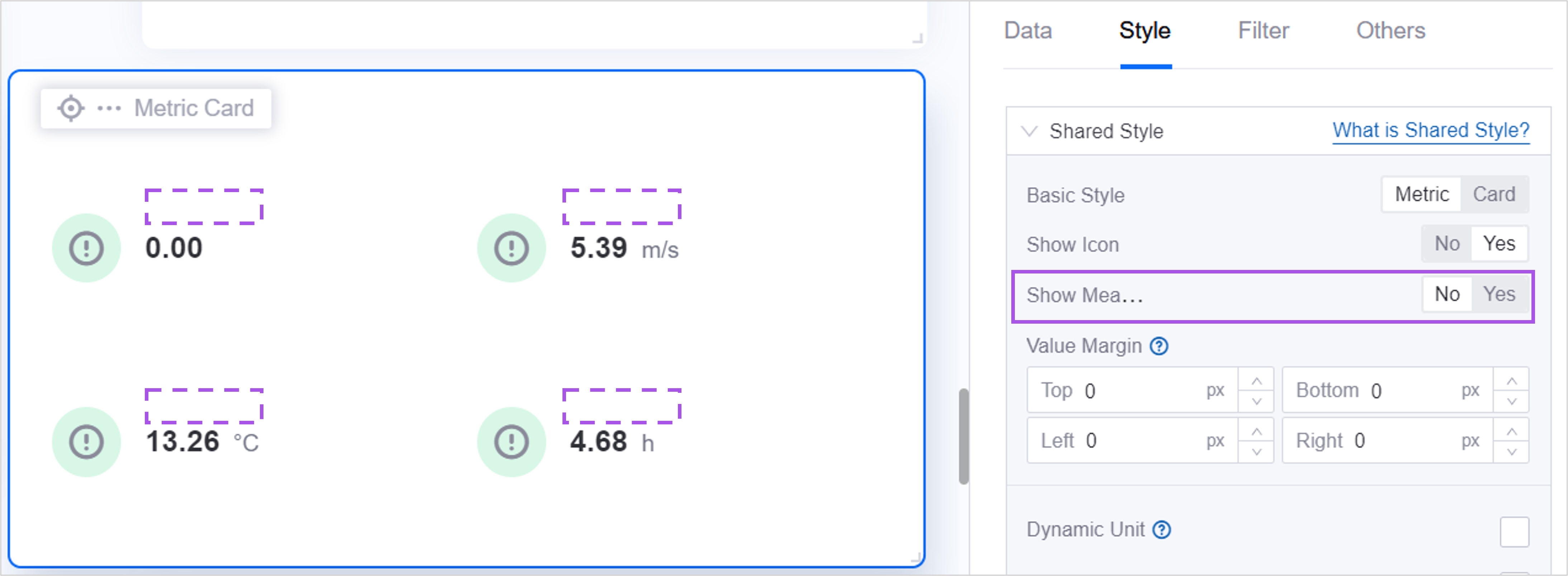
In some charts, if you do not need to display the name, set Field Name to No.
Unit
The unit is displayed next to the measurement value. By default the chart displays the unit that comes with the data field. If the data field has no default unit, or you need a different unit, configure Unit in the settings of the data field.
How detailed the unit settings are varies by chart. Single-Metric Card, Metric Card, Pie Chart, Multi-Metric Pie Chart, 3D Pie Chart, Multi-Metric 3D Pie Chart, and Stacked Progress Bar provide the complete set of unit settings, described in Configuring Units per Data Field below.
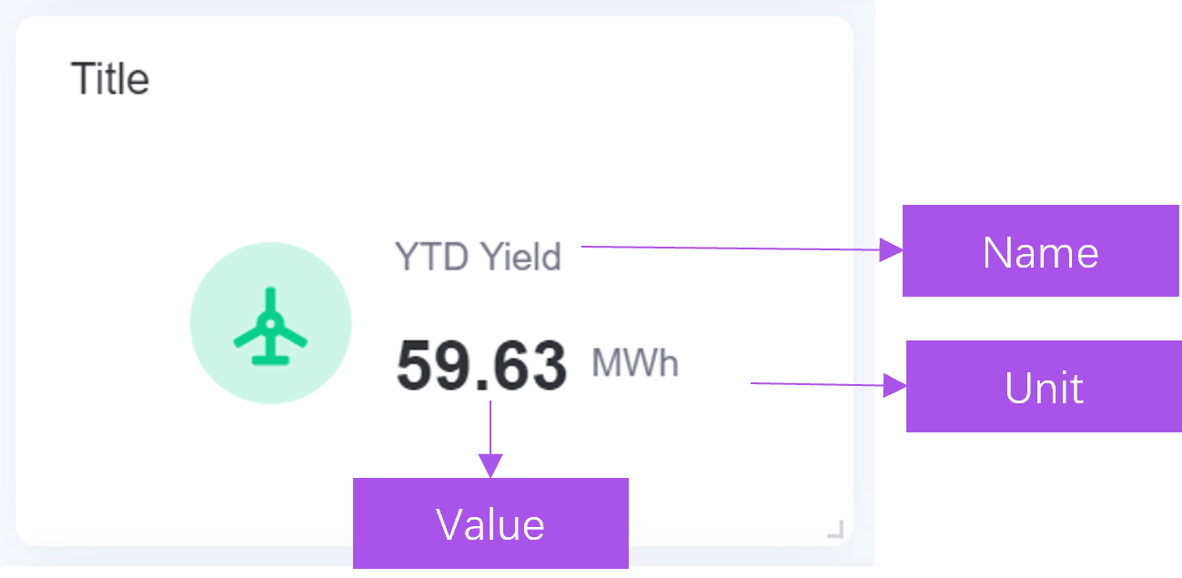
Configuring Units per Data Field
The following charts have moved the unit settings to the Data tab, where they are configured on the individual data field: Single-Metric Card, Pie Chart, 3D Pie Chart, and Stacked Progress Bar.
Unit: Select Unit Library to pick a standard unit from the DTV unit library, or select Custom to enter a unit name manually. Custom units do not take part in unit conversion.
Unit display mode:
Display data units: Displays the unit that comes with the data field.
Display specified units: Always displays the unit you specify. Selecting this mode shows the Display units configuration item.
Display units as data changes: Converts the value to a simplified notation automatically according to its magnitude. Selecting this mode shows The smallest unit, which sets the lower bound of the conversion.
Set as Global Unit: Uses the unit of this data field as the unit of the whole widget. Only Multi-Metric Pie Chart and Stacked Progress Bar provide this item, and it does not apply to Extension data fields.
Configuring Style
Configure the style of the chart on the Style tab.
Quick Style Switching
Charts that have been upgraded to the new configuration panel provide Quick style switching at the top of the Style tab, which lists thumbnails of the preset styles closest to the current chart. Select a thumbnail and Apply to switch the chart to that preset. Switching preserves as much of the existing configuration as possible and only changes the style.
Switching is limited to presets in the same group. For example, a bar chart can switch between Basic Bar, With Target Line, and Stacked Bar. For the presets available in a given chart, see the documentation of that chart.
Note
Charts that have not been upgraded to the new configuration panel do not provide this feature. For the list of upgraded charts, see Chart New Configuration Guide.
Title
On the Basic tab of the chart configuration, configure the content, layout, and style of the chart title.
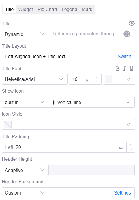
Title Content
Sets the content of the title. Select the eye icon on the right to show or hide the title. The title supports two value modes:
Fixed: Enter fixed title text directly.
Dynamic: Application developers can use global parameters, widget variables, and widget data to make the chart title change with the context. The following placeholders are supported:
Navigator parameter:
${parameter_key}. When the end user changes the navigator or a global filter condition, the title displays the current filter value.Widget variable:
@{parameter_key}. The title displays the current value of the widget variable.Widget data:
#{field_ID}. The title displays the actual value of a data field in the chart.
For example, after you enter
${mdmId}, the title displays the currently selectedmdmIdvalue.
Note
When an end user exports chart data, the system automatically resolves the variables in the chart title and in the exported content to the current filter value or the actual data value, producing a data file with clear business semantics.
Title Layout
Sets the alignment of the title text and icon. Select Switch to move between layouts.
Left-Aligned: Title Text: Default option.
Left-Aligned: Icon + Title Text: You can define the Icon type and Icon Style separately, including built-in styles and uploaded custom images.
Left-Aligned: Title Text + Icon: You can define the Icon type and Icon Style separately, including built-in styles and uploaded custom images.
Title Font
Sets the font, font size, and color of the title text, and applies bold (B), italic (I), and underline (U) styles.
Title Padding
Sets the distance in px between the title text and the left edge of the header.
Header Height
Sets the height of the header.
Adaptive: The header height follows the page settings.
Custom: Enter the header height manually.
Header Background
Sets the background of the header.
Adaptive: The background follows the page settings.
Auto: Uses the system default background.
Color: Customizes the background color.
Custom: Uploads an image as the background. After uploading, you can set how the image is displayed:
Default: Displays the image at its original size.
Stretch: Stretches the image to fill the header.
Adaptive: Keeps the aspect ratio and fits the image to the header.
Widget
Widget Size
Widget size is determined by the number of grids. Drag the widget or edit the values directly to update its size. What is a grid >>
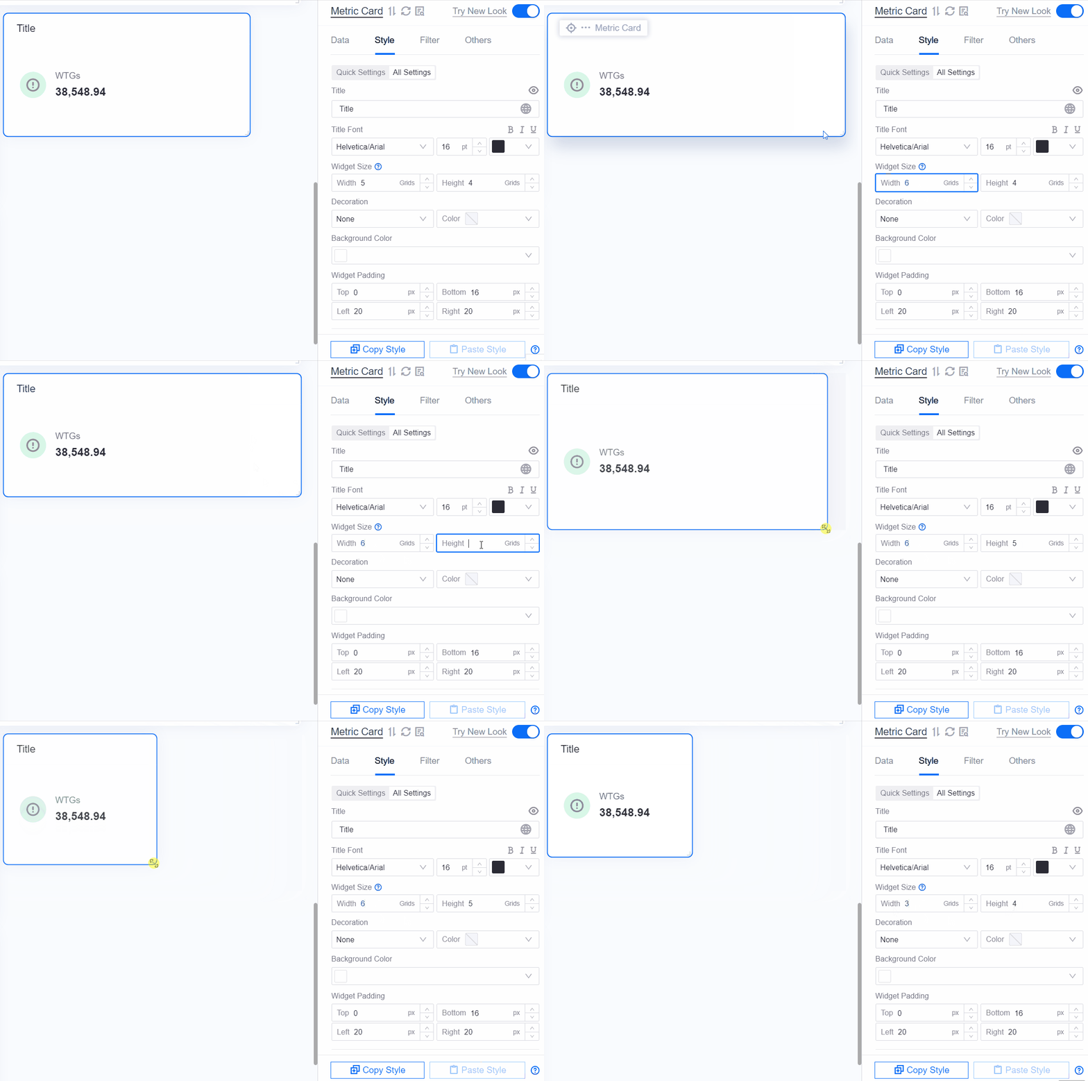
Widget Padding
Sets the top, bottom, left, and right spacing in px between the content area and the widget border. Adjusting the padding does not change the widget size. Increase the spacing in a given direction when the content sits too close to the border or when you need to leave room for decoration.
Rounded Corners
Sets the corner radius of each of the four corners of the widget: left-top, right-top, left-bottom, and right-bottom, in px. The default for each is 8 px.
Decoration
Adds a decorative line to the widget as a visual separator. The dropdown list offers None (default), Top Decorative Line, or Bottom Decorative Line, and Color on the right sets the color of the line.
Widget Background
Sets the background of the widget content area. Three modes are available:
Auto: Uses the default background of the current theme. When this is selected, Effect and Shadow Style are hidden.
Color: Default option. Specify the background color in the color picker on the right; solid and gradient colors are supported.
Custom: Uses an image as the background. Selecting this shows Background Image Style, which offers Default (original image size), Stretch (default, stretched to fill the widget), Contain (keeps the aspect ratio), or Contain Center (keeps the aspect ratio and centers the image).
Effect
Sets the visual effect of the widget background: Shadow Effect (default), Glass Effect, or No Effect. When Shadow Effect is selected, you can set the shadow Color on the right. This item is hidden when Widget Background is Auto.
Shadow Style
Displayed only when Effect is Shadow Effect. Sets the shadow X Offset, Y Offset, Blur, and Spread in px, with defaults of 0, 0, 20, and 0 respectively.
Scope of Series, Coordinate Axis, Legend, and Mark
The Series, Coordinate Axis, Legend, and Mark sections described below are provided by the presets in the Bar Chart, Line Chart, and Scatter Chart groups listed here. These presets share the same widget and the same configuration panel:
Bar Chart group: Basic Bar, With Target Line, Stacked Bar, Box Plot
Line Chart group: Basic Line, With Point, Basic Area Chart
Scatter Chart group: Basic Scatter, Bubble Chart
Note
Waterfall Chart sits in the Bar Chart group but is a separate widget and provides none of these four sections. See Waterfall Chart.
Table also has a section called Series, and Pie Chart and Multi-Metric Pie Chart also have a section called Mark, but their meaning is entirely different from the identically named sections described here. See Table and Pie Chart.
Series
The following configuration items are in the Series section. Apart from the items inside the series list, which apply to a single series, they all apply to the whole chart.
Layout
Sets the drawing direction of the chart.
V: Vertical. The dimension axis runs horizontally and the graphics extend from left to right. This is the most common direction.
H: Horizontal. The dimension axis runs vertically and the graphics extend from top to bottom, which suits long dimension labels or side-by-side comparison.
After you switch the layout, the Display X-Axis and Display Y-Axis labels in the axis style panel swap accordingly to reflect the actual coordinate direction.
Show Thousands Separator
When values are large, select Show Thousands Separator so that the values in the chart show a thousands separator, for example “722550” becomes “722,550”. This makes large numbers easier to read.
Maximum Data Count
Limits the maximum number of dimensions that the chart renders at one time. When the volume of data is large, use this item to trim the data and prevent the browser from stuttering while rendering too many data points.
The first N dimension values are kept in the order in which the data is returned, together with all data belonging to those dimension values; data for the remaining dimensions is discarded. This item therefore only takes effect once the chart has a Dimension field.
Add Series
A series binds one measurement to a chart type and a visual style. Select + Add to open the Add Series dialog box, and provide the following two items to create the series:
Name: The display name of the series, used as the legend text. Supports multiple languages.
Type: The chart type of the series. Options are Boxplot, Scatter Chart, Bar, Dot-Line, Area, Line, Target, and Bubble.
Editing a Series
Once created, each item in the list is shown in the form “type: series name”, for example Bar: Generation. Select the Edit icon to change the name and type, or × to delete the series.
Expand the series panel to configure the remaining items that apply to that type; the panel only shows the items applicable to the selected type. The common items are:
Data Field: The measurement field bound to the series. Empty by default. The Boxplot type does not have this item; instead it uses the five dropdowns Maximum Value, Minimum Value, Median Value, Upper Quartile Value, and Lower Quartile Value to bind measurement fields.
Color: Sets the color of the bars, lines, points, and other graphics; solid and gradient colors are supported. For the Boxplot type the corresponding item is called Box Background Color.
Decimal Places: Sets how many decimal places the values of this series show in the chart, from 0 to 3, with a default of 2. The source data is not affected.
Match Secondary Y-Axis: When selected, the data of this series is mapped to the secondary Y-axis, which suits comparing measurements of very different magnitudes. The visibility and style of the secondary Y-axis are configured in the Coordinate Axis section. Cleared by default.
Mark Predicted Data: When selected, data points with a timestamp later than the current time are displayed in a special style, making historical and predicted data easy to tell apart. Cleared by default.
Comparison: Selected by default. When selected, the series is split automatically into multiple series according to the comparison field configured on the Data tab, with one group of bars per comparison value. When no comparison field is configured, this item has no effect on the display.
Comparison Palette: Shown once Comparison is selected. The default is Gradient Palette, which assigns colors along a gradient. Solid Palette uses a solid color per group, and Custom Palette lets you define the colors.
Color JSON: Shown once Comparison Palette is set to Custom Palette. Assigns colors by comparison value. See Color JSON.
The remaining items depend on the Type you select. See the documentation of the individual charts:
Series type |
Type-specific configuration items |
|---|---|
Bar |
Rounded Corners |
Line |
Line Type (line type, Line Width, Smooth) |
Area |
Area Color, Line Type |
Dot-Line |
Line Type, Dot (shape, Size) |
Scatter Chart |
Scatter Size |
Target |
Target Height |
Bubble |
Data Field, Size |
Boxplot |
Maximum Value, Minimum Value, Median Value, Upper Quartile Value, Lower Quartile Value, Box Background Color, Border |
Color JSON
Color JSON is a multi-line text box that controls the color of each area precisely in JSON format. The format is a two-dimensional array in which each inner array holds 2 RGBA color values, representing the start and end colors of the gradient for that area.
The text box is empty by default, in which case the chart uses the built-in palette. The tooltip of the configuration item provides the following example, which you can copy with Copy All and then modify:
[
  ["rgba(220, 87, 255, 1)", "rgba(255, 152, 224, 1)"],
  ["rgba(17, 186, 101, 1)", "rgba(187, 243, 74, 1)"],
  ["rgba(57, 40, 250, 1)", "rgba(142, 133, 255, 1)"],
  ["rgba(245, 10, 34, 1)", "rgba(245, 69, 192, 1)"],
  ["rgba(10, 100, 255, 1)", "rgba(71, 255, 237, 1)"],
  ["rgba(132, 39, 245, 1)", "rgba(245, 98, 218, 1)"],
  ["rgba(0, 133, 128, 1)", "rgba(46, 236, 172, 1)"],
  ["rgba(255, 170, 0, 1)", "rgba(255, 230, 92, 1)"],
  ["rgba(255, 88, 2, 1)", "rgba(255, 213, 0, 1)"],
  ["rgba(0, 115, 133, 1)", "rgba(46, 236, 232, 1)"],
  ["rgba(243, 56, 10, 1)", "rgba(255, 129, 19, 1)"],
  ["rgba(10, 175, 229, 1)", "rgba(133, 228, 255, 1)"]
]
Each color corresponds to one area or bar in the chart. In the RGBA format the first three numbers are the red, green, and blue channels (0-255) and the fourth is the opacity (0-1). Entries in the color array map to the areas in order; when there are fewer entries than areas, the colors are reused cyclically.
Bar Spacing
Sets the spacing between adjacent bars as a percentage, with a default of 75%. The larger the value, the thinner the bars and the wider the gaps.
Shown only when at least one series has the Type Bar.
Maximum Bar Width
Limits the width in px of each column on the X-axis. When there are few data entries, this prevents bars from becoming too wide in a wide widget.
This item is always shown, even when the chart has no series of type Bar.
Stacked Bar Chart
When selected, multiple bar series are stacked on the same bar by category, which suits showing a total and its composition at the same time. Cleared by default.
Shown only when at least one series has the Type Bar.
Coordinate Axis
The top of the Coordinate Axis section provides the visibility switches for the three axes and the overall padding settings; below that, X-Axis, Y-Axis, and Secondary Y-Axis are expanded separately. The three axes share a set of identically named items, described in Common Axis Configuration Items; the items that vary with Label Field Type are described in Label Field Type Configuration Items.
Which axis carries the categories and which carries the measurements is determined by Layout in the Series section: in the vertical layout the X-axis is the category axis and the Y-axis is the measurement axis; in the horizontal layout the two swap. The configuration items of the three axes are not identical; items that appear on only some axes are marked below.
Note
Heat Map and Pareto Chart also provide a Coordinate Axis section, but their items are a subset of this section plus items of their own. See Heat Map and Pareto Chart. The axis style of Horizontal Bar Chart and Waterfall Chart is a different set of items with different names and this section does not apply. See Horizontal Bar Chart and Waterfall Chart.
Axis Visibility and Padding
Display X-Axis, Display Y-Axis, Display Secondary Y-Axis: Control the visibility of each of the three axes. When cleared, the style section of that axis is hidden as well. The secondary Y-axis is only meaningful when at least one series has Match Secondary Y-Axis selected.
Fix Axis Padding: Cleared by default, in which case the system reserves space for labels automatically. Only when selected are Top Offset, Bottom Offset, Left Offset, and Right Offset shown (in px), which you can use to prevent labels from being clipped or the chart from sitting too close to the edge.
Common Axis Configuration Items
The following items have the same meaning on the X-axis, the Y-axis, and the secondary Y-axis.
Axis Name
Name: The name or unit of the axis, displayed beside the axis, for example
kWh. Select the eye button to hide the name on its own, or the globe icon to configure multiple languages. Once the name is hidden, the corresponding font items are no longer shown.
Name Axis Margin: The distance between the axis name and the axis line. When Auto is selected the system calculates it; clear Auto to enter a value manually.
Unit Font: Sets the font, font size, color, bold, and italic style of the axis name.
Dynamic Unit: When selected, values are converted automatically to a simplified notation according to their magnitude, for example
22000 tis displayed as22 kt. For the DTV unit library and its conversion logic, see DTV Unit Library.
Label Settings
Label Field Type: Determines the field type used to interpret the labels of the axis. Options are Value, Category, and Time. Once selected, the panel only shows the format items applicable to that type; switching type resets the format you have configured. The category axis defaults to Category and the measurement axis to Value.
Tilt Angle: Rotates the text direction of the tick labels in degrees, with a default of 0 (horizontal). Positive values rotate counterclockwise and negative values clockwise; the closer the absolute value is to 90, the closer the labels are to vertical. The valid range is -90 to 90. This item rotates only the tick labels and does not affect the axis name. When labels are long, tilting them prevents adjacent labels from overlapping.
A rotated label has a taller bounding box on a horizontal axis, or a wider one on a vertical axis, so the system reserves more space for labels and the plot area is compressed accordingly. The larger the tilt angle, the more space is reserved. To control this padding yourself, select Fix Axis Padding and specify the offsets in each direction. See Axis Visibility and Padding.
Label Length (X-axis only): Limits the number of characters a label displays; the rest is shown as an ellipsis (…). When Auto is selected the system decides based on the widget width.
Label Font: Sets the font, font size, color, bold, and italic style of the tick labels.
Label Axis Margin: The distance between the tick labels and the axis line. Also supports Auto or a manual value.
Show Max Label (X-axis only): When selected, the label at the maximum value is always displayed on the axis, so that it is not omitted by the label layout rules. Cleared by default.
Axis Line and Grid Line
Axis Range: Calculated automatically by the system from the data by default. Clear Default to specify Min, Max, and Seg (the number of segments) manually, which helps you focus on a particular value range or align the axis range across several charts.
Coordinate Axis: Sets the line type, thickness, and color of the axis line. Select the eye button
to show or hide it.Grid Line: Sets the line type, thickness, and color of the grid lines extending from the ticks of this axis. Select the eye button
to show or hide them.Show Scalar Bar: When selected, a draggable range bar appears beside the axis so that end users can focus on part of the data at runtime. This is especially useful when there are many data entries. Cleared by default.
Label Field Type Configuration Items
Selecting a different Label Field Type shows the corresponding format items:
Category
The default type of the category axis. Labels are shown one per dimension value, and no additional format items are provided.
Value
The default type of the measurement axis. Labels are shown on a numeric scale.
Format: Sets the display format of the numeric labels. Options are
auto(default),none,k,m, andg.Decimal Places (Y-axis and secondary Y-axis only): Sets how many decimal places the labels keep, with a default of 1. The source data is not affected. When Auto-Trim Trailing Zeros is selected, trailing zeros in the decimals are hidden, for example
1.0is displayed as1. This item is selected by default.
Time
Labels are shown on a time scale, which suits axes bound to a time field.
Format Type (Y-axis and secondary Y-axis only): Options are Built-in and Custom; only appears when Label Field Type is Time. With Built-in, Format is a dropdown list; with Custom, Format becomes an input box in which you enter a format string.
Format: Sets the display format of the time labels, for example
YYYY-MM-DD HH:mm:ss,YYYY-MM-DD,MM-DD HH:mm, orHH:mm.Interpolation (X-axis only): Determines how missing time points are filled in. Options are Start and End Points, Start Point and Intervals, Intervals Only (default), and None.
Configure Segment Rule (X-axis only): Select the button to open a dialog box in which you configure the segmentation rules of the time scale. In the dialog box you can select Link with Global Filter: when cleared, add rules one by one by Granularity and Format; when selected, bind the rules to a navigator parameter or a global filter and specify a granularity and time format per filter value.
Window Start Time / Window End Time (X-axis only): Can only be set when Interpolation is None, and limit the range shown on the time axis.
Legend
The Legend button group offers No and Yes; when No is selected the items below are hidden. The legend text is the Name of each series.
Legend Position: Select the position of the legend relative to the chart from the icons. Options are bottom-middle (default), left-middle, top-middle, top-right, and right-middle.
Legend Margin: Shown only when Legend Position is top-right. Auto is selected by default; clear it to set the top and right margins separately.
Compact: When selected, legend items are laid out compactly, which saves space when there are many series. Cleared by default.
Size: Sets the Size of the legend icons and the Spacing between legend items, in px. When Auto is selected the system calculates them from the widget size.
Legend Font: Sets the font, font size, color, bold, and italic style of the legend text.
Note
Heat Map also provides a Legend section, but without Compact and Legend Margin; its Size sets the width and height of the legend color blocks instead, and it adds a heat-map-specific sliding precision item. See Heat Map. The Legend section of Pie Chart, Multi-Metric Pie Chart, 3D Pie Chart, and Multi-Metric 3D Pie Chart uses a different set of items. See Pie Chart and 3D Pie Chart.
Reference Line, Mark, and Highlight Area
The Mark section overlays reference information on the chart. It contains three groups of items, Reference Line, Mark, and Highlight Area, each of which is added with + Add and removed with ×.
All three can only reference data fields that are already configured, and the data field is empty by default, so you must select one after adding an item or the annotation cannot be positioned correctly: a Highlight Area is not drawn at all without a data field, and the position of a Reference Line or a Mark is undefined. If the selected data field is removed from the Data tab, the corresponding annotation configuration is deleted automatically.
Note
Pie Chart and Multi-Metric Pie Chart also have a section called Mark, but its content is the configuration of Data Label and is unrelated to the reference lines, marks, and highlight areas described here. See Pie Chart.
Reference Line
A reference line draws a line at a specified position, typically to show a threshold or a target baseline.
Name: The name of the reference line, displayed in the chart. Supports multiple languages.
Data Fields: The data on which the reference line is calculated. The options are the first Dimension field and all Measurement fields configured on the Data tab; extension fields are excluded. Empty by default.
Type: How the value of the reference line is derived. Options are Maximum Value, Minimum Value, Average Value (default), Median Value, Custom Fixed Value, and Parameter. For time and string type data fields, Custom Fixed Value and Average Value are not supported.
Value: Shown only when Type is Custom Fixed Value or Parameter, and specifies the value of the reference line. Besides entering a number directly, you can reference variables: page parameters as
${key}, widget parameters as@{key}, and widget data as#{fieldId}.Name Location: The position of the name relative to the line. Options are Right of line, Above line (default), and Below line.
Value Font: Sets the font, font size, color, bold, and italic style of the reference line value and name.
Line Format: Sets the line type, thickness, and color of the reference line. The default is a 1 pt dashed line.
Hover Display Content: The explanatory text shown when an end user hovers the mouse over the reference line. Supports multiple languages. When left empty, the default content is shown.
Hide Arrow: When selected, the arrow at the end of the reference line is hidden. Cleared by default.
Mark
A mark overlays an indicator on a particular data point, helping end users locate extreme values quickly.
Data Field: The data on which the mark is calculated. The options come only from the Measurement fields configured on the Data tab; dimension and extension fields are excluded. Empty by default.
Type: The data point to mark. Options are Maximum Value (default) and Minimum Value.
Data Display Format: What is shown beside the mark. Options are Value (default), Text, and Text + Value. Text Content, Text Font, and Value Font below are shown or hidden accordingly: Value shows only Value Font; Text shows only Text Content and Text Font; Text + Value shows all three.
Text Content: The text shown beside the mark.
Text Font: Sets the font, font size, color, bold, and italic style of Text Content.
Value Font: Sets the font, font size, color, bold, and italic style of the mark value.
Style: The shape and Size of the mark. The shape can be Dot (default), Circle, Square, Rounded Square, Triangle, Diamond, Bubble, or Arrow; the default size is 8 px.
Color: Sets the color of the graphic and of the bubble separately; both support solid and gradient colors.
Highlight Area
A highlight area adds a background highlight to particular values or ranges on an axis, which suits marking abnormal batches or special state ranges.
Linked Axis: The axis the highlight area applies to. Options are X-Axis (default) and Y-Axis.
Data Field: The source of the highlight range. The options come only from the Extension fields configured on the Data tab. Empty by default; no highlight area is drawn until one is selected.
Identification Method: Options are Match (default), which highlights the categories whose field value matches exactly, and Value Range, which highlights the categories whose field value falls within a specified range.
Color Rule: Select + Add to add a rule. With Match, assign a highlight color to each value; with Value Range, specify a start value, an end value, and a highlight color for each range. You can add several rules; where they conflict, the rule higher in the list wins.
Description
A description adds supplementary information to a metric value. For example, when you need to show the value for the same period last year, or for the previous quarter, below the metric value, configure it as a description.
Before configuring Description, make sure an Extension field has been added on the Data tab. The data in Extension is the source of the description value. Select an extension field as the supplementary information for a measurement. Once selected, the value of the extension field is displayed below the metric value.
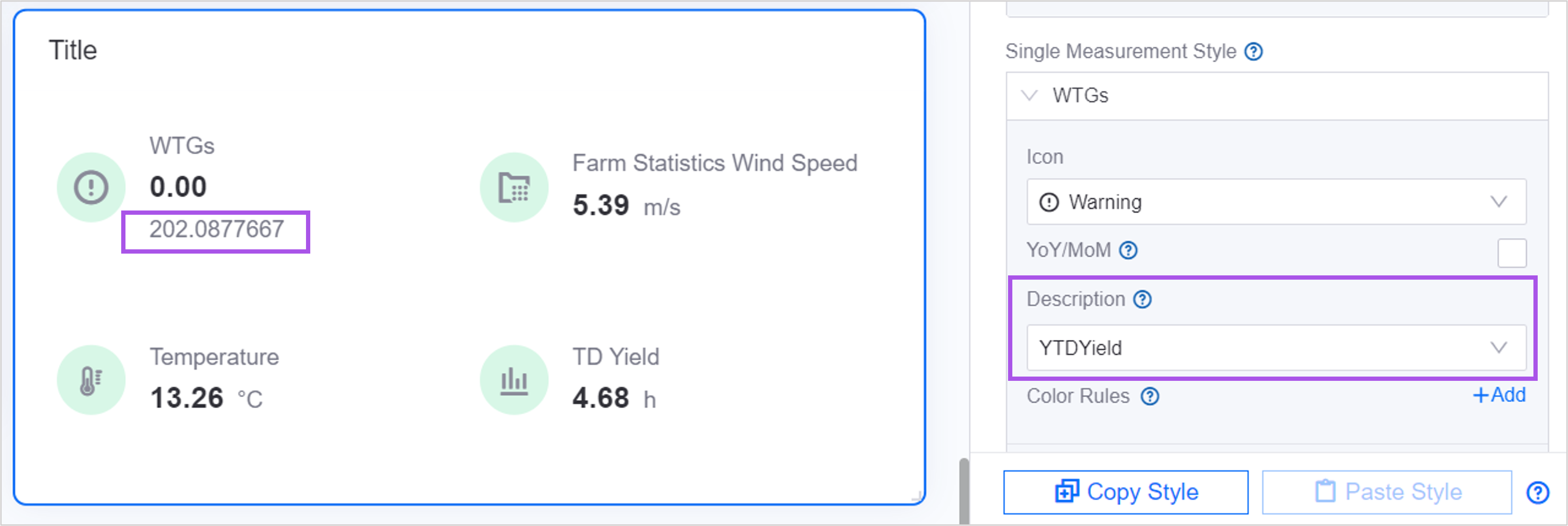
Color Rules
Color rules define the relationship between the value of a metric and its color, so that users notice anomalies or critical values quickly. For example, values from 0 to 10 are shown in black and values from 11 to 20 in red.
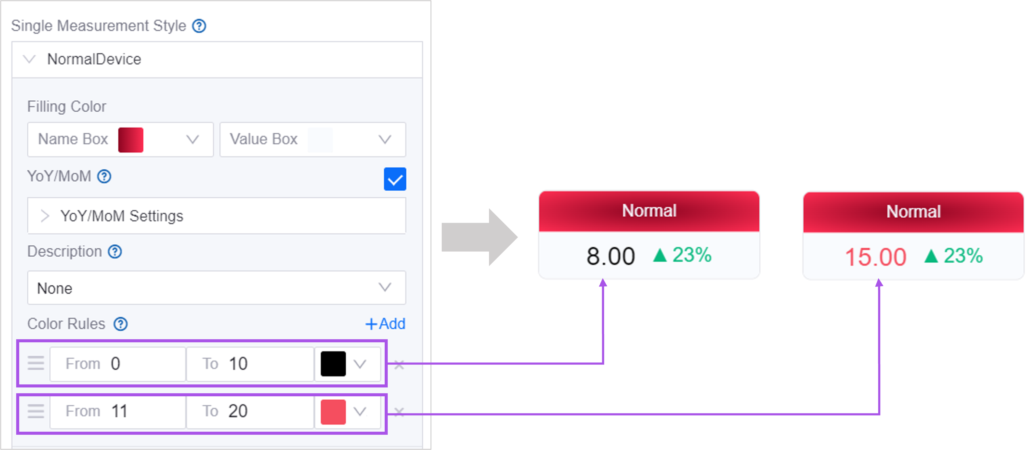
Note:
Values support dynamic parameters. For more information, see Using Dynamic Parameters.
When several color rules conflict, the topmost rule wins. Drag the rules up or down to change their order.
The following charts support color rules:
Donut Gauge
Meter Gauge
Progress Bar
Single-Metric Card and Metric Card
Liquid Fill Gauge
Heat Map
Table
Rich Text
Note
The color rules of the heat map are configured after Coloring Method is set to Segmented, and support matching strings as well as value ranges. See Color Rules of Heat Map.
The status markers of the metric card use a separate set of color rules, which also support matching strings. See Status Marker.
The color configuration of the list and the alarm list (conditional colors) uses text matching rather than the value range rules above. See Conditional Formatting of List.
Show Tooltip
Show Tooltip controls whether a tooltip appears when an end user hovers the mouse over the chart. The content of the tooltip is determined by the individual chart, and generally includes the category name, series name, value, and unit at the hovered position.
Where this item sits depends on the version of the configuration panel:
Old configuration panel: on the Basic > Others tab, labeled Show Tooltip.
New configuration panel: on the Others tab, labeled Show Tooltip. For the list of upgraded charts, see Chart New Configuration Guide.
The following charts provide this item:
Chart |
Location |
Description |
|---|---|---|
Bar chart (including box plot), line chart, scatter chart |
Others tab |
The tooltip groups by category and lists the name, color, and value of each series in that category. |
Pie Chart, Multi-Metric Pie Chart, 3D Pie Chart, Multi-Metric 3D Pie Chart |
Others tab |
See Pie Chart. |
Rose Chart |
Basic > Others tab |
Hovering over a slice shows the category name and the value. |
Heat Map |
Others tab |
Hovering over a color block shows the corresponding row, column, and value. |
Horizontal Bar Chart |
Basic > Others tab |
See Horizontal Bar Chart. |
List, Alarm List, Topology, 3D Chart, Button |
Basic > Others tab |
Present but ineffective: these widgets do not read this setting, and selecting or clearing it does not change the tooltip behavior at runtime. |
Charts not listed above do not provide this item; whether a tooltip is shown is decided by the widget itself and cannot be configured. For example, the tooltips of the waterfall chart and the Pareto chart are always shown, while the gauges, liquid fill, single-metric card, and metric card have no tooltip and only show the full content in a native overlay when text is truncated.
Configuring Filters
Adding Chart Internal Filters
Filters allow users to filter the data of a single chart by specified conditions. A filter sits inside the chart and can be positioned to the right of or below the title.
Follow these steps to add an internal filter:
On the Filter tab of the configuration panel, select Add.
In the Name box, specify the name of the internal filter.
From the Position list, select where to place the internal filter. If you select Hidden, the internal filter is not visible.
From the Type list, select the type of internal filter to use.
Note
When Multi-Select Dropdown is selected, if no filter name is configured the placeholder of the dropdown list is Select; if a filter name is configured, the placeholder is the filter name.
In the Font field, configure the font of the filter text.
Configure Field Options according to the filter type.
In Linked Data Fields, select the data field to filter and the corresponding condition.
Select OK.
Enable Measurement Filter
When the data fields include a Measurement, you can select Enable Measurement Filter.
Enable Comparison Filter
When the data fields include a Comparison, you can select Enable Comparison Filter.
Filter Font
Sets the font, font size, color, bold, and italic style of the filter text.
Enable Clearing All
When selected, the filter provides a one-click action for end users to clear all selected values.
Link Other Widgets
Once widget linkage is configured, when an end user performs the trigger action in the chart, such as clicking a dimension area, the linked widgets fetch data again under the specified conditions and only show the data that matches, which lets users drill down from a main chart into detail widgets.
Scope
The Filter tab of the following widgets provides the Link Other Widgets area:
Table
Pie Chart, Rose Chart
Bar Chart
Line Chart
Scatter Chart
Horizontal Bar Chart, Pareto Chart
Heat Map
Progress Bar
Map, 3D Chart, Button
Widgets not listed do not provide this feature and their Filter tab does not show the Link Other Widgets area, for example the waterfall chart, multi-metric pie chart, 3D pie chart, multi-metric 3D pie chart, timeline, list, alarm list, asset list, single-metric card, metric card, gauges, liquid fill, topology, device status chart, rich text, picture, video, and inline frame.
In addition, this feature is only available on widgets in the canvas, not in widget templates.
Available Trigger Actions
The options of Trigger in This Widget are generated by the widget from the fields configured on the Data tab:
Presets in the bar chart, line chart, and scatter chart groups: include clicking the
<dimension name>area, plus one option per series added, such as clicking the Generation Bar series.Progress Bar: generates one option per Measurement field, for clicking the
<measurement name>area. When a measurement has an Alias, the alias is displayed.All other widgets that support linkage: generate a single option for clicking the area of the first dimension.
As a result, when the widget has no Dimension configured (no Measurement for the progress bar), the list of trigger actions is empty and the + Add button is unavailable. Each trigger action can hold only one linkage, so the + Add button is also unavailable once all trigger actions are configured.
Configuring Linkage
Open the configuration drawer of the chart and select the Filter tab.
In the Link Other Widgets area, select + Add to open the Add Widget Link configuration drawer.
Select Trigger in This Widget, for example clicking the
AssetNamearea.Under Refreshed Widgets, select Select to open the Select Affected Widgets dialog box and select the widgets to refresh:
Widget tab: lists the widgets on the current canvas.
Widgets within Container tab: lists the widgets inside containers and array containers, showing the Belonging Container and Container Tab of each.
Widgets in the hidden area can also be selected; they are flagged with an icon in the list.
Under Refresh Conditions, configure one or more conditions for each selected widget. Select Add Condition to add a condition row:
Field in This Widget: The data field whose value is taken from this widget when the action is triggered. The presets of the bar chart, line chart, and scatter chart, and the progress bar, can use fields from Dimension, Comparison, Measurement, and Extension; all other widgets can only use Dimension fields.
Condition: How the value taken is compared with the data field of the linked widget. Options are
=,!=,>,>=,<,<=,like, andin.Field in The Linked Widget: The data field in the linked widget that receives the value. You can also select one of its data source parameters, in which case Condition is fixed at
=.
Select OK to save. Saved linkages are listed by trigger action in the Link Other Widgets area, where you can drag them to reorder or select the Edit and Delete icons to modify and remove them.
Linkage at Runtime
After the end user performs the trigger action, the value taken participates in the data request of the linked widget as a data source parameter or a query condition, and the linked widget fetches data again rather than filtering the data already returned on the front end.
Areas in the source widget that can trigger linkage show a hand cursor on hover, and a triggered area is highlighted.
A widget with linkage configured shows a Reset Link icon in its upper right corner, which is highlighted once linkage has been triggered. When the end user selects the icon, the linkage value is cleared and the linked widgets show all data again.
When the filter value of the navigator, a global filter, a container, or an array container changes, the linkage values of all widgets are reset automatically.
When a linkage condition, navigator linkage, and an internal filter act on the same data field, the value triggered last wins; when they act on different data fields, all of them take effect.
Note
Only widgets on the current canvas can be linked. When a linked widget is deleted from the canvas, the corresponding linkage configuration is cleared automatically; when a widget is copied, its linkage configuration is not copied.
Configuring Other Items
On the Others tab, configure the interactions, refresh frequency, and other settings of the chart.
Title Interaction (Left)
You can define the interactions available on the chart title, including the tooltip text shown on hover and the target to jump to when the title is clicked. When a user views the page, a “>” icon appears to the right of the title.
For example, with the following configuration:
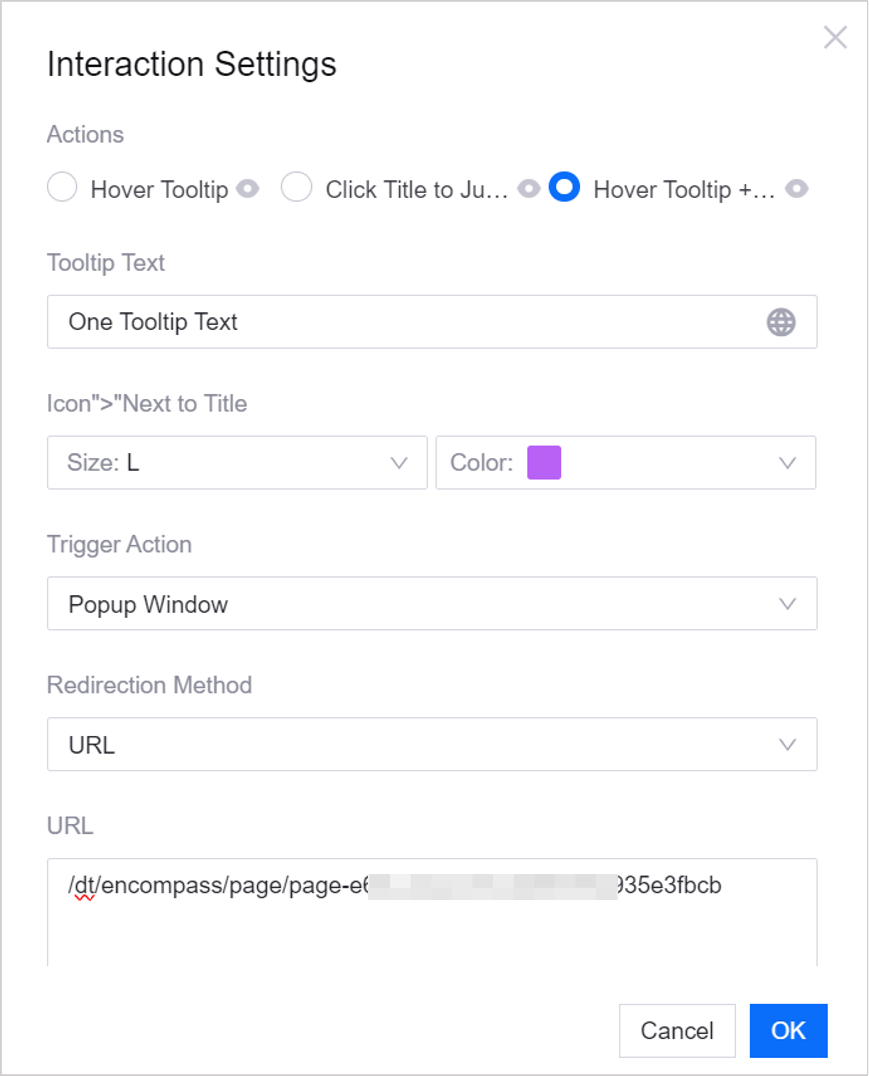
Users can do the following on the page:
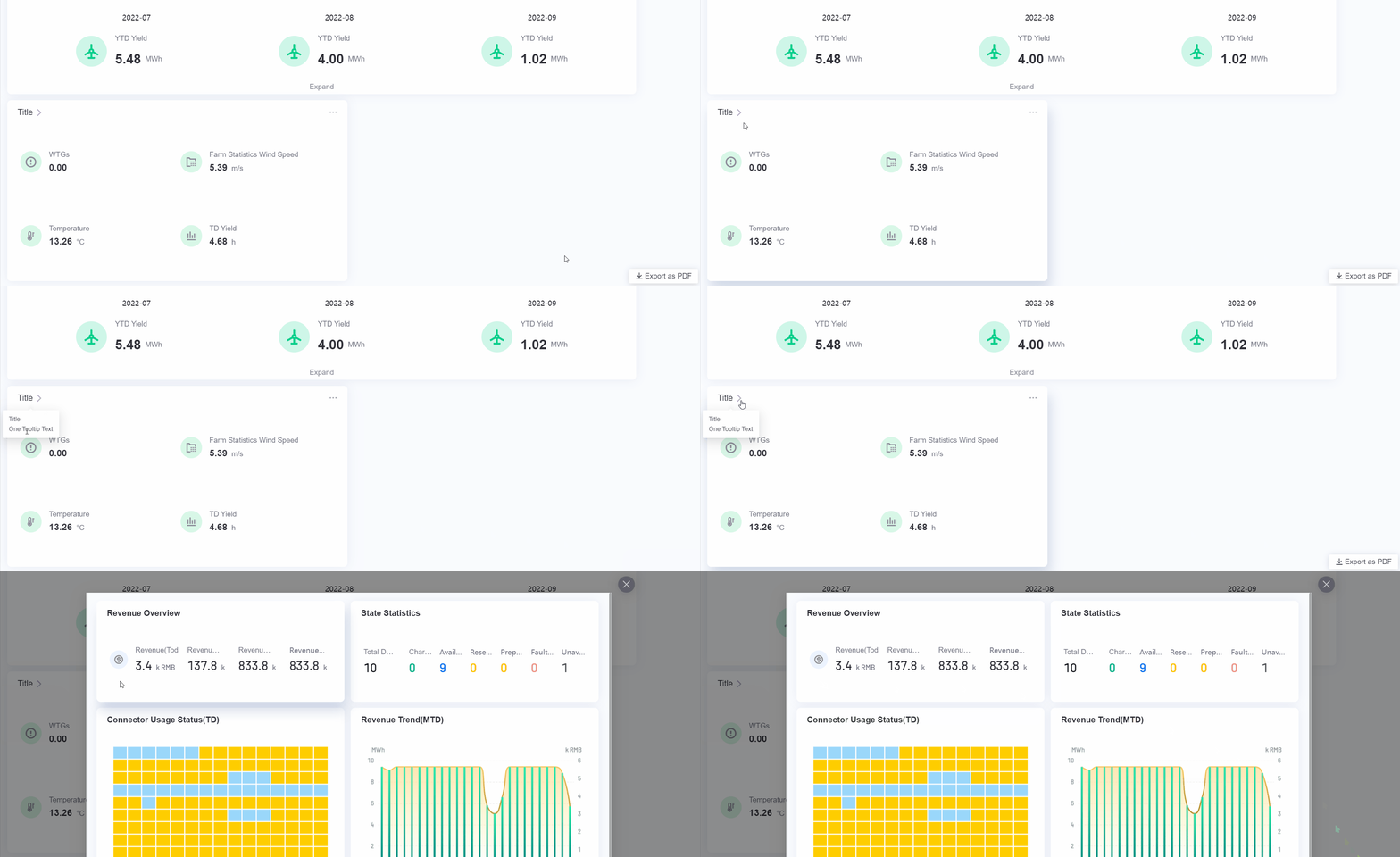
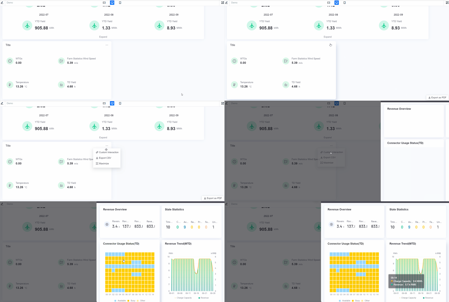
When Trigger Action is set to Popup Window, you can use Canvas Jump to open a target canvas in the popup window. After the end user triggers the interaction, the system shows the target canvas in a popup window, together with the charts and chart data fields on that canvas.
… Interaction (Right)
You can define other interactions for the chart. When a user views the page, a … button appears in the upper right corner of the chart, and hovering over … opens the additional interactions.
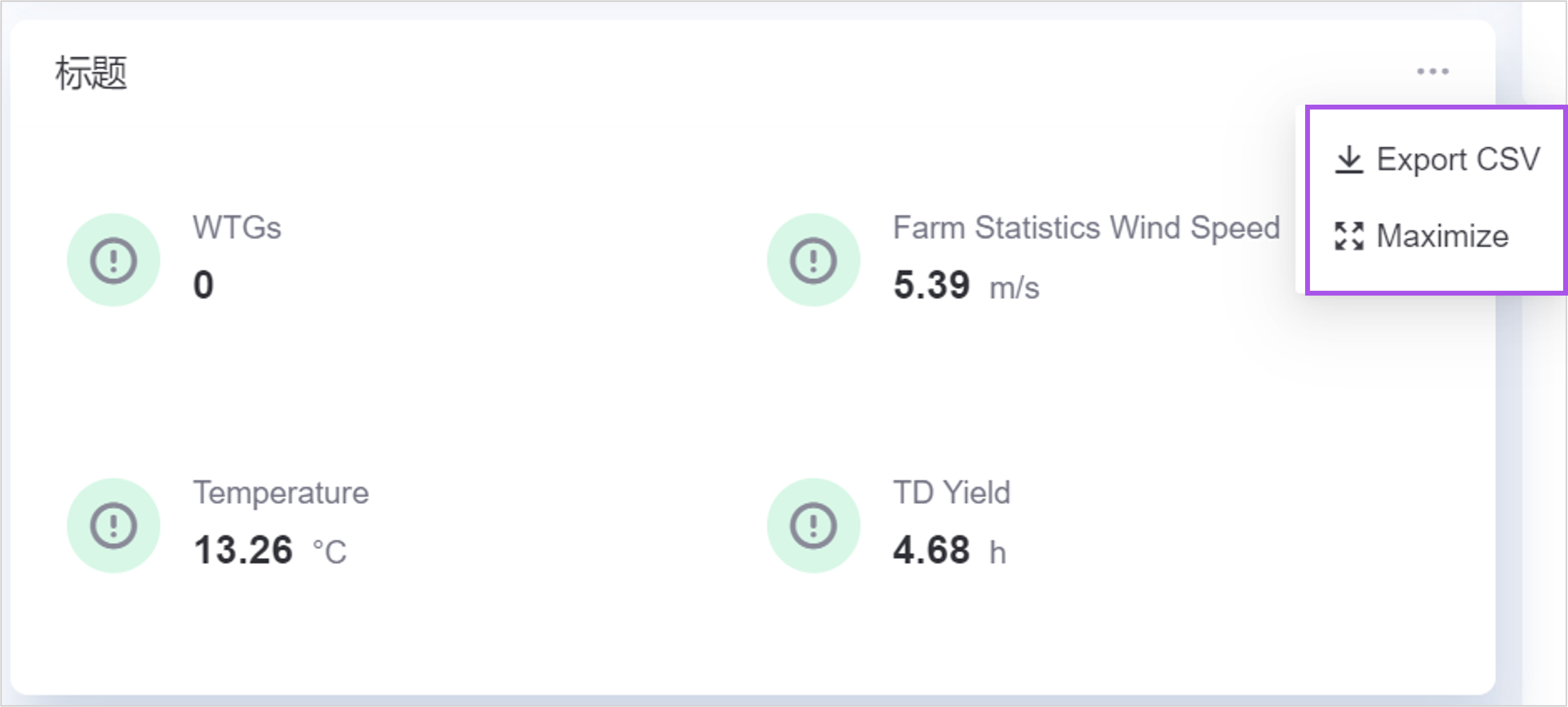
The following interactions are supported:
Maximize Widget: Users can display the widget in full screen.
Export Widget Data: Users can export the data currently displayed in the chart as a CSV file. The data in the CSV file is arranged in the order Dimension, Comparison, Measurement, and Extension. The original name of the data field is used by default; if an Alias is defined, the alias is used in the file. If a Unit is configured for a data field, the unit is exported as well.
Custom actions: Add other interactions.
Maximizing Widgets
To make a chart easier to read, you can enlarge it to fill the page based on the browser size.
Follow these steps to enable chart maximization:
The check box sits in a different place for charts and containers:
For a chart, open the Widget Settings panel and select the Basic tab.
For a container, in Container Settings, select the Others tab.
Select the Maximize Widget check box.
Select Save.
Follow these steps to maximize a chart:
Publish the page and open it through its URL.
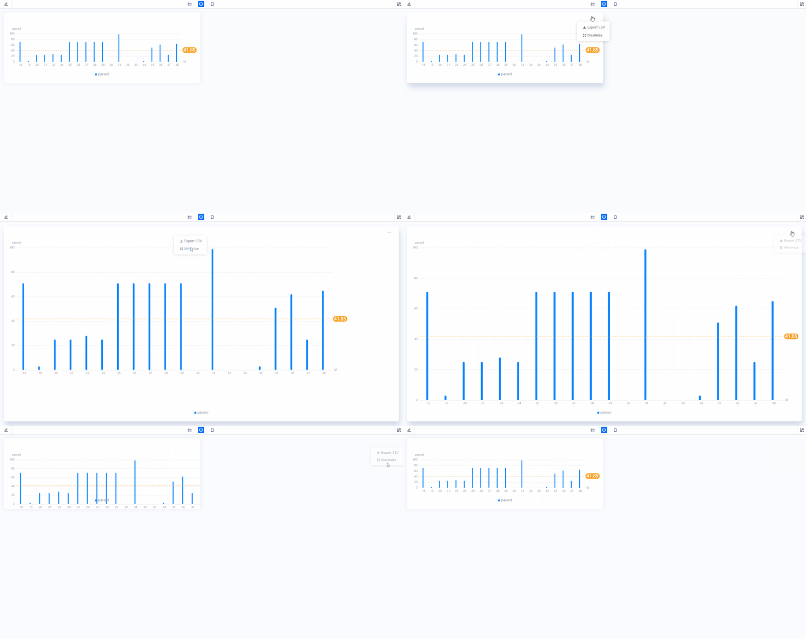
Move the mouse onto the chart, and then select Maximize
 in the upper right corner of the chart.
Note
If both Export Widget Data and Maximize Widget are selected, both appear under the ellipsis (…). Move the mouse onto the button to show them in the dropdown menu.
Filters do not support maximization; maximization applies only to chart widgets and to widgets inside containers.
Exporting Chart Data
Users can export data from a chart for further analysis on their local computer. The data is exported as a CSV file.
Follow these steps to enable chart data export:
In the Widget Settings panel of the selected chart, select Basic > Others.
Select the Export Widget Data check box.
Select Save.
Follow these steps to export chart data:
Publish the page and open it through its URL.
Move the mouse onto the chart and select Export CSV
 in the upper right corner to download the CSV file.
The data in the CSV file is arranged in the order Dimension, Comparison, Measurement, and Extension, and the data fields within each category follow the order shown in the widget settings panel. If a data field has an Alias, the exported CSV file uses that alias; otherwise the original name is used. If a unit is configured for a data field, the unit is exported as well.
Note
The Inline Frame, Picture, and Rich Text widgets do not support data export.
Dynamic Variable Resolution During CSV Export
When an end user exports chart data, the system resolves the dynamic variable placeholders in the chart title, the CSV title, and the data content automatically, based on the current filter values and the actual data of the chart. The exported CSV file uses the resolved values, which makes the business context of the data easy to identify.
Supported variable types:
Navigator parameter: uses the syntax
${parameter_key}; the current filter value is provided by the navigator or a global filter on the page.Widget variable: uses the syntax
@{parameter_key}and references the current value of the widget variable.Widget data: uses the syntax
#{field_ID}and references the actual value of a data field in the widget.
Example:
If the chart title is configured as ${location} Station Daily Report and the end user selects Beijing in a global filter, the title row of the exported CSV file reads Beijing Station Daily Report. Variables in the CSV data rows are also replaced with the current filter value or the actual data value.
For more information about dynamic parameters, see Configuring Parameters for Dashboards.
Interaction Settings
Some charts let you configure interactions on clickable areas such as metrics and comparison labels, for example jumping to a page, opening a popup window, or triggering an HTTP request. Select the Interaction Settings button in the chart configuration panel to open the configuration dialog box.
Once configured, the corresponding action is triggered when the end user clicks the area. If Interaction Display Name is configured, the name is shown as an operation hint when the user hovers over the area.
Interaction Display Name
Optional. Sets the name of the interaction shown to end users, describing what happens on click. If left empty, no name is shown.
Trigger Action
The type of action performed on click:
Option |
Description |
|---|---|
No Action |
Performs no action. Use it to disable a configured interaction temporarily. |
New Tab |
Opens the target address in a new browser tab. |
Current Tab |
Navigates to the target address in the current tab, replacing the current page. |
Popup Window |
Opens the target address in a popup window on the current page. You can configure the position of the window (centered or following the click position). |
Side Drawer |
Expands the target content as a drawer on the right of the page. You can configure the drawer width and title. |
Bottom Drawer |
Expands the target content as a drawer at the bottom of the page. You can configure the drawer height and title. |
HTTP Request |
Sends an HTTP request to the specified interface on click, without navigating. See HTTP Request. |
Trigger Action through SDK Dispatch |
Dispatches a custom event on click, which an external application embedding the DTV page receives and handles. See SDK Event Dispatch. |
Redirection Method
When Trigger Action is New Tab, Current Tab, Popup Window, Side Drawer, or Bottom Drawer, select the type of jump target:
No Link: No jump target is set.
URL: Enter any URL as the jump target. See URL Jump.
Application Portal: Select an application and a menu page inside the application portal as the jump target. Some charts, such as the content area of a list, use this type to jump to an application center page.
Canvas Jump: Select a canvas from the canvas list of the current application as the jump target. This option can only appear when Trigger Action is Popup Window, and it is not offered at every configuration entry point.
Note
When Trigger Action is HTTP Request or Trigger Action through SDK Dispatch, no page navigation is involved and Redirection Method is not shown.
URL Jump
When Trigger Action is New Tab or Current Tab, you can enter any URL.
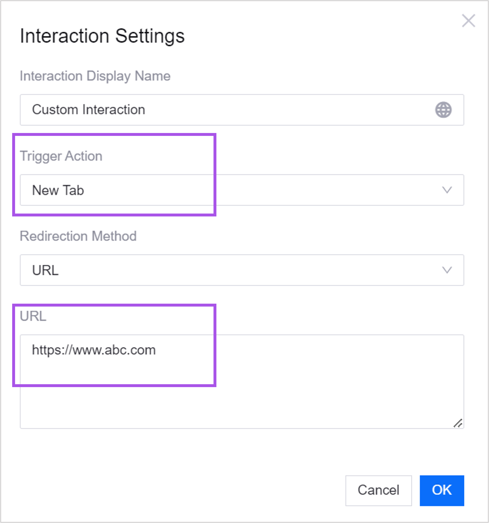
When Trigger Action is Popup Window, Bottom Drawer, or Side Drawer, only relative paths under the same domain are supported.
For example, with the following configuration:
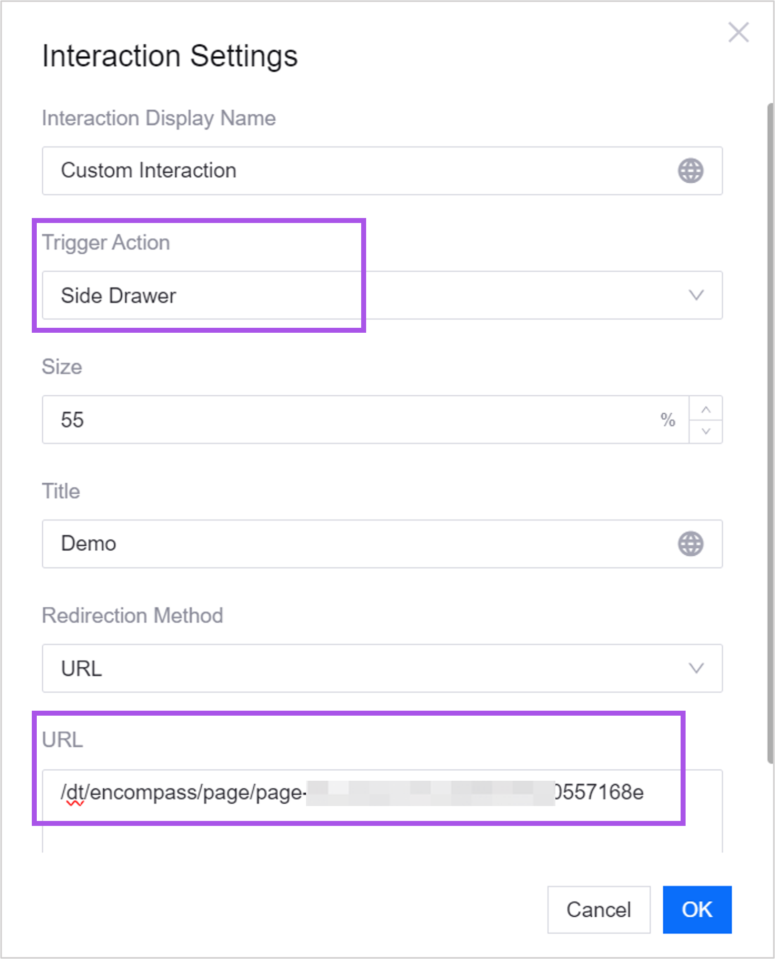
Users can do the following on the page:
HTTP Request
Once an HTTP request is defined, clicking the interaction button triggers the request automatically.
Service address: must be a relative path.
The return format of the interface must be
{code: '', data: {}, message: ''}.Status code: 0 or 200 means success; any other status code is treated as a failure.
Request feedback: whether the page shows “Request succeeded” or “Request failed” after the user triggers the request.
SDK Event Dispatch
After you select Trigger Action through SDK Dispatch, the chart supports receiving events dispatched by the DTV SDK. Where developers have used the APIs or features that the DTV SDK provides, the SDK dispatches an event when a user clicks the title, and other code can listen for and respond to that event.
Merge Request
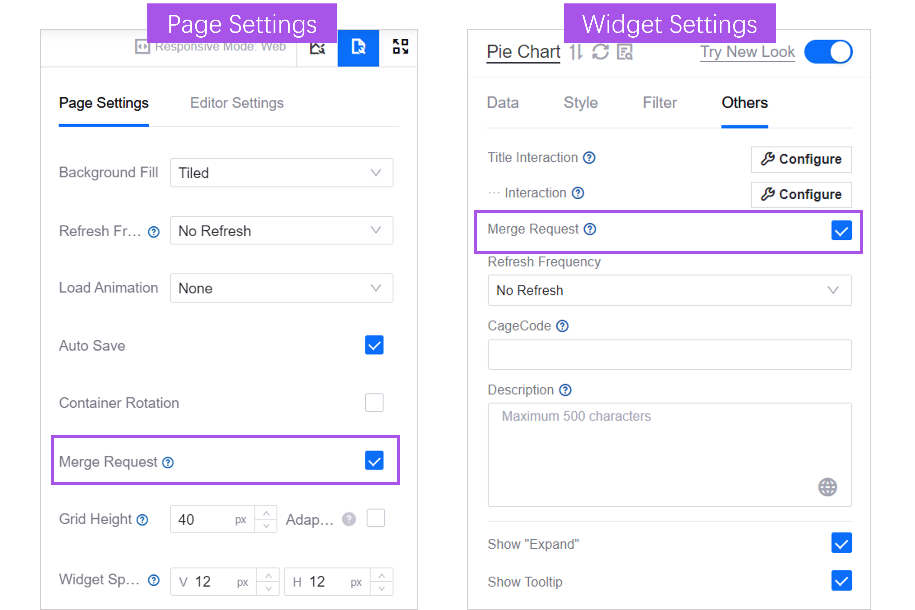
When several charts on a page use the same data source and refresh at the same time, select Merge Request in Widget Settings to merge the request of this chart with those of the others and improve response speed. Enabled by default. Enabling it on the chart only takes effect when Merge Request is also enabled in Page Settings.
Refresh Frequency
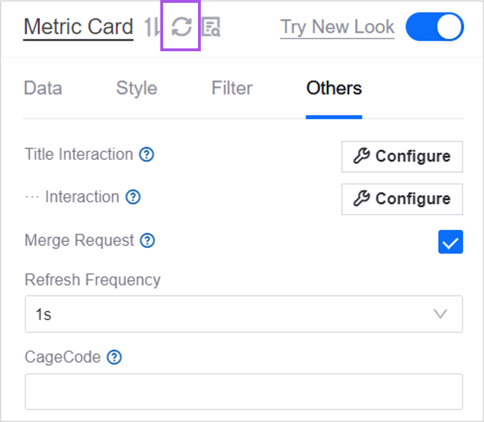
Select how often the chart retrieves data from the data source and refreshes automatically.
You can also select the Refresh Data button to refresh the data manually.
CageCode
The identification code of the chart. When an event is dispatched externally through the DTV SDK, if an identification code is provided, only the object with that code responds.
Link Group ID
Enter the same Link Group ID on several charts to bind the zoom range of their scalar bars together: drag the scalar bar on one chart and the other charts in the group zoom to the same range, which makes it easy to compare the same time period or value range across several charts.
Link Group ID is a free-form text box and is empty by default. An empty value means the chart does not take part in linkage; clearing it removes the chart from the group immediately. The ID is only used for matching, so any value works as long as the charts that need to be linked use exactly the same one.
Note the following when using Link Group ID:
The charts need a scalar bar: linkage synchronizes the zoom range of the scalar bar, so the charts taking part must have Show Scalar Bar selected in the Style > Coordinate Axis section. See Axis Line and Grid Line. When a chart has no scalar bar, entering a link group ID has no effect.
Only the zoom range is synchronized, not the tooltip: hovering the mouse affects the current chart only and does not show a tooltip and cursor on the other charts in the group at the same time. To synchronize the cursor, use widget grouping instead. See Widget Grouping Settings.
Widget grouping takes precedence: when a chart already belongs to a widget group, linkage follows the group and Link Group ID has no effect.
Isolated per card in an array container: when a chart is inside an array container, linkage happens only between charts on the same card and cards do not affect each other. Even if all cards use the same link group ID, they do not interfere.
Note
Only the presets in the bar chart, line chart, and scatter chart groups (including the box plot) and the Timeline respond to Link Group ID. Other widgets may also provide this input box, but entering a value has no effect.
Description
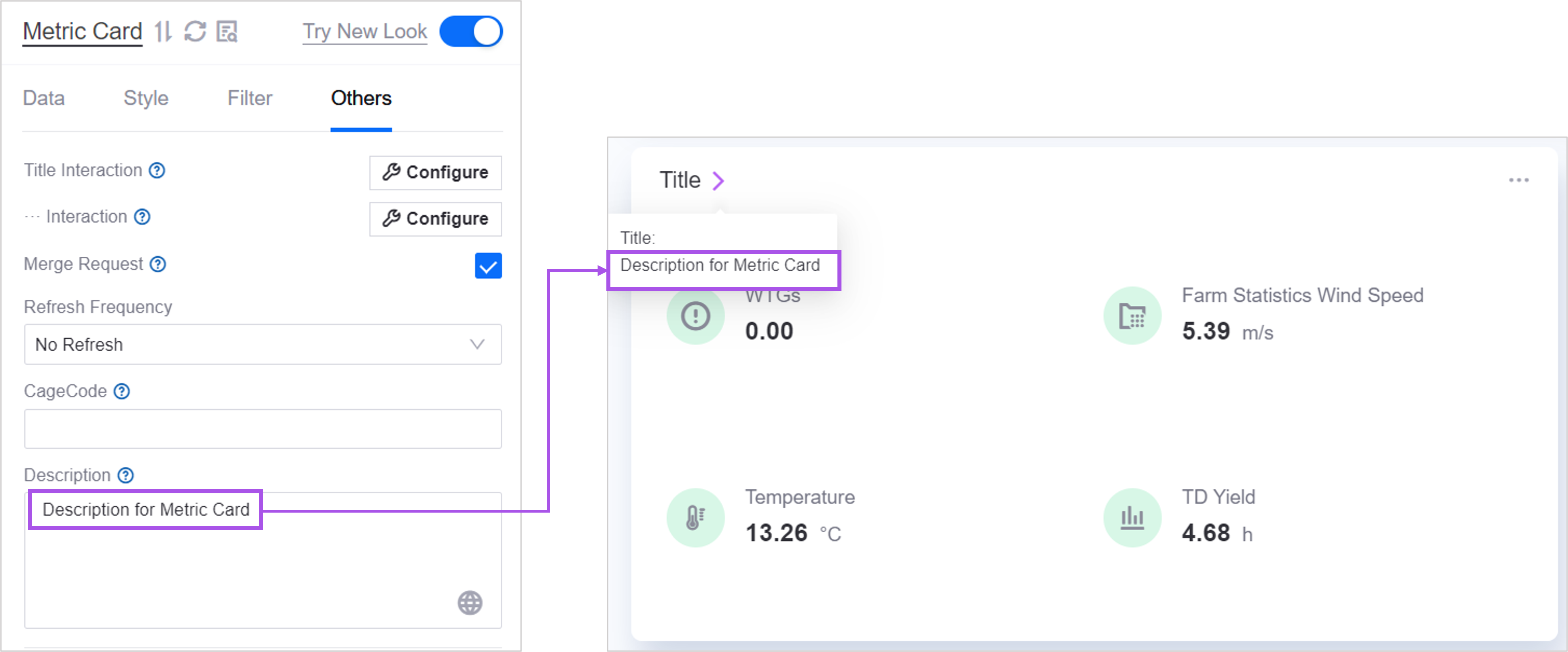
The description is supplementary information about the chart. End users see it when they hover the mouse over the chart title.
Open Trend Analysis
After you Open Trend Analysis for metric data, hovering the mouse over the metric data opens the Trend Analysis dialog box, in which users view the data trend curve of the selected metric.
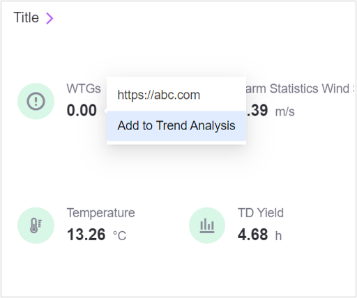
The following charts support trend analysis:
Metric Card
Table
Progress Bar
Note
The topology also offers trend analysis, but as a built-in runtime feature: end users add a measurement point to trend analysis by clicking it in a node, so there is no need to enable it per metric. You only configure Trend Analysis Hyperlink in the style. See Topology.
Asset Aggregation
When Asset Aggregation is selected, the same metric data of several assets is aggregated in the trend analysis dialog box.
Asset Parameter
Asset parameters define which asset data the trend analysis curve shows.
Without asset aggregation, the curve shows the asset IDs returned by the data source the chart uses. Reference multiple asset IDs in the form
#{mdmId}, separated by commas.With asset aggregation enabled, the curve shows the asset IDs defined in the request parameters of the data source the chart uses. Reference multiple asset IDs in the form
@{mdmId}, separated by commas.
Copying and Pasting Chart Styles
Copying and pasting styles lets you reuse the style of a chart in another chart of the same type, as easily as copying and pasting text.
Note
Pasting is only supported into charts of the same type within the current OU, and the target chart must have the copy/paste style feature enabled. If needed, contact your system administrator to enable copy/paste for a chart type.
When you have configured chart A and want to reuse its style in chart B of the same type to save configuration steps:
At the bottom of the configuration panel of chart A, select Copy Style.
Open the configuration panel of chart B and select Paste Style to paste the following from chart A into chart B:
Title font
Background color
Decoration
Widget padding
Icon style
Filter font
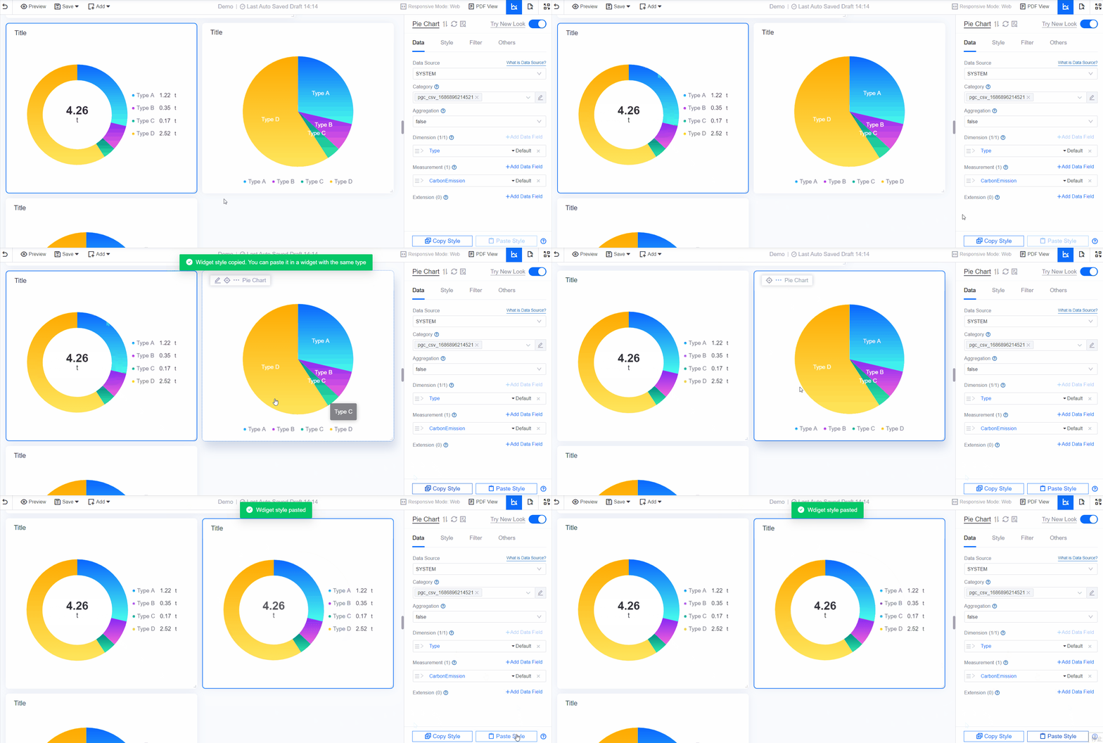
Note
Copied content is only valid in the current session. If you close the page in the browser, the copied content is lost.
Style items tied to data fields are pasted one by one in order. If the source chart has fewer data fields than the target chart, the remaining data fields keep their original style.
Features that use extension fields, such as reference lines, highlight areas, and trend comparison, cannot be pasted yet.
Only the following chart types are supported:
Table
List
Alarm List
Pie Chart
Rose Chart
Bar Chart
Line Chart
Scatter Chart
Box Plot
Horizontal Bar Chart
Waterfall Chart
Heat Map
Donut Gauge
Meter Gauge
Progress Bar
Stacked Progress Bar
Liquid Fill Gauge
Single-Metric Card
Rich Text
Button