Heat Map
Note
This widget already supports the new configuration panel, and this topic describes the new panel by default. You can switch panels at any time in the upper right corner of the chart configuration panel without affecting your configuration.
A heat map maps data values to cell colors, using color depth or segmented colors to show the distribution and density of data, which helps identify patterns, peaks, and abnormal areas quickly.

This topic describes the configuration items specific to the heat map. For the items common to all charts, such as the Filter tab and the Others tab, see Common Configurations for Charts.
Types of Heat Map
When adding a widget, the Heat Map group provides the following presets:
Heat map preset |
Style |
Description |
Recommended scenario |
|---|---|---|---|
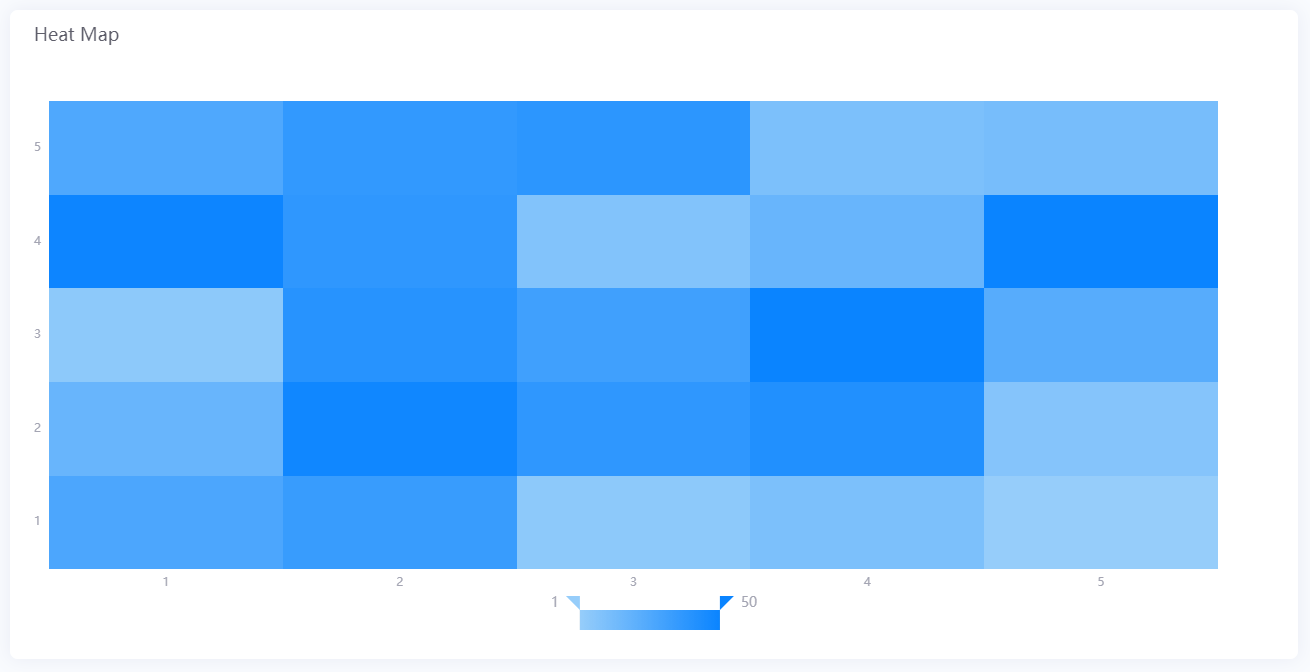
Basic Heat Map |
|
Maps measurement values to cell colors, showing the data distribution on a two-dimensional grid. |
Viewing the temperature distribution of a device across time periods, or the energy intensity of each area. |
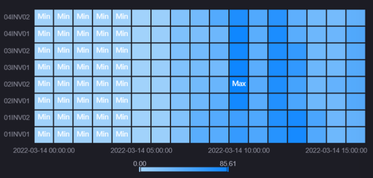
With Mark |
|
Marks the cells holding the extreme values on top of the basic heat map. |
When peaks or troughs need to be located directly, such as finding the period with the highest load. |
The two presets differ only in the default state of items such as Mark Min Value, Mark Max Value, and Border. You can switch between them in the style settings at any time after creating one, or use Quick Style Switching at the top of the Style tab.
Data of Heat Map
In a heat map, Measurement determines the cell color, while Dimension and Comparison define the categories along the two directions.
For general information about data sources and data fields, see Common Configurations for Charts > Configuring Data.
Dimension
Dimension defines the categories on the X-axis (horizontal), and accepts 0 or 1 field. For example, with “hour” as the dimension, the X-axis arranges the cell columns as 0:00, 1:00, 2:00, and so on.
Comparison
Comparison defines the categories on the Y-axis (vertical), and accepts 0 or 1 field. For example, with “device number” as the comparison, the Y-axis arranges the cell rows by device.
Note
A complete two-dimensional grid requires both a dimension and a comparison. With only one of them configured, the other direction has no categories and the cells form a single row or column. With neither configured, the widget shows an empty state.
Measurement
Measurement determines the color of each cell, and exactly 1 field is required. A cell is positioned at the intersection of a dimension value and a comparison value, and its color comes from the measurement value at that position after conversion by the Coloring Method.
Note
The decimal places, dynamic unit, and unit name of the measurement value in the tooltip come from the corresponding items of the Y-axis (Decimal Places, Dynamic Unit, and Name); when no unit name is entered, they fall back to the unit of the measurement data field itself.
Data Arrangement Rules
Axis categories are generated from the deduplicated dimension and comparison values; duplicate records do not produce extra rows or columns.
Data rows whose dimension or comparison value is empty, null, or whitespace only are not drawn.
The sort setting of a data field determines the order of the cells on the corresponding axis. See Common Configurations for Charts > Ordering Value.
Style of Heat Map
The Style tab is organized into sections such as Title, Widget, Cell, Coordinate Axis, and Legend. For common styles such as the title and the widget, see Common Configurations for Charts > Configuring Style.
Cell
Coloring Method
Coloring Method determines how measurement values map to cell colors and is the core item of the heat map. Options are Gradient (default) and Segmented. Once selected, the panel only shows the items of that method.
Gradient: Maps continuous values to a smooth color transition, which suits continuously varying values such as temperature, power, and humidity.
Segmented: Bands values by range or by string, with one fixed color per band, which suits data that needs clear grading, for example device status split into normal, warning, and fault.
Gradient
Shown once Gradient is selected, and specifies the two ends of the gradient.
Auto: Selected by default; the gradient range comes from the colors of the current theme and the actual minimum and maximum of the data. While it is selected, the From and To colors cannot be edited.
From / To: Once Auto is cleared, specify the value and color of each end of the gradient. The minimum value can be 0 and negative numbers are not accepted; when left empty or invalid, the actual minimum and maximum of the data are used. Values in between are interpolated proportionally.
Note
Once From and To are specified manually, cells whose measurement value falls outside that range are not colored and are not shown in the chart.
Color Rules
Shown once Segmented is selected. Select Configure Segment Rule to open the dialog box, choose the Segmented By type first, and then fill in the corresponding rule table. The rule tables of the two types are mutually exclusive, and only the rules of the currently selected type take effect.
Banding by Value Range
When Segmented By is Value Range (default), values are banded by size. Select Add to add a rule row, and fill in From, To, and Color on each row.
The matching range of a rule is left-open and right-closed: when the measurement value is greater than From and less than or equal to To, the cell uses the Color of that row.
Values not covered by any rule use Color for Non-Matching Values. This includes the gaps between rows, as well as everything below the smallest From and above the largest To.
A rule with both From and To empty, or with From greater than To, is invalid and ignored. When every rule is invalid, no cell is colored and the legend is not shown either.
Banding by String
When Segmented By is Matched String, the measurement value is matched exactly as text. Select Add to add a rule row, and fill in the matched string, Display Field, and Color on each row.
When the measurement value equals the matched string of a row, the cell uses the Color of that row. Leading and trailing spaces in the matched string are ignored during comparison.
Display Field is the name shown in the legend and the tooltip when that row is hit. Select the globe icon to configure multiple languages. When left empty, the original measurement value is shown.
When the same string appears on several rows, only the first row takes effect.
Cells that hit no rule are not colored and are not shown in the chart.
Note
Color for Non-Matching Values is also shown under the Matched String type, but it has no effect: cells that hit no rule are never colored. To assign a color to non-matching data, use the Value Range type.
Border
Border is the frame around each cell. Hidden by default; select the eye button  to enable it, and then set its line type, thickness (pt), and color. Enabling it suits large cells or cases where the grid needs to be clearly separated.
Mark Min Value
When selected, a Min text marker is overlaid on the cell with the smallest measurement value, which makes the trough in the data easy to locate.
Mark Max Value
When selected, a Max text marker is overlaid on the cell with the largest measurement value, which makes the peak in the data easy to locate.
Note
When every cell has exactly the same measurement value, the extreme value markers are not shown. When several cells share an extreme value, all of them are marked.
Coordinate Axis
The top of the section provides the Display X-Axis and Display Y-Axis check boxes; clearing one hides the collapsible style panel of that axis. The heat map has only an X-axis and a Y-axis, with no secondary Y-axis.
Both axes of a heat map are category axes and their items are a subset of the common axis configuration. The items actually provided are listed per axis below; select a link for the meaning of each.
X-Axis
The X-axis carries the Dimension, its Label Field Type defaults to Category, and it additionally provides:
With Value selected, Format is shown (
auto,none,k,m,g).With Time selected, Associating Rule is shown, which specifies the display format of the time labels:
With Link with Global Filter cleared (default), the Format Type (Built-in or Custom) and Format dropdown lists appear in place, and all time labels use that format.
With Link with Global Filter selected, the dropdown lists are replaced by a Configure Segment Rule button. Select it to open a dialog box, choose the navigator parameter or global filter to link to, and then add rules one by one, specifying a time format per filter value.
The X-axis does not provide Dynamic Unit, Decimal Places, Interpolation, Window Start Time, or Window End Time. The rule table of Associating Rule provides no Granularity column either.
Y-Axis
The Y-axis carries the Comparison, its Label Field Type defaults to Category, and it additionally provides:
With Value selected, Format and Decimal Places are shown (Auto-Trim Trailing Zeros is not provided).
With Time selected, Format Type and Format are shown.
The Y-axis provides neither Interpolation nor Associating Rule.
Note
The Dynamic Unit, Decimal Places, and Name of the Y-axis also determine how the measurement value in the tooltip is converted. See Measurement. These items therefore affect the tooltip even when the Comparison is a text field.
Legend
The legend of a heat map explains how cell colors map to values. The Legend button group at the top offers No and Yes; when No is selected the items below are hidden.
The form of the legend is determined by the Coloring Method and needs no separate configuration:
With Coloring Method set to Gradient, the legend is a continuous color band labeled with values at both ends, and the sliders can be dragged to filter the data.
With Coloring Method set to Segmented, the legend is a set of separate blocks, one per color rule. Under the value range type each block is labeled with the range of that band; under the matched string type it is labeled with the Display Field entered in the rule. Selecting a legend item hides data.
The following items take effect for both forms:
Legend Position: Sets the position of the legend within the widget. Options are bottom-middle (default), left-middle, top-middle, top-right, and right-middle.
Size: Sets the Width and Height of the legend color blocks in px. When Auto is selected the system calculates them from the widget size.
Legend Font: Sets the font, font size, and color of the legend text.
Sliding Precision: Controls the number of decimal places of the legend values and of the drag filter. Options are 0, 1, and 2, with a default of 0. Shown only when Coloring Method is Gradient.
Note
When Coloring Method is Segmented but there is not a single valid rule in Color Rules, the legend is not shown and looks no different from Gradient. Add at least one rule before the legend becomes a set of separate blocks.
The legend of a heat map provides neither Compact nor Legend Margin.
Other Settings
The Others tab provides the heat-map-specific Show Tooltip, selected by default. When cleared, hovering the mouse over a cell no longer opens a tooltip.
The heat map does not respond to Link Group ID; entering a value has no effect. For the remaining common items, see Common Configurations for Charts > Configuring Other Items.
Interactions at Runtime
The heat map behaves as follows at runtime:
Tooltip: Requires Show Tooltip on the Others tab (selected by default). Hovering the mouse over a cell shows a tooltip that begins with
X:andY:for the two category values of the cell, followed by the cell color and the measurement value with unit. When Coloring Method is Segmented and the type is Matched String, the Display Field configured in the rule is shown instead of the raw value. Cells with no data show no tooltip content.Legend filtering: Requires Yes in Style > Legend. Under Gradient coloring, drag the sliders at either end of the color band to keep only the cells within the selected value range; under Segmented coloring, select a legend block to hide or show that band, and the cells of a hidden band are no longer colored. Both only affect the display of the chart, not the exported data.
Widget linkage: The heat map can act as a linkage source, configured in the Link Other Widgets area of the Filter tab, with the trigger action being a click on the dimension area. After an end user selects a cell, the system triggers linkage with the X-axis category value of that cell, and the selected column is marked with a translucent band. For the configuration method, see Link Other Widgets.