Table
Note
This widget already supports the new configuration panel, and this topic describes the new panel by default. You can switch panels at any time in the upper right corner of the chart configuration panel without affecting your configuration.
A table presents multi-dimension, multi-measurement data clearly in rows and columns, with rich interactions such as sorting, filtering, pagination, a total row, and expandable subtables. It suits scenarios where all data needs to be shown, such as device lists, alarm records, and report data.

This topic describes the configuration items specific to the table. For the items common to all charts, such as the Filter tab and the Others tab, see Common Configurations for Charts.
Types of Table
DTV presets several common table types. When adding a table to a page, choose from the following according to your business scenario:
Table type |
Style |
Description |
Recommended scenario |
|---|---|---|---|
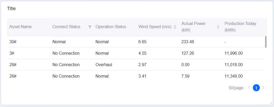
Basic Table |

|
Presents dimension and measurement data in rows and columns, with sorting and filtering. |
Showing all data, such as a device list or alarm records. |
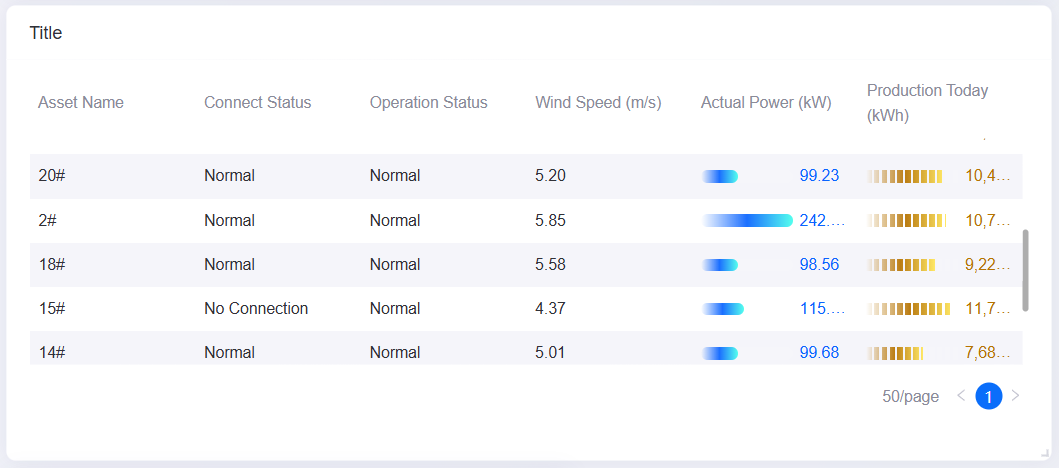
With Progress Bar |
|
Embeds a progress bar in table columns to show at a glance how a value compares with the maximum. |
Showing completion rates and proportions, such as the generation progress of each asset. |
Pure Color Table |
|
Supports background color and font color rules per value range to highlight key data. |
When colors help locate abnormal values or particular states quickly. |
Data of Table
The data of a table centers on measurements: dimensions define the row grouping, a comparison splits the data into multiple columns, and extension fields act as the data source of the subtable.
For general information about data sources and data fields, see Common Configurations for Charts > Configuring Data.
Dimension
Dimensions determine how rows in the table are grouped. For example, with assetId as the dimension, the table shows one row per asset. A table supports up to 2 dimensions, and multiple dimensions produce multi-level row grouping.
When the data source contains descriptive fields such as timestamp, device ID, or location, those fields are typically used as dimensions.
Comparison
A comparison expands the distinct values of a field horizontally into multiple columns. For example, with month as the comparison, the table generates one column per month, which makes it easy to compare measurement values across months.
A table supports 0 to 1 comparison. Once a comparison is added, the measurement columns expand automatically according to the distinct values of the comparison.
Measurement
Measurements are the core numeric data shown in the table. Each measurement corresponds to one column, and there is no limit on the number. In Field Style you can configure the display format of each measurement column separately, such as decimal places, progress bar, and color rules.
Extension
There is no limit on the number of extension fields. They provide additional data per row that users can expand to view, such as an alarm threshold or the value for the same period last month.
Note
Extension fields do not generate columns in the main table. Table columns come only from Dimension, Measurement, and Comparison; the only use of an extension field is as the data source of the subtable. Adding extension fields without enabling the subtable therefore changes nothing in the table.
The value of an extension field used as the subtable data source must be an array or a JSON string that can be parsed into an array; otherwise the expanded subtable is empty.
The dimension and measurement fields of a table can be used as an icon data source. See Enhancement > Icon - Data Source.
When the subtable is enabled, extension fields appear in the list of data fields available to the subtable. See Enable Subtable.
Style of Table
The table supports the new configuration panel. The Style tab organizes the configuration items in the order Title, Widget, Layout, Series, and Table, and each dimension or measurement field in Series is configured separately. For common styles such as the title and the widget size, see Common Configurations for Charts > Configuring Style.
Layout
Layout configures the overall presentation of the table: pagination, transposition, row height, and column width.
Enable Pagination
When enabled, the table shows data page by page and end users move between pages with the paginator. When disabled, the table shows all data at once and users browse with the scroll bar.
Carousel Effect
Sets how the table turns pages automatically:
None: Does not turn pages automatically.
Paginator: Cycles through pages automatically, which suits large-screen carousel scenarios.
Rotation Interval
Shown only when Carousel Effect is Paginator. Sets the interval between automatic page turns, in seconds. Only non-negative integers are accepted.
Rows per Single Page
Sets the number of data rows shown per page. Used together with Enable Pagination to control how much data is visible on one page.
Row Height
Sets the row height multiplier of data rows. The default is 1.5 and the value cannot exceed 5. Increasing the row height leaves more room for long text or progress bars.
Fixed Dimension Columns
When enabled, the dimension columns stay fixed on the left while the table scrolls horizontally, so row identifiers stay visible next to the measurement values.
Column Width
Controls how column widths are allocated:
Auto: Allocates column widths based on the content.
With Auto cleared, Configure Column Width appears and you can set a pixel width per column. If the total width is less than the widget width, the table is stretched proportionally; if the total exceeds the widget width, a horizontal scroll bar appears at the bottom of the table.
Series
The Series area first configures how the table displays values in general, and then configures the style of each Dimension and Measurement field. The title of each field card indicates the data type of the field.
Show Thousands Separator
When enabled, values are shown with a thousands separator. For example, 1234567 is displayed as 1,234,567.
Field Style
In the upper right corner of a field card, select the display mode of the field: Normal, URL, or Hidden. Each mode shows a different set of configuration items.
Normal: Default mode, used for ordinary text or values. In this mode you can configure trend analysis, decimal places, enhancement, color rules, and so on.
URL: Displays the field as a clickable link. In this mode you can configure Display Text and Interaction Settings; the field value can be the link target or the source of the display name.
Hidden: Hides the field from the table. A hidden field can still serve as the icon source, display text, or link target of another visible field.
Open Trend Analysis
Available only when the field mode is Normal or URL. When enabled, end users can open trend analysis on the data of that field.
Only common data service data sources are supported. Enabling it shows the following items:
Asset Aggregation: Aggregates the same metric data across several assets.
Asset Parameter: Enter the asset IDs used for trend analysis, separated by commas (
,). Page parameters${parameter_key}, widget parameters@{parameter_key}, and data parameters#{field_ID}are supported.
For more information, see Common Configurations for Charts > Open Trend Analysis.
Decimal Places
Available only when the field mode is Normal. Sets the number of decimal places of the field value. Options are - (keeps the original precision), 0, 1, 2, and 3.
Show Totals
Shown for Measurement fields only. Controls whether the field takes part in the total row calculation. Enabled by default.
Display Text
Shown only when the field mode is URL. Sets the source of the link text:
With Enter Text disabled: select a field from Data Fields, and its value on each row is used as the link text.
With Enter Text enabled: enter fixed link text, and all rows show the same name.
Interaction Settings
Shown only when the field mode is URL. Select Interaction Settings to configure the action the link triggers and the jump target. For the general configuration method, see Interaction Settings.
Enhancement
Shown only when the field mode is Normal. Adds an icon or a progress bar to the cell. The options are:
None: Adds nothing.
Icon - Data Source: Select a Source from the Dimension or Measurement fields of the current table and use its value to determine the icon shown. You can also place the icon to the left or right of the value.
Icon - Rule: Shows an icon based on the value of the current field or on a string match. You can also place the icon to the left or right of the value.
Progress Bar: Shows a progress bar using the maximum value of the current field as the baseline.
Progress Bar - No Data: Same as the progress bar, but no bar is shown when the field value is empty.
Icon Rule
Shown only when Enhancement is Icon - Rule. Select the button to configure the segment rules, and then configure:
Segmented By: Select Value Range or Matched String.
Default icon and color: The icon and color shown when none of the rules below match.
Rule list: A value range rule takes From, To, an icon, and a color; a string rule takes the string to match, an icon, and a color. Rules are matched from top to bottom.
Progress Bar Style
Shown only when Enhancement is Progress Bar or Progress Bar - No Data. Select Bar or Stripe.
Content Color Rule
Available when the field mode is Normal or URL. Sets the text color of the cell by value range; each rule contains From, To, and a color. Solid and gradient colors are supported, and rules take effect from top to bottom.
Background Color Rule
Available when the field mode is Normal or URL. Configured in the same way as Content Color Rule, but the rules apply to the cell background.
Value Color Follow Progress Bar
Shown only when Enhancement is Progress Bar. Enabled by default. When enabled, the value text takes the color of the progress bar.
Value Color
Shown only when Enhancement is Progress Bar and Value Color Follow Progress Bar is disabled. The color picker labeled Value sets the color of the field value on its own.
Table
The table area configures the overall table style in the order Show Total Row, Enable Subtable, Header, Content, and Total.
Show Total Row
When enabled, the Total configuration appears, which totals the data of selected columns at the top or bottom of the table.
Enable Subtable
Available when at least 1 field has been added to Extension and no Comparison field has been added. When enabled, an expand control appears on the left of every row and end users can expand it to view the subtable.
Data Field
Shown only once the subtable is enabled. Select one of the Extension fields as the data source of the subtable.
Background Color
Shown only once the subtable is enabled. Sets the background color of the expanded subtable area.
Header
The header contains the following configuration items:
Column to Sort
Select the fields that end users can sort by clicking the header. Multiple selection is supported; selecting All makes every dimension and measurement field sortable.
Column to Filter
Select the fields that end users can filter with the header filter. Multiple selection is supported; selecting All makes every dimension and measurement field filterable.
Alignment
Sets the horizontal alignment of the header text: left, center, or right.
Font
Sets the font, font size, color, bold, italic, and underline style of the header text.
Background Color
Sets the background color of the header row.
Content
The content area configures the style of ordinary data rows.
Alignment
Sets the horizontal alignment of the data cell text: left, center, or right.
Font
Sets the font, font size, color, bold, italic, and underline style of the data cell text.
Background Color
Sets the background color of Odd Rows and Even Rows separately, producing a zebra-stripe effect.
Line Color
Sets the color of the H and V lines separately: horizontal lines separate rows and vertical lines separate columns.
Total
Shown only once Show Total Row is enabled. The total row contains the following configuration items:
Name
Sets the label shown at the far left of the total row, for example “Total” or “Average”. Supports multiple languages.
Aggregation
Sets the default aggregation method: Sum, Average, Max, or Min.
Column to Summary
Select the dimension or measurement fields that take part in the total calculation. Multiple selection is supported; selecting All includes every field. Whether a measurement field can take part is also controlled by its Series > Show Totals setting.
Special Total Row
Sets a different aggregation method for specific data fields. Select Add, choose one or more data fields, and then select Sum, Average, Max, or Min. A special rule takes precedence over the default aggregation method.
Position
Sets whether the total row appears at the Bottom or the Top.
Alignment
Sets the horizontal alignment of the total row text: left, center, or right.
Font
Sets the font, font size, color, bold, italic, and underline style of the total row text.
Background Color
Sets the background color of the total row so that it stands out from ordinary data rows.
Interactions at Runtime
The table behaves as follows at runtime:
Sorting: Requires fields selected in Column to Sort. Clicking the header toggles between ascending and descending order; only one column is active at a time, and the total row never takes part in sorting. When Enable Pagination is on and the data source supports server-side pagination, sorting happens on the server, which also requires that the field itself is sortable.
Header filtering: Requires fields selected in Column to Filter. Select the filter icon in the header and choose which values to keep from the values in the current data. The filter provides no search box, and the feature is not available when the table is transposed or when server-side pagination is used.
Pagination: Once Enable Pagination is on, a paginator appears at the bottom of the table. The paginator has no page size selector; the number of rows per page is set by Rows per Single Page.
Automatic page turning: When Carousel Effect is Paginator and Rotation Interval is greater than 0, the table cycles through pages automatically and returns to page 1 after the last page. Hovering the mouse does not pause it.
Expanding the subtable: Once Enable Subtable is on, an expand control appears on the left of every row. The subtable shows 5 rows at a time; Show More adds 5 more rows each time and Collapse returns to 5 rows.
Cell jump and trend analysis: When the field mode is URL, the cell is displayed as a link, which only jumps on the published page; whether it opens in the current tab is determined by the Interaction Settings of that field. Once Open Trend Analysis is on, Add to Trend Analysis appears when hovering over a cell. When both are enabled, hovering shows a two-item menu with the jump and Add to Trend Analysis.
Row click linkage: Once linkage is configured on the Filter tab, clicking any row triggers it, the selected row is highlighted, and the column used as the linkage field carries a link icon in the header. The feature is unavailable when the table is transposed. For the configuration method, see Link Other Widgets.
Full text: Cell content that exceeds the column width is truncated, and hovering the mouse shows the full text.
Note
End users cannot drag to resize columns; column widths can only be set in Column Width. The table itself provides no export button either; the export entry is in the … menu in the upper right corner of the widget. See Common Configurations for Charts > Exporting Chart Data.