Scatter Chart
Note
This widget already supports the new configuration panel, and this topic describes the new panel by default. You can switch panels at any time in the upper right corner of the chart configuration panel without affecting your configuration.
A scatter chart uses discrete data points to show the distribution and dispersion of a measurement across categories, which suits observing clustering patterns and outliers. Building on that, the scatter chart also supports a bubble mode: an extension field controls the displayed size of each data point, so one more dimension of information fits in the same chart.

This topic describes the configuration items specific to the scatter chart. For the items common to all charts, such as the Filter tab and the Others tab, see Common Configurations for Charts.
Types of Scatter Chart
When adding a scatter chart, you can choose from the following presets:
Scatter chart preset |
Style |
Description |
Recommended scenario |
|---|---|---|---|
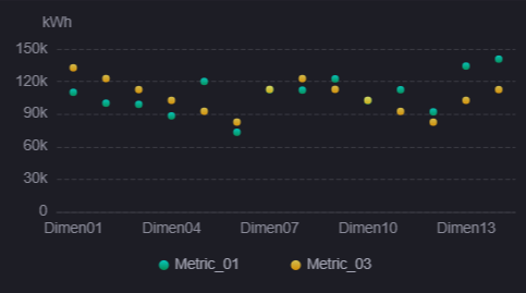
Basic Scatter |
|
Shows the distribution of a measurement with evenly sized data points, and can stack several series. |
Observing the distribution pattern and outliers of a measurement across categories, such as the operating temperature scatter of each unit. |
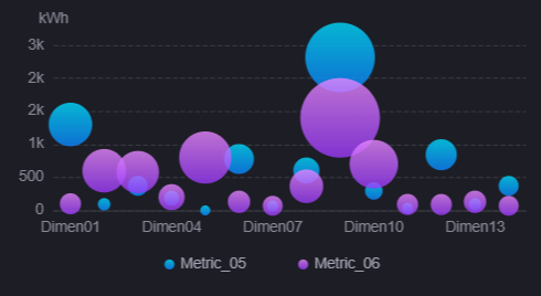
Bubble Chart |
|
Builds on the scatter chart, using the size of the data points to express the magnitude of another field. |
When a magnitude dimension needs to be added to a distribution chart, such as using bubble size for installed capacity. |
Note
The scatter chart shares one widget and one configuration panel with the Bar Chart and the Line Chart; they differ only in the default series type of their presets. The scatter chart can therefore also mix bar, line, area, and other series types.
Data of Scatter Chart
The scatter chart centers on measurements, uses dimensions to define the category axis, and can use a comparison field to produce several groups of points. For data sources, data fields, aggregation, and sorting, see Common Configurations for Charts > Configuring Data.
Dimension
Dimension defines the labels on the category axis. Each dimension value corresponds to one position on the axis, and the measurement values at that position are scattered along the other axis. Categorical fields such as timestamps and asset identifiers are typically used.
A scatter chart accepts up to 2 dimension fields, but the chart only uses the first dimension as the category axis; the second has no effect on the display. In the vertical layout the categories appear on the X-axis; in the horizontal layout they appear on the Y-axis.
Comparison
Comparison is optional and accepts up to 1 field. It splits one measurement into several groups of points by the values of that field, each in a different color. For example, once assetId is used as the comparison, the data points of each device are shown in their own color, which makes distribution differences easy to compare within one coordinate space.
A comparison field only takes effect once Comparison is selected in the series. See Common Configurations for Charts > Series.
Measurement
Measurement determines the position of the data points on the value axis. At least 1 measurement is required, with no upper limit. Each series binds one measurement, and a single chart can mix scatter, bubble, and other series types.
Note
The roles of the two axes in a scatter chart are fixed: the category axis is always carried by the Dimension field and the value axis is always carried by the Measurement bound to the series. A measurement cannot be assigned to the category axis, so the scatter chart cannot plot measurement-against-measurement correlation directly.
Extension
Extension fields are not drawn on the scatter chart directly. There is no limit on the number, and they have two uses:
Bubble size: When the series type is Bubble, select an extension field in Data Field, and the chart scales the bubble size by the value of that field. When none is selected, all bubbles are shown at the same size.
Data source of a highlight area: The Data Field of a highlight area lists only the extension fields you have added, and the chart determines the range to highlight from the value of that field.
Note
The tooltip of the scatter chart does not show extension fields. Adding extension fields without referencing them in a Bubble series or a Highlight Area changes nothing in the chart.
Style of Scatter Chart
The style items are organized into six sections: Title, Widget, Series, Coordinate Axis, Legend, and Mark. Most of the content belongs to the common configuration items of charts. See Common Configurations for Charts > Configuring Style.
Series
In addition to the common items, the Scatter Chart and Bubble series types each have the following type-specific items.
Scatter Size
Specific to the Scatter Chart type and shown only once that type is selected. Sets the displayed size of the data points in px, with a default of 8. All data points of this type use the same size.
Data Field and Size
Specific to the Bubble type; both items are shown only once that type is selected.
Data Field: Select one of the extension fields you added, and the chart scales the bubble size by the value of that field. Empty by default, in which case all bubbles are fixed at 8 px and the Size setting below has no effect.
Size: Sets the mapping range of the bubble size, with a Min (1 px by default) and a Max (20 px by default). The bubble with the smallest field value takes the minimum size, the largest takes the maximum size, and values in between are interpolated proportionally.
Note
If a Bar series is mixed into a scatter chart, the Series section additionally shows Bar Spacing and Stacked Bar Chart; Maximum Bar Width has no such condition and is shown even without a bar series. For descriptions of all three, see Common Configurations for Charts > Series.
Interactions at Runtime
The scatter chart shares one widget with the bar chart, the line chart, and the box plot, and its runtime interactions are identical: the tooltip highlights by category and lists the value of each series, selecting a legend item hides a series, selecting Show Scalar Bar lets users drag the scalar bar to zoom, selecting Enable Selection Zooming lets users drag a rectangle to zoom in, configuring widget linkage lets users select a data point to trigger linkage, and charts that share a Link Group ID zoom together.
For the trigger conditions and details of each, see Bar Chart > Interactions at Runtime.