Metric Card
Note
The configuration panels of the Single-Metric card and the Multi-Metric card differ considerably: the multi-metric card uses the new configuration panel and supports shared styles, YoY/MoM, status markers, and more, while the single-metric card uses the old panel and supports none of these. This topic follows the item order of the multi-metric card, and notes the differences per section where they exist.
A metric card presents the data of one or several metrics clearly, such as store revenue for the day, month, year, and cumulatively. “Revenue today”, “Revenue this month”, “Revenue this year”, and “Cumulative revenue” are the metrics here.

It can also present several metrics under one dimension, such as the turbine status of a wind farm. “A given wind farm” is the dimension here, and “Normal”, “Under repair”, and “Failed” are the metrics.

This topic describes the configuration items specific to the metric card. For the items common to all charts, such as the Filter tab and the Others tab, see Common Configurations for Charts.
Types of Metric Card
The basic types of metric card are the Single-Metric card and the Multi-Metric card. Building on them, DTV presets several common types. When adding a metric card to a page, choose from the following according to your business scenario:
Metric card type |
Style |
Description |
Recommended scenario |
|---|---|---|---|
Single-Metric |
|
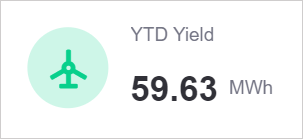
Shows a single value of one metric, with support for a comparison field to break the data down and for extension fields to provide additional information. |
Highlighting one metric that needs frequent attention, or fitting a space-constrained page such as mobile, where simplicity matters. |
Multi-Metric |
|
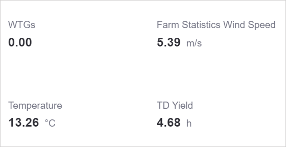
Shows the data of several metrics, optionally by a dimension, and supports extension fields on a metric to show YoY/MoM and other supplementary information. |
Showing several metrics under one dimension, such as total output power, wind speed, and temperature within a wind farm, as an overview of site status. |
With Icon |
|
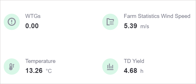
Adds an icon per metric on top of the basic multi-metric card, with an icon color that can follow the value. |
Flagging abnormal data promptly through icons and color changes. |
Card Style |

|
Adds card colors on top of the basic multi-metric card, using color to express the relationship between metrics. |
Distinguishing several related metrics by color, such as the distribution of turbine states within a wind farm, as a reference for maintenance and fault handling. |
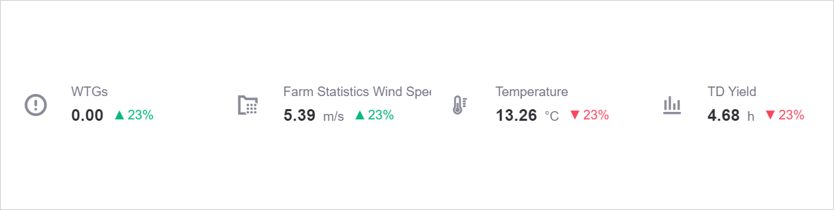
With Trend Comparison |
|
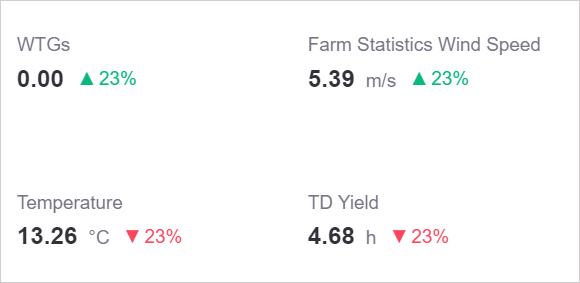
Supports several extension fields on top of the basic multi-metric card, so each metric can be compared against a different extension field to derive a trend. |
Showing several metrics under one dimension along with their YoY/MoM, reflecting the trend of multiple metrics in real time. |
With Icon & Comparison |
|
Adds a default icon and several extension fields on top of the trend comparison card. |
Flagging abnormal metrics promptly through color changes. |
Card Style With Comparison |

|
Adds card colors and several extension fields on top of the trend comparison card. |
Distinguishing several related metrics and their trend comparison data by color. |
Data of Metric Card
The data of a metric card centers on measurements, with comparison and dimension limiting and breaking down the measurement data, and extension enriching the display of trends.
For more information about data sources and data fields, see Common Configurations for Charts.
Best Practices for Single-Metric Cards
The single-metric card shows the value of one metric, which suits key metrics that have a significant business impact and are easy to understand. For example, when building a resource monitoring panel, use a single-metric card to show the group total of the “Annual output” metric, or break the data down by asset.
Measurement of the Single-Metric Card
Measurement is the core data of the single-metric card. After you select the core metric “Annual output (YTDYield)”, the center of the card shows the latest entry of that metric by default.

To show the total annual output of all assets, use Aggregation to display the value after Sum. For more information, see Display Aggregated Data.

Comparison of the Single-Metric Card
To group the data of the metric by a dimension and focus on the differences between the values under that dimension, add a data field to Comparison.
For example, adding the comparison assetId to the metric YTDYield shows the annual output per asset. The single-metric card then shows several values of YTDYield broken down by asset.

When several YTDYield values belong to the same assetId, use Aggregation to aggregate the measurement data of the same comparison, so that the card shows 1 value per assetId. For more information, see Display Aggregated Data.
Extension of the Single-Metric Card
The single-metric card accepts any number of Extension fields. An extension field has only one use here: as the source of Total Proportion Value. Once you select an extension field in Total Proportion Value under Description and Total Proportion Value, the metric shows the proportion in the form current value / total; without extension fields, the only option in that dropdown list is None.
The single-metric card provides neither Description nor YoY/MoM Settings; use the multi-metric card if you need them.
Best Practices for Multi-Metric Cards
Once you have created several metrics for your business, use a multi-metric card to lay their data out side by side. For example, show 4 metrics of one site at the same time, such as the number of turbines, real-time wind speed, temperature, and daily generation hours, together with the YoY/MoM value of each.
Measurement of the Multi-Metric Card
When configuring the data of a metric card, the first step is to decide the Measurement, which determines the core data the widget shows. The multi-metric card accepts several data fields and shows the latest entry of each by default.

Dimension of the Multi-Metric Card
To aggregate and view the data of each metric by a dimension, add a data field to Dimension.
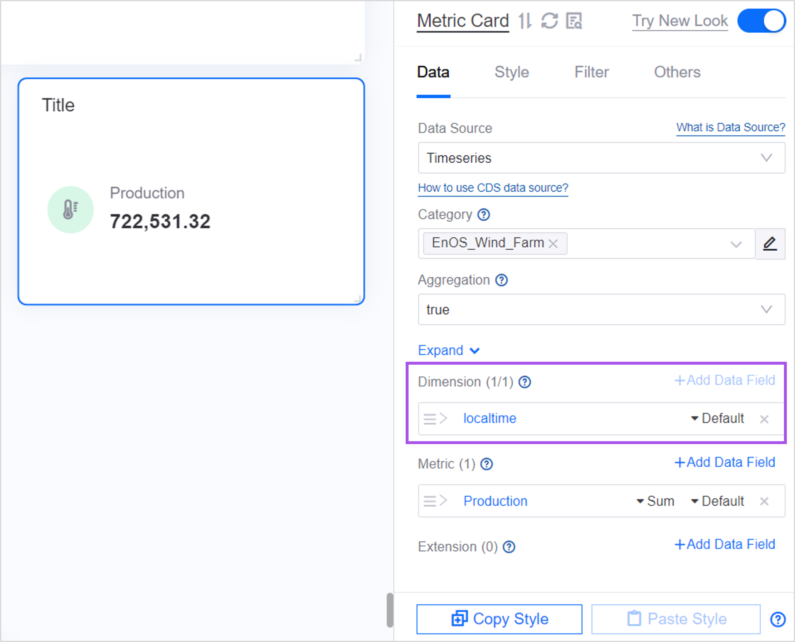
For example, in a multi-metric card that uses a Timeseries data source, follow these steps to add the dimension localtime to the metric “Generation” and aggregate the generation data by local time.
Add the data field
localtimeto Dimension. In the data list, the first column is now the selected dimension and the remaining columns are the selected metrics.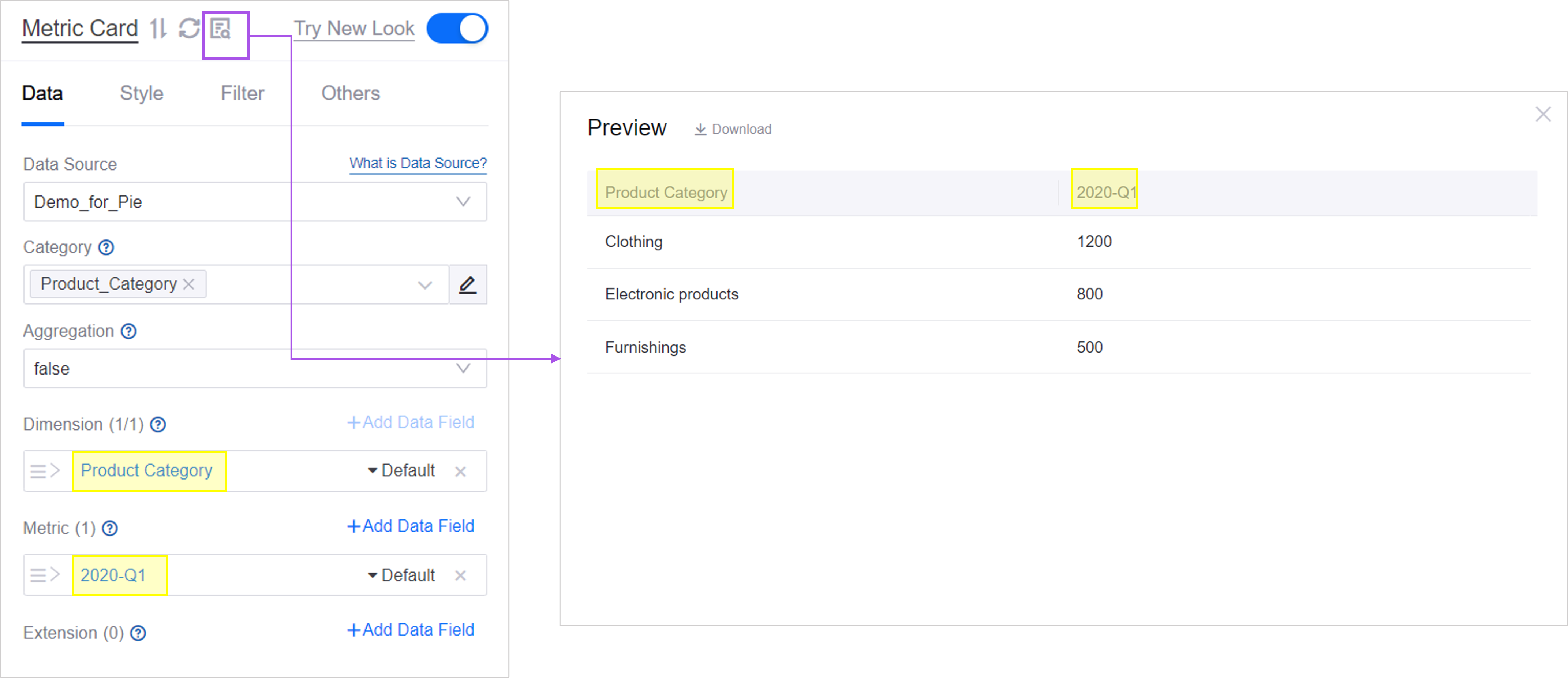
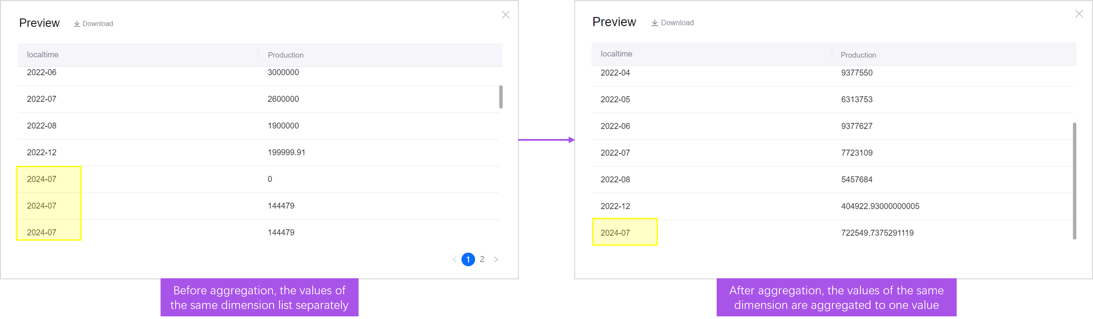
Select Yes for Aggregation, then select Expand and configure the time, asset scope, and other parameters as needed. The parameters depend on the data source you selected. The data is now the asset data aggregated by the dimension
localtime.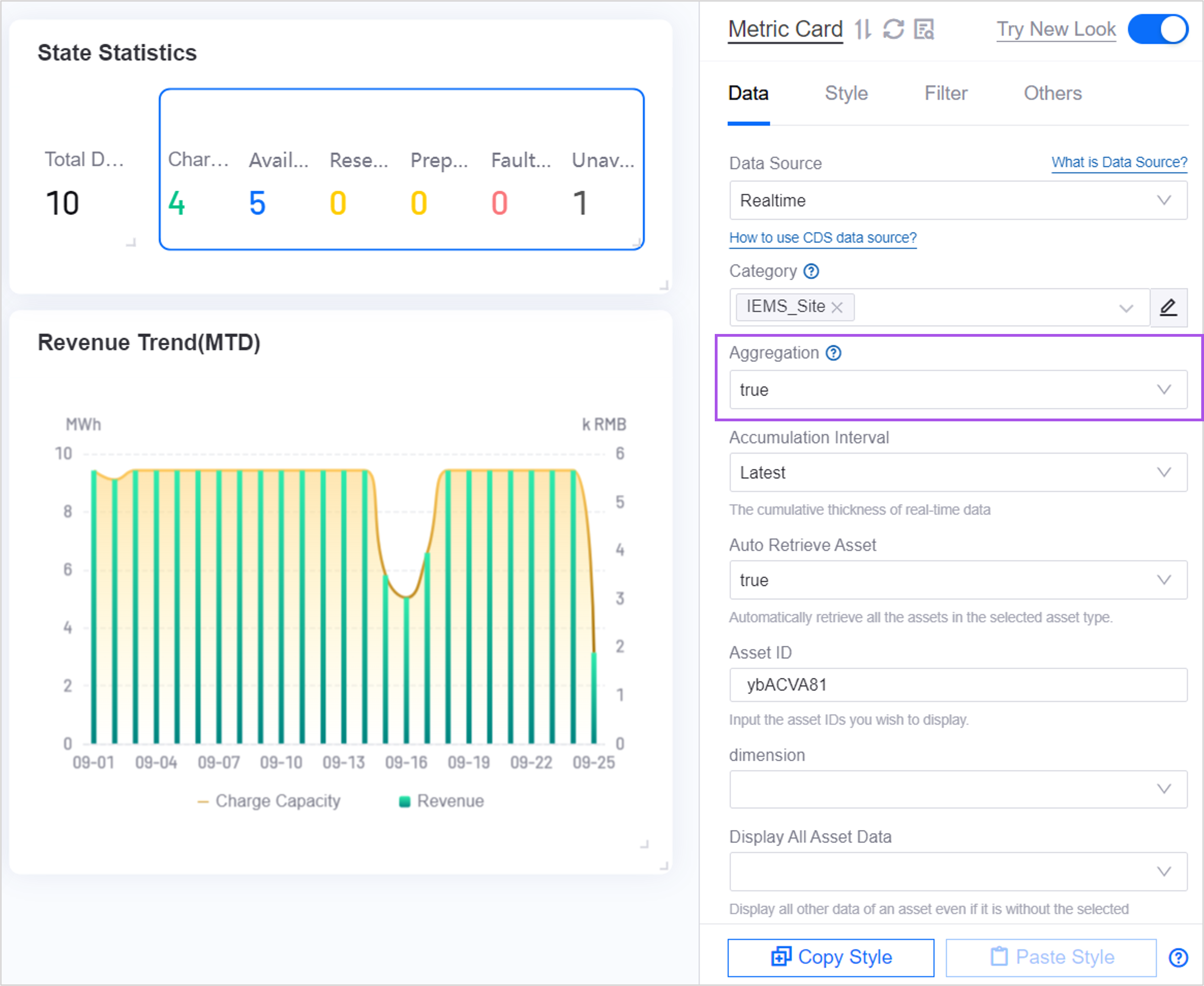
The card shows the last entry, sorted in ascending order by dimension value by default. You can switch
localtimebetween ascending and descending order. For more sorting options, see Ordering Value.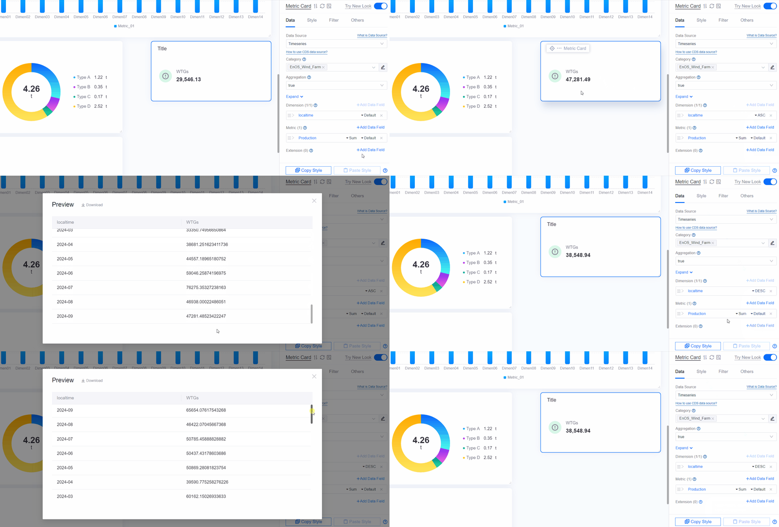
Measurement data is aggregated with Sum by default; you can choose another method for the metric
Generation. For more aggregation methods, see Display Aggregated Data.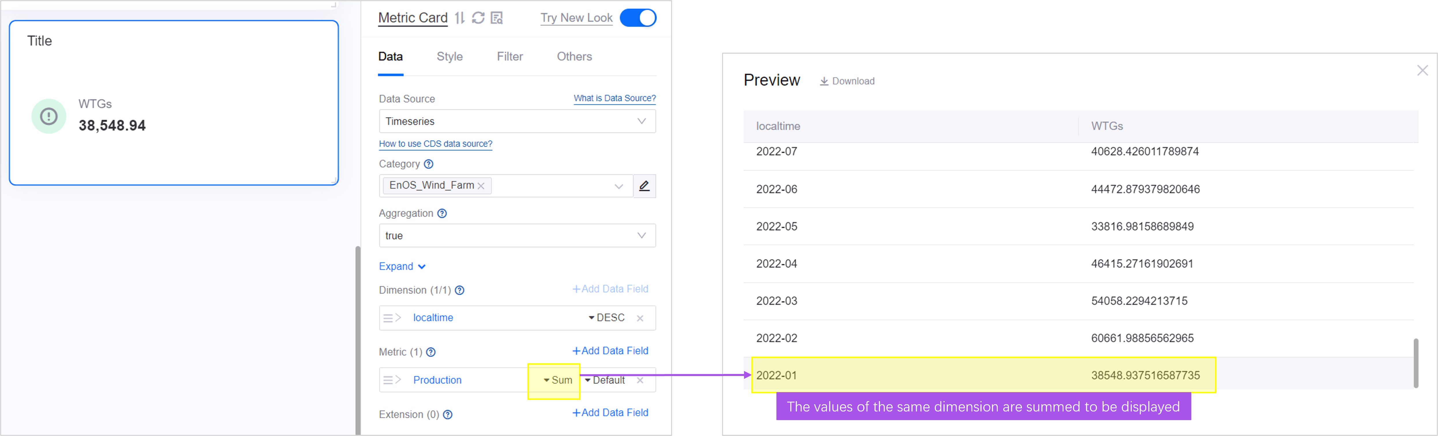


In the figure above, the metric Generation is aggregated by month with sum, and the card shows the latest monthly generation value.
Extension of the Multi-Metric Card
To show additional information about the measurement data, such as YoY/MoM Settings or Description, add data fields to Extension.

For example, adding the extension “Annual net emission YoY” to the metric “Annual net emission” shows the year-on-year result beside the metric value. YoY/MoM Settings >>.

As another example, adding the extension “Rated temperature” to the metric “Temperature” shows the supplementary rated temperature below the metric value. Description >>.

If no suitable data field is available as an extension, select Add Calculated Field in the Add Data Field dialog box to build your own field from a simple calculation on existing data fields, for example “Annual net emission YoY = (net emission this year - net emission last year) / net emission last year x 100%”. For more information, see Calculated Fields.
Style of Metric Card
Layout
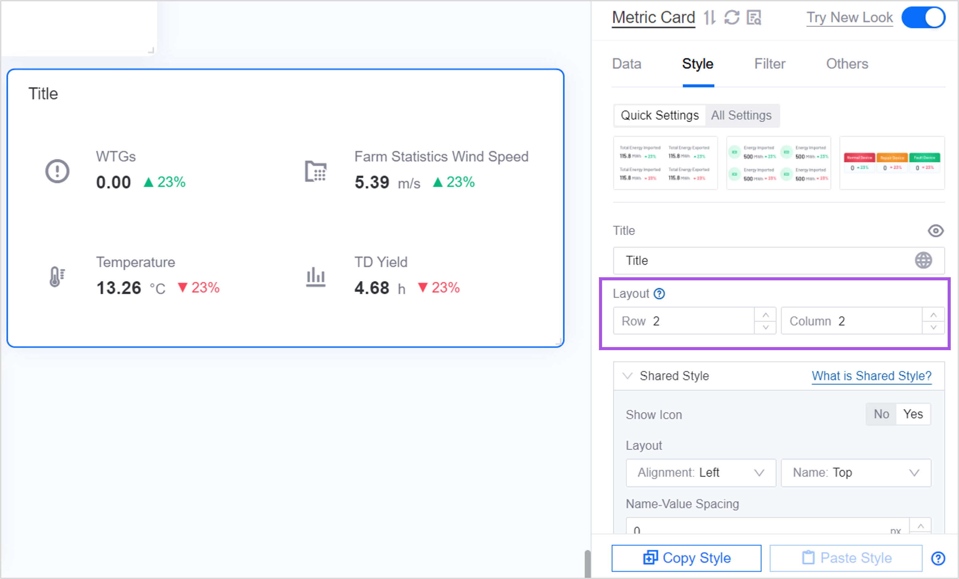
A multi-metric card, and a single-metric card with a Comparison configured, shows several values in one widget. Use Layout to change how those values are distributed across rows and columns.


In the multi-metric card, Layout is its own section and contains:
Row and Column: The number of metric rows and columns shown on one screen. When the number of metrics exceeds them, Show “Expand” on the Others tab provides an expand entry.
Spacing: Horizontal controls the horizontal distance between adjacent metrics; Row Height controls the height of each row, and 0 fits the height to the content.
The rows and columns of a single-metric card are set in Layout under Comparison Style, and only take effect once a comparison is configured.
Metric
The style of a single-metric card adds one configuration card per measurement added, and each measurement is configured separately.
The style of a multi-metric card has two layers: Shared Style, which applies to all metrics, and Single Measurement Style, which is configured per metric. The top of the Style tab also provides Quick Style Switching for moving quickly between similar presets.
The items below follow the order of the multi-metric card configuration panel.
Shared Style
A shared style applies uniformly to every metric in the widget. To configure one metric on its own, use Single Measurement Style.
The following styles can be shared:
Basic Style: Metric or Card.
Icon: No or Yes.
Show Measurement Name: No or Yes. With No selected, the name-related items are hidden.
Name font, value font, and unit font

Single Measurement Style
Single measurement style builds on Shared Style to define the style of an individual metric further, such as its icon and YoY/MoM.
Once a single measurement style is configured for a metric, the Single Measurement Style of that metric overrides the Shared Style, while the metrics without one continue to use the shared style.
Layout
Layout determines how the name and the value are arranged. Shown only when Show Measurement Name is Yes.
Alignment: The alignment of the elements within a metric, with options such as Space Between, which is the default.
Name Location: The position of the name relative to the value, above it by default. With left or right selected, the name and the value are arranged horizontally.
Name-Value Spacing
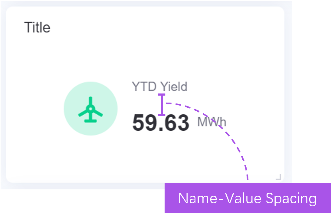
In a metric card widget, the data of a metric consists of a name and a value.

Name-Value Spacing is the display distance between the name and the value of a metric.
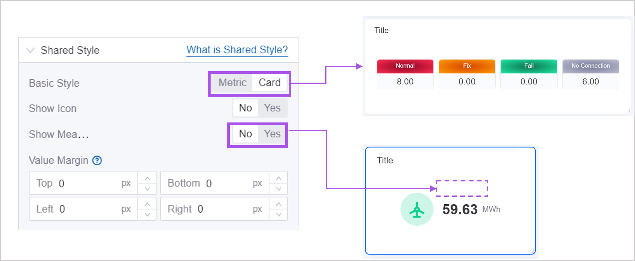
Name-Value Spacing is hidden in the following cases, where you can control the spacing with Name Margin or Value Margin instead:
Basic Style is Card.
Show Measurement Name is No.
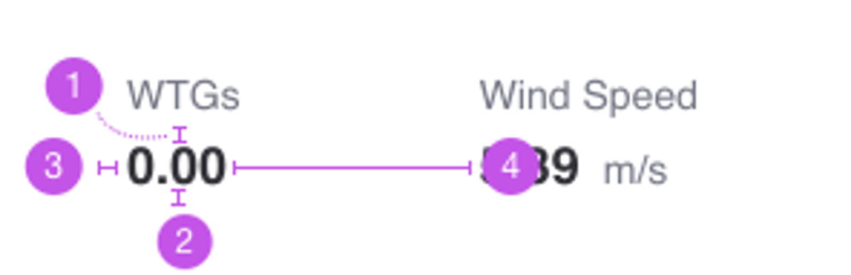
Name Margin
In a metric card widget, the data of a metric consists of a name and a value.

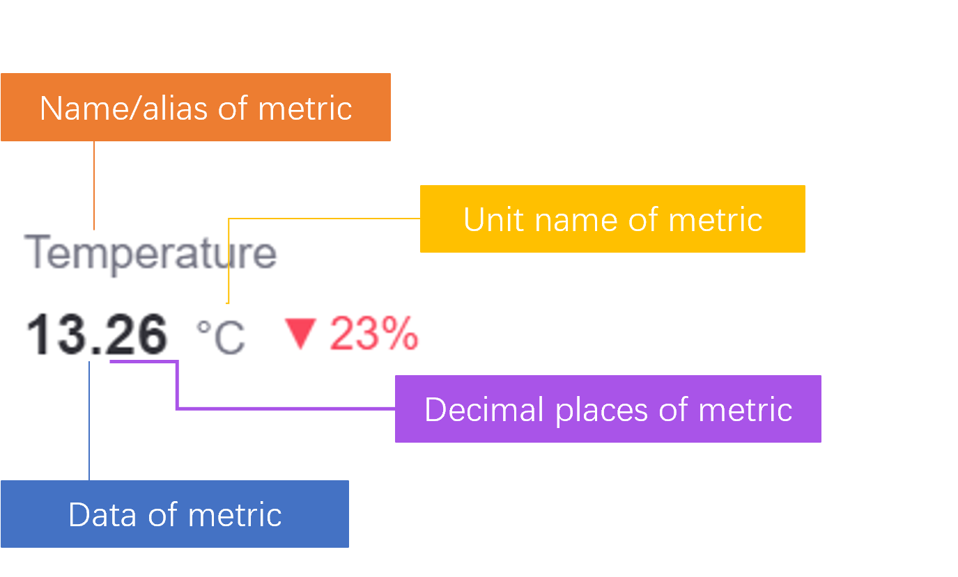
Name Margin is the margin between the name of a metric and the other elements, as shown below:
Top margin
Bottom margin
Left margin
Right margin

When Show Measurement Name is set to No, Name Margin is hidden. Value Margin is unaffected by that setting and remains configurable.
Value Margin
In a metric card widget, the data of a metric consists of a name and a value.
Value Margin is the margin between the value of a metric and the other elements, as shown below:
Top margin
Bottom margin
Left margin
Right margin
Note
Name margin and value margin both support all four directions. The single-metric card provides no four-way margins; it offers Name Card Padding and Value Card Padding in Card Style > Card instead.
Icon
Once Icon is set to Yes in Shared Style, configure the icon of each metric in Single Measurement Style:
Icon: Select Built-in or Custom first. With built-in, pick an icon from the icon library; with custom, upload or select an image from the asset library.
Icon Color Follows Value: When selected, the icon color is determined by Color Rules from the current value. Available only for built-in icons.
Icon Style: Sets the Size and Color of the icon. The color can be configured only for a built-in icon with Icon Color Follows Value cleared.
The single-metric card also supports icons, in Metric Style, with the items Icon, Icon Color Follows Value, Icon Color, and Icon Size.
Filling Color
Filling Color sets the background color of the name and value areas of a metric, and is commonly used with the Card option of Basic Style.
Name Box and Value Box: Set the background color of the two areas separately, with solid and gradient colors supported.
Border: Selected by default, showing a border around the filled area.
Note
With the card style and the name on the left or the right, Value Box cannot be configured on its own. The single-metric card has no such item; instead, Card Color in Card Style > Card offers six preset color schemes: none, green, blue, gray, orange, and red.
Decimal Places and Thousands Separator
Both items are configured per metric in Single Measurement Style:
Decimal Places: Rounds the value to the specified number of places, up to 4.
Show Thousands Separator: Adds a thousands separator to the value, for example 1000000 becomes 1,000,000.
Description and Total Proportion Value
Both items require an Extension data field on the Data tab first, and are then selected in Single Measurement Style.
Description: Select an extension field whose value appears near the metric value as supplementary information. None by default.
Total Proportion Value: Select an extension field as the denominator, and the metric shows the proportion in the form
current value / total. None by default. Once selected, you can also set Total Value Name Font and Total Value Font.
If an extension data field is removed and the previously selected field no longer exists, both items reset to None automatically.
Color Rules
Color Rules is configured per metric in Single Measurement Style and changes the color of the value text by value range. See Common Configurations for Charts > Color Rules.
Once Icon Color Follows Value is selected, the icon color follows the same set of rules.
Note
These color rules and the Value-Dependent Coloring of the Status Marker are two separate settings: the former applies to the value text and the icon, the latter only to the marker, and the latter also supports string matching.
Status Marker
A Status Marker is a small dot displayed beside the metric name or value, whose color conveys the status or grade of the metric, for example green for normal and red for an alarm.
Once Status Marker is set to Yes in Shared Style, the following items appear:
Marker Location (configured in the shared style):
Alignment: Whether the marker follows the name or the value. Name by default.
Position: Whether the marker sits to the Left or the Right of the text it follows. Left by default.
Marker Size (configured in the shared style):
Size: The diameter of the marker, 6 by default.
Spacing: The distance between the marker and the text, 8 by default.
Marker Color (configured per metric in Single Measurement Style):
By default a fixed color is specified, with solid and gradient colors supported.
Once Value-Dependent Coloring is selected, you select Configure Segment Rule instead and band the colors by value in the dialog box. Segmented By offers Value Range (each rule takes From, To, and Color) or Matched String (each rule takes the string to match and a color), and you can set Color for Non-Matching Values.
Note
The marker offers only a left or right position, with no vertical alignment item. Its vertical relationship to the name and the value is determined by Name Location in Layout.
YoY/MoM Settings
YoY/MoM compares the data of adjacent time periods and helps present the trend of a metric. For example, configure it when you need to show the change in a metric from last year to this year, or the growth from Q1 to Q2 of this year.
Before configuring YoY/MoM, make sure an Extension data field has been added on the Data tab. The data in Extension is the source of the YoY/MoM value.
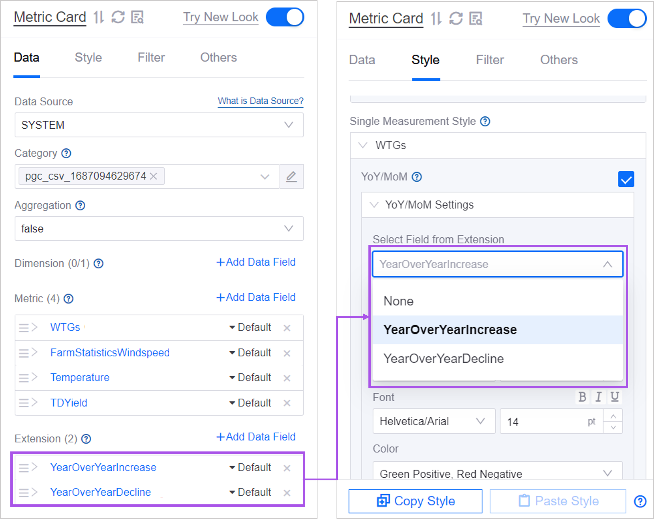

2. In Select Field from Extension, select an extension field for the current metric as the YoY/MoM data field. Once selected, the YoY/MoM value appears beside the metric value.

3. You can then define how the value is displayed, its position, font, and color.

The items are:
Display: Arrow, Arrow + Ratio (Percentage), or Arrow + Ratio (Decimal). Only the arrow is shown by default. Once Hide Value is selected, only the arrow remains and the position item is hidden.
Position: The position of the YoY/MoM relative to the metric value, either Right of Value (default) or Left of Value, with a spacing from the value that defaults to 4 px.
Font: Sets the font, font size, bold, and other styles of the YoY/MoM text. This item provides no color setting; the color is determined by Color.
Color: Red Positive, Green Negative (default) or Green Positive, Red Negative, which determines the colors used for a rise and a fall.
Note
YoY/MoM is provided only in the multi-metric card and is always configured per metric, unaffected by Override Shared Style. The single-metric card does not support YoY/MoM.
Override Shared Style
Once Override Shared Style is selected, you can redefine the layout, spacing, fonts, and other styles of the current metric. That metric then uses the configuration in Single Measurement Style, while the metrics without Override Shared Style selected continue to use the shared style.

The items you can override are exactly those of Shared Style: basic style, icon, status marker, measurement name, layout, name-value spacing, name margin, value margin, marker location, marker size, and the name font, value font, and unit font.
The first time you select it, these items start from the current shared style values, which makes fine-tuning easier. Once selected, the configuration card of that metric shows an Overriding flag.
Note
Decimal places, filling color, the specific icon style, description, total proportion value, color rules, and YoY/MoM are configured per metric to begin with and are unaffected by Override Shared Style.
Other Settings of Metric Card
The Others tab provides the following items. For common items such as refresh frequency, title interaction, and exporting widget data, see Common Configurations for Charts > Configuring Other Items.
Show “Expand”
When selected, if the number of metrics exceeds the rows and columns set in Layout, an Expand entry at the bottom of the widget lets users view the rest; when cleared, only the metrics that fit the layout are shown.
Interaction
Configures the jump or linkage behavior on click, per metric. Each metric can be set separately. For the configuration method, see Common Configurations for Charts > Interaction Settings.
Open Trend Analysis
Once trend analysis is enabled per metric, end users see the historical trend of that metric by hovering the mouse over it. You can then configure Asset Aggregation and Asset Parameter.
For details of all three, see Open Trend Analysis, Asset Aggregation, and Asset Parameter.
Note
The single-metric card provides neither interaction nor trend analysis items. To configure a jump for a single metric, use Title Interaction on the Basic tab. See Title Interaction (Left).
Interactions at Runtime
The metric card has no tooltip switch, legend, or carousel, so its runtime interactions all center on the metric values:
Value jump and trend analysis: Only the values of metrics with Interaction or Open Trend Analysis configured are clickable, and the mouse pointer becomes a hand. With only one configured, hovering shows the name of that action or Add to Trend Analysis and selecting the value performs it directly; with both configured, hovering shows a two-item menu to choose from. Jumps only work on the published page. With neither configured, the value has no hover or click effect. The single-metric card provides neither Interaction nor Open Trend Analysis, so its value is not clickable.
Expand: When Show “Expand” is selected and the number of metrics exceeds the rows and columns of Layout, an Expand/Collapse button appears at the bottom of the widget.
Value animation: On the running page, metric values and total proportion values count up from 0 to the final value; the editor shows the final value directly, which makes configuration easier.
Full name: A metric name that exceeds its display area is truncated, and hovering the mouse shows the full text.