List
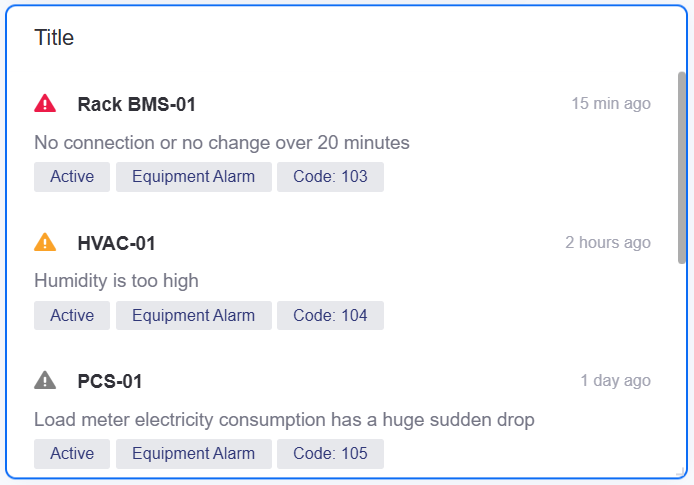
A list presents multiple text records in a compact form. Each record consists of a title, a subtitle, content, and tags, each of which can be bound to a data field, and conditional colors highlight the records that need attention. It is commonly used for alarm summaries, event records, and device status.
DTV has two other widgets with similar names:
Alarm List in the Business Widget group, whose configuration items are almost identical to the list but which additionally provides rows per page and a rotation interval.
Asset List in the Control group, which presents the real-time data of assets as cards or a table and is unrelated to the list.
This topic describes the configuration items specific to the list. For the items common to all charts, such as the Basic tab and the Filter tab, see Common Configurations for Charts.
Data of List
A list organizes each record with Dimension and Measurement data fields. Every dimension and measurement you add can serve as the data field of the title, subtitle, content, or tags; you select the specific data field per area in the style settings.
For general information about data sources and data fields, see Common Configurations for Charts > Configuring Data.
Dimension
A list supports 0 to 2 dimension fields. Dimension fields can be used for the title, subtitle, content, and tags, and can also serve as the matching data field of Conditional Formatting > Conditional Colors.
Measurement
A list supports any number of measurement fields. Measurement fields can be used for the title, subtitle, content, and tags, but cannot serve as the matching data field of conditional colors.
Style of List
The list uses two groups of style settings: List Style manages the title, subtitle, content, and tags; Conditional Formatting applies colors to selected areas based on the value of a dimension field.
For general information about the title and the widget, see Common Configurations for Charts > Configuring Style.
List Style
The visibility, data field, and font of the title, subtitle, content, and tags are each controlled separately.
Title
The title shows the main information of a record, such as an alarm name or an event identifier.
Visibility: Select
 to show or hide the title text.
Data Field: Select one of the dimension or measurement fields you added as the title.
Font: Sets the font, font size, color, bold, italic, and other styles of the title text.
Icon: Select the icon to the left of the title. Options are None and Warning; the warning icon is a fixed alarm triangle.
Icon Color: Sets the color of the warning icon. This item has no effect when the icon is None.
Subtitle
The subtitle shows information that supplements the title, such as the time an alarm occurred, the device name, or the source of an event.
Visibility: Select
to show or hide the subtitle text.Data Field: Select one of the dimension or measurement fields you added as the subtitle.
Font: Sets the font, font size, color, and style of the subtitle text.
Content
The content shows the detailed description or message body of a record.
Visibility: Select
to show or hide the content text.Data Field: Select one of the dimension or measurement fields you added as the content.
Font: Sets the font, font size, color, and style of the content text.
Redirection Method: Configures the click interaction of the content area, so that end users can jump to the specified target by selecting the content. For the configuration method, see Interaction Settings.
Tags
Tags show the classification or status information of a record as bubbles, such as alarm severity and alarm type.
Visibility: Select
to show or hide the tags.Data Field: Select one or more of the dimension or measurement fields you added. The value of each selected field generates one tag.
Font: Sets the font, font size, color, and style of the tag text.
Each record shows at most the first 5 selected tag fields; the rest are not displayed in the widget.
Conditional Formatting
Conditional Colors in conditional formatting applies a color to the title, subtitle, content, tags, or warning icon based on the value of the selected dimension field. It uses text matching rather than the value ranges of the general color rules.
Data Field
Select one of the Dimension fields you added as the basis for conditional color matching. Measurement fields cannot be used for conditional matching.
Use Color Rules
When enabled, the widget matches every record against the configured color rules. When disabled, all records keep the original font or icon color of each area.
Color Rules
Select Add to add a color rule. Each rule contains the following:
Configuration item |
Description |
|---|---|
Matching text |
Enter the text to match. The rule is hit when the value of the selected dimension field contains that text. Leaving it empty matches every record, which suits a fallback rule. |
Color |
Sets the color used when the rule is hit. |
Rules are matched from top to bottom and the first rule hit takes effect. When no rule is hit, the record keeps the original color of each area.
Areas the Color Rules Apply To
Select the areas the color rules apply to:
Link Title: Applies the matched color to the title text.
Link Subtitle: Applies the matched color to the subtitle text.
Link Content: Applies the matched color to the content text.
Link Tags: Applies the matched color to the tag text.
Link Icon: Applies the matched color to the warning icon.
Conditional colors do not change the background color of a whole record or of a tag bubble. Areas that are not selected keep their own configured color.
Interactions at Runtime
The list behaves as follows at runtime:
Record layout: Each record is shown on three lines. The first line holds the warning icon, the title (60% of the width), and the right-aligned subtitle (40% of the width); the second line holds the content; the third line holds the tags. A separator line sits between adjacent records, and its color follows the theme.
Scrolling: The list is not paginated. Records are arranged from top to bottom in the order the data is returned, and can be scrolled vertically within the widget when they exceed its height.
Full text: Hovering the mouse over the title, subtitle, content, or any tag shows the full value of that field. Content and tags are truncated with an ellipsis when they exceed the width, a title that is too long wraps automatically, and the overflowing part of a subtitle is hidden.
Content click jump: Once Content > Redirection Method is configured, the mouse pointer over the content text becomes a hand and clicking performs the jump. This only works on the published page; clicking in the editor canvas does nothing.
No data: When the data source returns no records, the widget shows an empty-state placeholder and no records.
Note
When Redirection Method is not configured, the content area is still clickable: on the published page, clicking it opens the alarm console in a new tab and passes the alarm ID of that record. This is the default behavior the list inherits from the alarm list, so if the data contains no alarm ID field, the page that opens cannot locate a specific alarm. Specifying a target in Redirection Method, or selecting no link, overrides this default behavior.