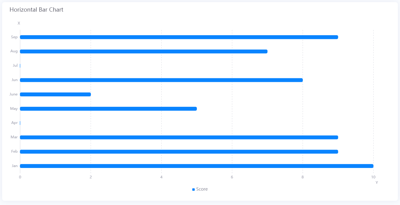
Horizontal Bar Chart
The horizontal bar chart widget is used to compare data values.
Data Fields
The data fields required are:
Field |
Multiplicity |
|---|---|
Dimension |
1 |
Measurement |
≥ 1 |
Chart Style
Measurement Style
You can style the bar for each Measurement field. Only available in Advanced Mode.
Field |
Description |
|---|---|
Color |
Select the color of the bars |
You can also style the appearance of the bars.
Field |
Description |
|---|---|
Rounded Corners |
Select this to display bars with round corners |
Stack |
Select this to place bars with same Dimension value side by side |
Bar Spacing |
Specify the vertical spacing between bars with different Dimension values |
Axis Style
Formats the horizontal and vertical axes of the bar chart. You can hide any axis by clicking their respective  button.
Field |
Description |
|---|---|
Unit |
Specify the unit to be used for the axis label |
Dynamic Unit [1] |
Select this to automatically use the unit that suits your data values |
Axis Range [1] |
Specify the minimum and maximum value on the horizontal axis, and the number of tick marks between the first and last tick marks |
Label Settings |
Choose the type, format and the orientation of the tick mark labels |
Font [2] |
Styles the font of the tick mark labels |
Axis Line [2] |
Styles the axis line. Axis line is disabled by default - click |
Grid Line [2] |
Styles the grid lines. Grid lines are disabled by default - click |
Show Scalar Bar [2] |
Select this to show a bar that can limit the range of data displayed on each axis |
[1] Only available for Horizontal Axis/X-Axis [2] Only available in Advanced Mode
Note
The scalar bar enables you to show a part of the bar chart, so that users focus only on the important parts.
Legend Style
Formats the legend. You can hide the legend by clicking .
Field |
Description |
|---|---|
Position |
Select the position to display the legend |
Size [3] |
Specify the size of the legend bar. Select Auto to automatically set the optimal size for the legend bar |
Legend Font [3] |
Configure the font of the legend text |
[3] Only available in Advanced Mode