Donut Gauge with Metric Card
Donut Gauge with Metric Card places one donut gauge next to up to two metric cards, which suits presenting progress alongside a few key values. It is a different widget from the Donut Gauge and its configuration panel differs too.
In the widget library, the four presets With Metric Card under the donut gauge, meter gauge, progress bar, and liquid fill groups are all this same widget; they differ only in the Type preset in the Gauge panel, and you can switch type at any time after inserting one. This topic therefore applies to all four presets.
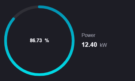
This topic describes only the differences from the Donut Gauge. For common configuration such as the data source, alias, unit, color rules, and interaction settings, see Common Configurations for Charts.
Data
This widget uses only Measurement, and accepts 1 to 3 fields:
The first measurement drives the donut gauge.
The second and third measurements each appear as a metric card, showing only the name, value, and unit.
The widget does not support Comparison, so it cannot split into several gauges by field value the way With Comparison does.
Style
The Style tab has two sections, Metric Style and Mix Gauge Style; the latter contains the Gauge and Layout collapsible panels.
Metric Style
Each measurement you add gets its own Metric Style collapsible panel, whose title shows the name of the selected field automatically. The items of the first measurement, which drives the gauge, match the donut gauge. See Style of Donut Gauge > Metric Style.
The second and third measurements (the metric cards) have fewer items. The differences are:
Configuration item |
First measurement (gauge) |
Second and third measurements (metric cards) |
|---|---|---|
Show Name |
Provided, selected by default |
Not provided; the name is always shown |
Unit Wrap |
Provided only when Type is Donut Gauge or Liquid Fill Gauge |
Not provided |
Axis Range, Show As Percentage |
Provided |
Not provided |
Color Rules |
Solid and gradient colors, applied to the progress arc |
Solid colors only, applied to the value text |
Name Font, Unit Name, Dynamic Unit, Unit Font, Value Font, and Decimal Places are provided in all three panels with the same meaning.
Note
Min and Max of Axis Range do not accept parameter placeholders in this widget; only fixed numbers can be entered. When left empty, Min counts as 0 and Max as 100.
This widget provides no Interaction Settings, so the values do not support a click jump. For a jump, use Title Interaction on the Basic tab. See Common Configurations for Charts > Title Interaction (Left).
Gauge
Type determines the form of the graphic on the left. Options are Donut Gauge (default), Meter Gauge, Progress Bar, and Liquid Fill Gauge.
Type also determines which further items appear in this panel and in the first Metric panel:
Type |
Other items in the Gauge panel |
Additional items in the first Metric panel |
|---|---|---|
Donut Gauge |
Gauge Thickness: the thickness of the ring arc in pt, with a default of 6 and a minimum of 0 |
Unit Wrap |
Meter Gauge |
Gauge Thickness (20 by default) and Data Font |
None |
Progress Bar |
Progress Bar Height |
None |
Liquid Fill Gauge |
None, only Type |
Unit Wrap, Border, and Fixed Water Level at 40% |
For the graphics themselves, see Meter Gauge, Progress Bar, and Liquid Fill Gauge. For the meaning of Border and Fixed Water Level at 40%, see Style of Liquid Fill Gauge > Border and Fixed Water Level at 40%.
Layout
Line Break: Selected by default. When selected, the name and the value of a metric card appear on two lines; when cleared, they appear on the same line with the value right-aligned.
Position: The position of the metric card group relative to the gauge. Options are Top, Bottom, Left, and Right (default).
Spacing: The distance between the metric card group and the gauge, with a default of 2 and a minimum of 0.
Line Spacing: The distance between the two metric cards, with a default of 2 and a minimum of 0.
Interactions at Runtime
Area split: The gauge and the metric card group each take half of the widget, in a fixed proportion that cannot be configured. With Position set to Top or Bottom the split is vertical; with Left or Right it is horizontal.
Hover tooltip: When the name, value, or unit is too long it is truncated with an ellipsis, and hovering the mouse shows the full text.
No animation: Neither the gauge nor the metric cards play a fill or count-up animation; they show the final value directly. When Type is Liquid Fill Gauge the liquid rises and falls continuously, which is the built-in wave animation of the liquid fill and is not affected by this.
Data retrieval: Only the last record in the returned data is shown.
Invalid value: When the measurement value is not a number,
--is shown. When Type is Liquid Fill Gauge, the ball is additionally drawn with a low gray wave to distinguish it from a real 0.
Note
This widget provides no Show Tooltip item (see Common Configurations for Charts > Show Tooltip), and the Filter tab provides no Link Other Widgets either.