Rose Chart
The rose chart is a variant of the pie chart. Where an ordinary pie chart expresses proportion through slice angle (arc length) alone, a rose chart encodes data with both the angle and the radius of a slice: the angle represents the share of that category in the total, while the radius reflects its value. This makes categories with similar proportions but different values visually distinct, and suits scenarios where composition and magnitude need to be shown in one view.
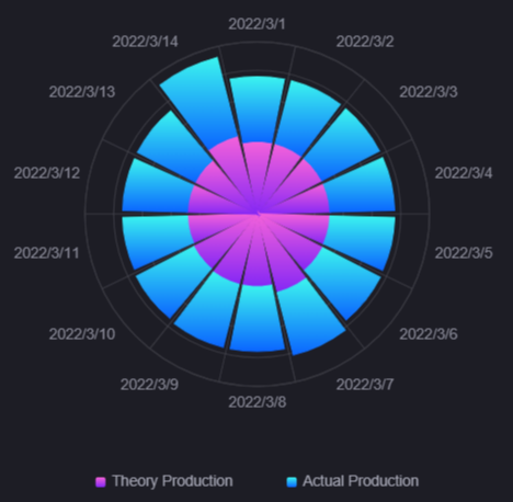
This topic describes the configuration items specific to the rose chart. For the items common to all charts, such as the Basic tab and the Filter tab, see Common Configurations for Charts.
Data of Rose Chart
The rose chart centers on Measurement and uses Dimension to divide the slices. For general information about data sources and data fields, see Common Configurations for Charts > Configuring Data.
Dimension
Dimension determines the slice categories on the angular axis, with one category per dimension value. A rose chart requires 1 dimension field.
Measurement
Measurement determines the value of each category slice and how far it extends outwards. A rose chart supports 1 or more measurement fields and does not support comparison fields.
When several measurements are added, the slices sharing a dimension value stack outwards from the center, one layer per measurement, and the overall radius reflects their cumulative value. The rose chart provides none of the pie chart’s center total, ring diameter, or number of display data items.
Style of Rose Chart
On the Style tab, configure Metric Style and Axis Style in turn, followed by Legend and Column under Other Settings.
Metric Style
Once measurements are added, Metric Style produces one configuration card per measurement. You can select a solid or gradient color per card; with no measurements, the section is hidden.
Axis Style
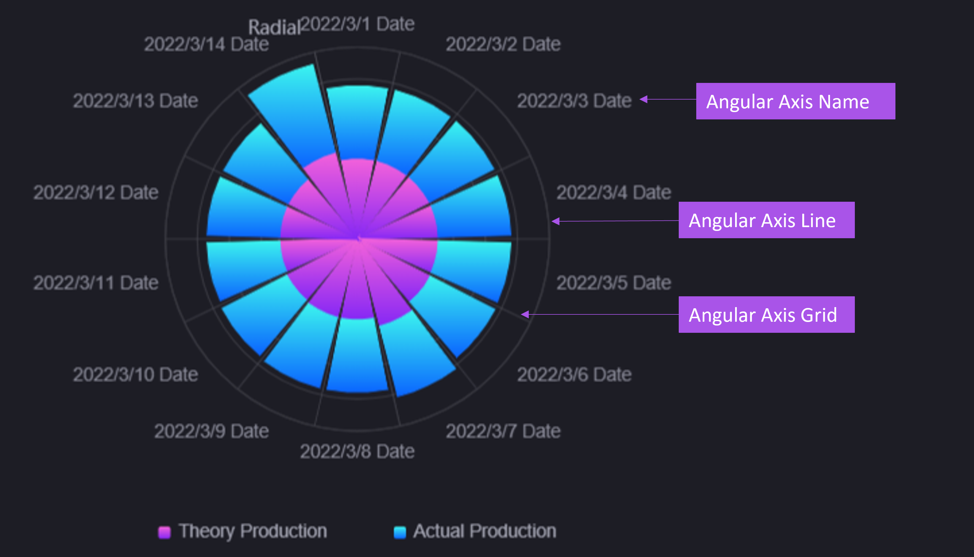
The rose chart uses two axes to define the chart space: the Angular Axis controls how slices are distributed around the circumference, and the Radial Axis controls how far they extend outwards. Use the eye button  beside an axis to hide it.
Angular Axis
The angular axis runs around the circumference, and its tick labels sit on the outer edge of the slices to identify the dimension values.
Visibility: Select
to show or hide the title text.Name: Specifies a name or unit for the angular axis, shown as a suffix on each dimension field label, which helps explain what the slices represent.
Axis Font: Sets the font, size, and color of the angular axis label text.
Axis Line: Sets the color and thickness of the outer circular axis line. The axis line is hidden by default; select the eye button
to show it.Grid Line: Sets the style of the slice separator lines radiating from the center. Grid lines are hidden by default; select the eye button
to show them. The rose chart currently provides no separate scalar bar or zoom slider.
Radial Axis
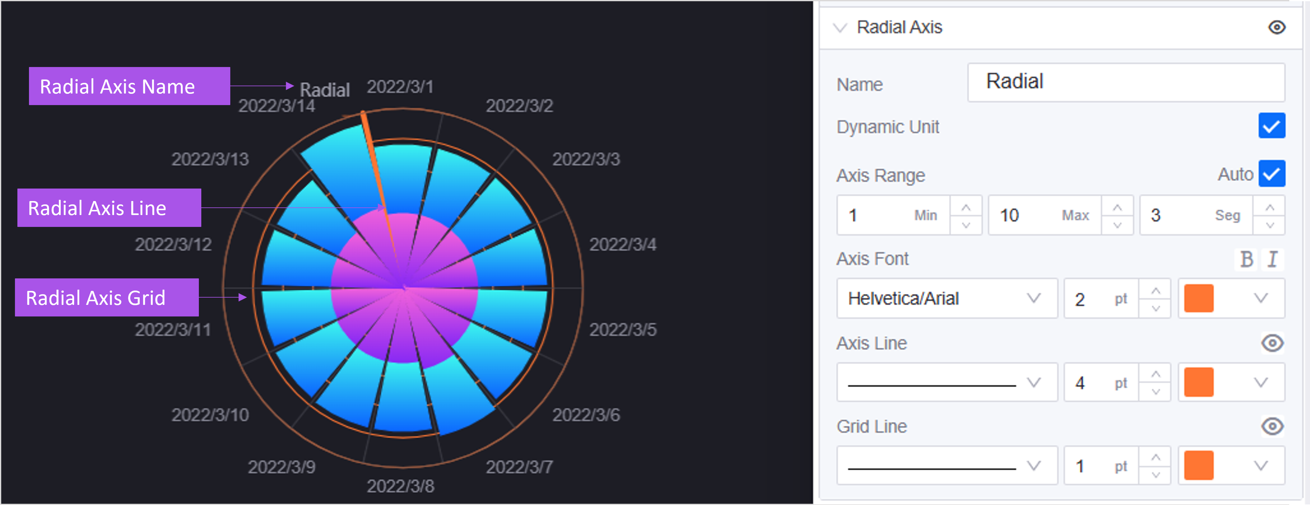
The radial axis runs along the direction in which the slices extend, and its ticks label the values at different radii, which helps users read the magnitude of each slice.
Visibility: Select
to show or hide the title text.Name: Specifies the title text of the radial axis, explaining what the axis expresses.
Dynamic Unit: When selected, DTV picks a suitable unit automatically according to the magnitude of the data (for example 1000 becomes 1 k), which makes axis labels more concise.
Axis Range: Sets the minimum, maximum, and number of ticks of the radial axis manually. Fixing the axis range prevents slice radii from changing sharply when the data updates and keeps the comparison basis consistent across charts.
Axis Font: Sets the font, size, and color of the radial axis name and tick labels.
Axis Line: Sets the color and thickness of the radial axis line. The axis line is hidden by default; select the eye button
to show it.Grid Line: Sets the style of the radial axis grid lines, which appear as concentric circles. Grid lines are hidden by default; select the eye button
to show them.
Other Settings
Other Settings contains the Legend and Column sections.
Legend
The legend helps users identify the dimension value or measurement name of each slice, which is useful with many dimension categories or several measurements. Use the eye button to hide it.
Position: Determines the position of the legend relative to the chart. Options are bottom-middle, left-middle, top-middle, top-right, and right-middle. Adjusting the position according to the aspect ratio and content density of the chart prevents the legend from covering slice labels. The default is bottom-middle.
Size: Controls the Size of the legend color blocks and the Spacing between legend items, in pixels. Once Auto is selected, DTV calculates them from the chart size and the values you entered are no longer used.
Legend Font: Sets the font, size, and color of the legend text so that it matches the overall visual style.
Column
Column controls the spacing between slices and how value labels are displayed.
Sector Spacing: Controls the gap between adjacent slices as a percentage. Increasing it makes the slices easier to tell apart, which helps with many categories; 0 leaves the slices adjoining. The default is 0.
Show Values: When selected, the value of each slice is labeled at its outer end, so data can be read without hovering. This suits presentations and reports. Cleared by default.
Value Font: Sets the font, size, and color of the value labels on the slices. Shown only once Show Values is selected.
Widget Linkage
The rose chart can trigger linkage in other widgets: when an end user selects a slice, the target widgets refresh with the dimension value of that slice as the filter condition.
Configure the linkage rules in the Link Other Widgets area of the Filter tab. The rose chart must have a Dimension data field added, otherwise the + Add button is unavailable. For configuring linkage conditions, target widgets, and refresh behavior, see Link Other Widgets.
Interactions at Runtime
The rose chart behaves as follows at runtime:
Tooltip: Requires Show Tooltip on the Basic > Others tab. When the mouse enters the sector of a category, that sector is highlighted with a shadow, the first row of the tooltip shows the dimension value of the category, and the rows below list the name, color, and value with unit of each measurement. Measurements with no value get no row of their own; when no measurement under the category has a value, no tooltip appears.
Legend filtering: Requires the legend to be visible. Selecting a legend item hides or shows the stacked layer of the corresponding measurement. Unless a maximum is fixed in Radial Axis > Axis Range, the radial axis range is recalculated from the visible measurements and slice lengths change accordingly. Hiding a measurement only affects the display; it does not refetch data and does not affect exported data.
Hover highlight: When a measurement uses a gradient color, the hovered slice brightens as a whole; with a solid color, the default highlight applies.
Slice click linkage: Slices respond to a click only once Link Other Widgets is configured on the Filter tab; without it, selecting a slice does nothing. For the configuration method, see Widget Linkage.
Note
The rose chart provides neither scalar bar zooming nor selection zooming, so although Link Group ID on the Others tab adds the chart to a linkage group, it produces no zoom synchronization like the bar chart. See Common Configurations for Charts > Link Group ID.
If a Name is configured for the Angular Axis, that suffix also appears in the category name of the tooltip and on the chart labels. The category value passed out when a slice is selected then carries the suffix and no longer matches the raw value in the data, so linkage may fail to hit the target data. Clear Angular Axis > Name when linkage is needed.