Fleet Map
Note
The fleet map is an independently deployed business widget and sits under the Business Widget group. Its configuration panel is provided by the widget itself and works differently from other chart widgets.
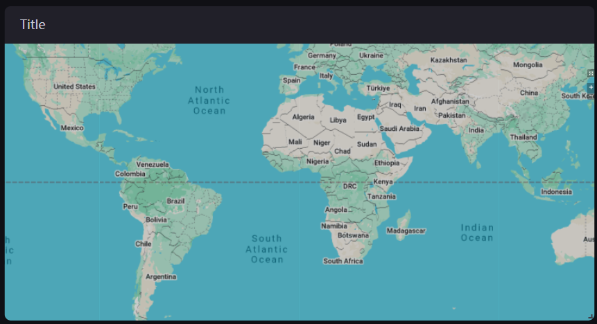
The fleet map presents fleet data on a map by site, supports drilling down between the overview map and a single-site map, and can aggregate site status and metrics by region. It suits centralized monitoring of several sites and regional overviews.
Prerequisites
The fleet map relies on the asset navigator on the page for the asset types and the asset selection method: the configuration panel of the widget reads the asset types configured in the navigator to initialize the list of configurable site types.
Without an asset navigator on the page, the widget still renders, but the site selection on the map cannot link with the other widgets on the page.
Data of Fleet Map
The fleet map does not use the DTV dimension, measurement, and comparison data fields, and the configuration panel has no entries for them. Its data comes from two places:
The asset navigator and page parameters: These determine which sites are shown and which node is selected.
The service of the widget itself: Once the asset scope is determined, the widget queries the status, metrics, and measurement point data of the sites directly from the backend.
To use this widget, therefore, configure an asset navigator on the page and then set the map form and the site content on the Map and Asset tabs of the widget.
Configuration Panel of the Fleet Map
The configuration panel has four tabs:
Tab |
Description |
|---|---|
Basic |
The common basic information of DTV, such as the title and background. See Common Configurations for Charts. |
Map |
Map types, map sources, coordinate systems, view extent, and aggregation. |
Asset |
The status, click behavior, and details popup of object types, and the display style of sites. |
Function |
Custom interface text. |
Map
The top of the Map tab holds two independent switches, followed by the table for selecting map types and map sources, the Coordinate System card, and cards named after the levels of the asset navigator (such as Organization and Site).
Enable Mask
Off by default. When enabled, the map is bright in the middle and dark around the edges, which emphasizes the central area.
Map Types and Map Source
First select which Map Types the widget enables, then choose a Map Source for each type:
Map type |
Description |
|---|---|
Geographical Map |
A satellite imagery base map. |
Road Map |
A road base map. |
ECDIS |
A nautical chart base map, which suits offshore wind and similar scenarios. |
3D Map |
A three-dimensional base map, supported only at the site level. |
Map Source offers Tiandi Map, Google Map, and Offline Map; the geographical map, road map, and 3D map also offer Custom. Once Offline Map is selected, enter an Offline Download URL.
Note
At least one map type must be selected, otherwise the widget reports that at least one map type must be selected.
Whether ECDIS and 3D Map are available depends on the map configuration of the deployment environment; some environments do not offer them.
Coordinate System
Asset Coordinate System: Specifies which coordinate system the longitude and latitude of the assets belong to. Options are WGS84 (default), GCJ02, and BD09.
Satellite Coordinate System / Road Coordinate System / 3D Map Coordinate System: Specify the coordinate system used by the corresponding base map. Options are WGS84 (default) and GCJ02. Shown only when the corresponding map type is selected, the deployment environment offers that map type, and the selected map source does not already have a coordinate system fixed in the deployment environment; if the map source has one fixed, this item is not provided.
Note
A mismatch between the asset coordinate system and the base map coordinate system shifts the site positions. Confirm the actual coordinate system of the asset longitude and latitude with your data provider before configuring.
Organization and Site
There is one card per level of the asset navigator, named after the level configured in the navigator (such as Organization and Site). The items in a card determine the default form and extent when the map of that level is opened, in the following order:
Default Map Type: Specifies which base map is shown by default when the map of that level is opened. Shown only when more than one map type is selected.
Max Zoom in Level: The maximum zoom level the map allows, from 0 to 22 with a default of 15.
Zoom Granularity: The step of each zoom, from 0.1 to 1.
Auto-Center Default View: When selected, the widget calculates the center point and zoom level from the site distribution. Once cleared, you can specify the longitude and latitude of the Center Point and a Default Zoom manually.
Enable Asset Aggregation: Off by default. When on, nearby sites merge into an aggregation bubble as the view zooms out, and Aggregation Zoom Level (0 to 22, 15 by default) sets the zoom level at which aggregation begins. Aggregation is always by region and no aggregation by attribute is offered. Once asset aggregation is on, you can also configure Display Data on Aggregation Icons (at most 1 item), the aggregation Donut Chart (at most 6 items), and the data fields shown in the details popup of an aggregation bubble (at most 10 items).
Show Administrative Boundaries by Default: When selected, administrative boundaries are drawn by default.
Invert Administrative Background Color: When selected, the background colors of administrative regions are inverted.
Note
Which items a card actually shows depends on the asset selection method of the asset navigator: the asset aggregation and administrative boundary items are only provided in the cards of overview levels (multiple sites, region), while the site-level card provides Default Map Type and additionally provides Max Zoom in Level and Zoom Granularity when the asset selection method corresponds to a single-site scope.
Items for setting a default view or a default zoom level per asset type are not provided in this widget.
Administrative Boundary
Assigns a custom administrative boundary to a node of the organization structure. Select Configure to open the dialog box and add nodes and their boundaries row by row:
Organization Structure Node: Select the node to set a boundary for.
Boundary: Select a built-in administrative region, or upload a GeoJSON file.
Map Location: Sets the position of the current node on the map of its parent node.
Note
The GeoJSON you upload must include
adcode(region code) andname(region name) in itspropertiesobject.The total size of all configuration files on the current page cannot exceed 2 MB.
A boundary must be configured for a parent node before its child nodes can be configured.
Asset
The Asset tab is also split into cards per level of the asset navigator (such as Organization and Site), and each card is further grouped by asset type (such as Store or wind power) to set how that asset type and its objects appear on the map.
Show Object Status
Controls whether the status is shown on the object icons of that asset type. On by default.
Object Type
Use Add Object Type to add the object types to show on the map (such as energy storage air conditioners, wind turbines, or vehicles). Drag the handle on the left to reorder them and select × to delete one. Each object type is configured in the following order:
Device Status: Select the status data for that object type, at most 1 item. Select View Data Fields to see the data fields selected; each status can have an Alias, which can be entered per language. The status of a wind turbine is built into the widget and this item is not provided for it.
Click 3D Icon to: Configurable for wind turbines only. Sets the jump method after the 3D icon is selected (no jump, new tab, or current tab) and the address.
Click Pop-up Title to: Sets the jump method after the title of the details popup is selected. Don’t Jump by default; a new tab or the current tab can also be chosen along with an address.
Show {object} Trajectory: Provided only when the asset type is wind power and the object type is a movable object such as a vehicle, a person, or a vessel.
Show Object Location: Sets whether the location icon of that object type is shown on the map.
Popup Display Settings: Sets the content source of the details popup, either Data Fields (default) or Embedded Content. With Embedded Content selected, set the width, height, style, and URL of the embedded content; DTV URLs starting with
/dt/can be embedded.Data in Details Popup: Provided only when Popup Display Settings is Data Fields. Use Add Data Field to choose which data appears in the details popup, at most 10 items; each can have an Alias that supports multiple languages.
More Layers
Provided only when the asset type is wind power. You can select the Wind Resource and Fence layers.
The 3D map supports wind turbine models only; other objects and layers are not supported yet.
Show Icon of Associated Resources
Controls whether the locations of associated resources are shown on the map. Provided only when the asset selection method of the asset navigator corresponds to a multi-site or global scope.
Site Style
In the card of an overview level, you can set how the sites themselves appear on the map:
Site Style: The form in which a site appears on the map, either Icon (default) or Dot.
Icon Size: The scale factor of the site icon, from 0.5 to 4 with a default of 2.
Show Asset Name: Controls whether the name is shown beside the site icon.
Site Status and Interaction
In the card of an overview level, each asset type (wind, solar, thermal, hydro, and so on) can also configure the status display and click behavior of sites:
Show Site Status Legend: Always on and cannot be turned off. It only indicates that the site status legend of that asset type is shown.
Click Site Icon to: Sets what happens when a site is selected. Options are Don’t Jump (default), Jump to Single-Site Map, and Jump to Other Page. Once jump to another page is selected, set the Link Type (new tab or current tab) and the URL. Jump to Single-Site Map is only offered when the asset selection method of the asset navigator is not multi-site, which corresponds to the region dimension.
Legend Filter: Configures the legend filter items for that type. Each item can have an alias, a condition, a unit, and a choice of whether to use an enum icon. There is no limit on the number.
Note
The Dimension Filter, which supports linkage (it can be set as the primary filter and linked with other filters, up to 10 items), has no add entry in the panel of this widget. If a dimension filter was configured for the asset previously, for example after migrating from another deployment, the existing filter items are still shown and can be edited or deleted, but no new ones can be added.
Click Pop-up Title to: Sets the jump behavior and address after the title of the details popup is selected.
Popup Display Settings: Sets the content source of the details popup, either Data Fields (default) or Embedded Content. The popup supports data fields by default and can also embed DTV URLs starting with
/dt/.With Data Fields selected you can set:
Data in Details Popup: Choose which data fields appear in the details popup when the mouse hovers over a site, at most 10 items.
Show Picture: When selected, a picture is shown in the details popup, and you can set its width, height, style, and address. Base the width and height on a resolution of 1920x1080.
With Embedded Content selected, set the width, height, style, and URL of the embedded content; the data in details popup and show picture items are then no longer provided.
Function
UI Text Customization
Sets custom content for the interface text of the widget, which can be entered per language. Use it to replace the default wording (for example “Site”) with the term your business uses.
Interactions at Runtime
The widget provides the following behaviors at runtime, with no configuration needed:
Zooming and panning: Zoom with the scroll wheel, pan by dragging, and use the zoom in, zoom out, and refresh buttons. With Auto-Center Default View on, the map adjusts to a suitable extent automatically when the site data changes.
Site hover and click: Hovering the mouse shows the details popup, and selecting a site jumps or drills down according to Click Site Icon to.
Drill-down and return: Selecting a site opens the single-site map; with aggregation on, selecting an aggregation bubble zooms into that region.
Legend filtering: Selecting a status legend item filters the sites on the map by status.
Fullscreen: Once Show Fullscreen Button is on, the map can be viewed full screen and Esc exits.