Ranking List
A ranking list shows a series of values and their progress bars in ascending or descending order, with a rank index in front of each bar and an optional rotation interval for cycling through several pages. It suits presenting metric rankings on large screens.
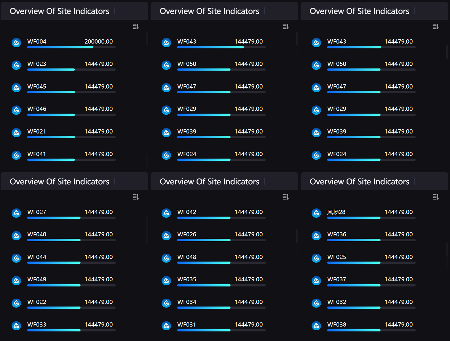
This topic describes the configuration items specific to the ranking list. For the items common to all charts, such as the Basic tab and the Filter tab, see Common Configurations for Charts.
Note
The ranking list is a preset in the progress bar group and shares one widget and one configuration panel with the Progress Bar, only with a comparison field and the rank index preconfigured. Its configuration items are therefore identical to the progress bar; this topic covers only the ranking-related parts, and for the rest see Progress Bar.
Data of Ranking List
The data fields of a ranking list match the progress bar. For data sources and data fields, see Common Configurations for Charts > Configuring Data.
Measurement
A ranking list requires at least 1 measurement field and accepts several with no upper limit; each measurement field corresponds to one progress bar. See Progress Bar > Measurement.
Comparison
Comparison is optional and accepts up to 1 field. The ranking list splits the data into several progress bars by comparison value to take part in the ranking, and shows the comparison value as a label on the left, so a comparison field is usually needed. See Progress Bar > Comparison.
Extension
There is no limit on the number of Extension fields. They are not shown as bar content directly and have the same uses as in the progress bar: as the basis of the icon conditions, or as the display name of the label on the left in place of the comparison field value. See Progress Bar > Extension.
Style of Ranking List
The style items fall into five sections, Comparison Style, Metric Style, Name, Unit and Value, Progress Bar, and Icon, which are identical to the progress bar. See Style of Progress Bar. For the items common to all charts, such as the title and the widget, see Common Configurations for Charts > Configuring Style.
The items directly related to ranking are:
Progress Bar > Show Rank Index: Shows a rank index (1, 2, 3, and so on) in front of each progress bar, with Ranking Label Color and Ranking Label Font configurable. The ranking list preset has it enabled. See Progress Bar > Show Rank Index.
Comparison Style > Carousel Effect and Rotation Interval: Cycle through several pages of rankings when the number of comparisons exceeds what one page shows. See Progress Bar > Carousel Effect.
Note
Show Rank Index itself is unaffected by Layout and can always be selected, but the rank index is only rendered when Layout is Bar below Value; selecting it with a horizontal layout produces no visible change. See Progress Bar > Layout.
Interactions at Runtime
The ranking list shares one widget with the progress bar and its runtime interactions are identical: selecting the bar area triggers widget linkage, hovering over a measurement value opens trend analysis, and selecting a comparison label or an icon performs a jump. The ranking list supports all of these and configures them exactly as the progress bar does. See Progress Bar > Interactions at Runtime. Two ranking-related points are worth noting:
Once Show Rank Index is enabled, a sort icon appears beside the index and end users can select it to switch between descending and ascending order.
When Carousel Effect is Page Flip and Rotation Interval is not 0, the sort icon is no longer shown and end users cannot switch the sort direction at runtime; Scroll is unaffected and the sort icon still appears.