Stacked Progress Bar
The stacked progress bar is a variant of the progress bar that stacks several measurements in one bar, presenting the share of each part and their total at a glance. It suits scenarios where several categories together make up a whole, such as the generation share of each energy type.
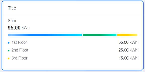
This topic describes the configuration items specific to the stacked progress bar. For the items common to all charts, such as the Basic tab and the Filter tab, see Common Configurations for Charts.
Note
The three presets Stacked progress bar (with legend), Stacking progress bar (value on top, no icon), and Stacked progress bar (with icon) in the widget library are all this same widget; they differ only in the preset value of Chart Layout, which you can switch at any time after inserting one. This topic therefore applies to all three. For a style comparison of the presets, see Types of Progress Bar.
Data of Stacked Progress Bar
The stacked progress bar centers on measurements, with each measurement corresponding to one color segment of the bar. The widget does not use Comparison fields and the Data tab has no comparison entry. For data sources and data fields, see Common Configurations for Charts > Configuring Data.
Measurement
Measurement determines the length and share of each color segment. A stacked progress bar requires at least 1 measurement field, with no upper limit. Each measurement field corresponds to one color segment and produces its own panel in Metric Style, whose title shows the field name automatically.
The width of each segment is calculated as the share of that measurement value in the total of all measurement values, so percentages are always based on the sum of the measurements currently added.
Extension
At least 1 Extension field is required, with no upper limit. Extension fields are not drawn on the bar; they only provide the name text of the summary area: once an extension field is selected in Summary Name, the chart shows the value of that field as the title of the summary area.
Note
The value in the summary area does not come from an extension field; it is the total of all measurement values, calculated by the chart automatically. This use only takes effect when Chart Layout is Show Summary Value, Legend at Bottom; without an extension field referenced in Summary Name, nothing in the chart changes.
Style of Stacked Progress Bar
The style items fall into three parts: Chart Layout, Metric Style, and Global Settings, with Global Settings containing the Progress Bar and Legend collapsible panels. Chart Layout determines which items in the other sections are available. For the items common to all charts, such as the title and the widget, see Common Configurations for Charts > Configuring Style.
Chart Layout
The stacked progress bar provides three layouts, which determine how the summary value, names, values, and icons are presented. The first is the default:
Show Summary Value, Legend at Bottom: The summary name and summary value appear above the bar, and the color blocks, names, and values of the measurements are listed below the bar as a legend. Suits many measurements that need a legend to explain them.
No Summary Value, Legend Accompanying, No Icon: No summary value is shown, and the name, value, and unit of each measurement are labeled directly above the corresponding color segment, in a compact layout.
No Summary Value, Legend Accompanying, With Icon: Builds on the previous layout by additionally showing an icon per measurement, with built-in icons and custom images supported. Suits branded displays or cases where visual distinction is needed.
Metric Style
Each measurement field corresponds to one Metric Style collapsible panel. When Chart Layout is Show Summary Value, Legend at Bottom, that panel provides only Progress Bar Color.
Progress Bar Color
Sets the color of the color segment of that measurement, with solid and gradient colors supported. When not set, the default color is used.
Name Font / Value Font / Unit Name
Set the font style of the name, value, and unit labeled beside the color segment of that measurement respectively (Unit Name configures the font of the unit text). Available only when Chart Layout is one of the two No Summary Value layouts.
Icon
Sets the icon of that measurement. Options are Built-in and Custom. Available only when Chart Layout is No Summary Value, Legend Accompanying, With Icon:
Built-in: Select an icon from the built-in icon library, and set its Size (px) and Color (solid colors only) in Icon Style. The icon is shown on a semi-transparent backing circle of the same color.
Custom: Select an image from the asset library, and set its size with Icon Size (pt, 24 by default).
Progress Bar
Controls the appearance of the bar itself, how values are presented, and the summary area.
Data Display Format
Sets what is labeled for each measurement: Value (default), Percentage, or Value + Percentage. Available only when Chart Layout is one of the two No Summary Value layouts.
Decimal Places
Rounds the displayed value to the specified number of decimal places, with a default of 2. When Show Thousands Separator is selected, values are shown with a thousands separator.
Summary Name
Select one of the Extension fields, and the chart shows the value of that field as the title of the summary area above the bar, with the total of all measurement values below it. Select None (default) to hide the summary area. Available only when Chart Layout is Show Summary Value, Legend at Bottom.
Summary Name Font / Summary Value Font / Summary Unit Font
Set the font style of the name, value, and unit of the summary area respectively. Available only when Chart Layout is Show Summary Value, Legend at Bottom.
Progress Bar Height
Sets the thickness of the stacked bar in px, with a default of 8.
Dynamic Effect
When enabled, each color segment plays a highlight sweeping from left to right in a loop. For the exact behavior, see Interactions at Runtime.
Icon Position
Sets the position of the icon relative to the name and value: Top (default) or Left. Available only when Chart Layout is No Summary Value, Legend Accompanying, With Icon.
Note
With Left selected, the icon of the last measurement appears to the right of its name and value, so that the icon does not overflow the right edge of the widget.
Name Location
Sets the position of the name relative to the value: Top (default, name above the value) or Left (name on the same line as the value). Available only when Chart Layout is one of the two No Summary Value layouts.
Name-Value Spacing
Sets the spacing between the name and the value in px, with a default of 4. Available only when Chart Layout is one of the two No Summary Value layouts.
Unit Position
Sets where the unit appears: Follow Value (default, to the right of each value) or Top Right (shown once in the upper right corner of the widget in the form Unit: X). Available only when Chart Layout is one of the two No Summary Value layouts.
Note
With Top Right selected, the values of all measurements are converted to the same unit, which makes them easy to compare. The base unit comes from the measurement set as the global unit on the Data tab, or from the first measurement when none is set.
Top Unit Font
Sets the font style of the unified unit text in the upper right corner. Available only when Unit Position is Top Right. When Chart Layout is Show Summary Value, Legend at Bottom, the font of that text is controlled by Legend Unit Font instead.
Legend
Controls how the legend area below the bar is presented. The whole section is available only when Chart Layout is Show Summary Value, Legend at Bottom.
Data Display Format
Sets what each measurement shows in the legend: Value (default), Percentage, or Value + Percentage.
Legend Name Font / Legend Value Font / Legend Unit Font
Set the font style of the name, value, and unit in the legend respectively.
Unit Position
Sets where the unit appears in the legend: Follow Value (default) or Top Right.
Size
Sets the Size of the legend color blocks and the Spacing between items, in px. When Auto is selected, both are calculated as 6.
Interactions at Runtime
The stacked progress bar behaves as follows at runtime:
Hovering a color segment: Hovering the mouse over a color segment enlarges it vertically and adds a shadow, while a tooltip appears at the mouse position with the name, value, and unit of that measurement, preceded by a dot in the same color as the segment. The tooltip follows the mouse horizontally and disappears once the pointer leaves the bar area. This widget provides no Show Tooltip item, so the tooltip is always present. See Common Configurations for Charts > Show Tooltip.
Hovering a name or value: Names and values do not wrap and are clipped when they exceed the widget. Hovering the mouse over a name or value shows it in full.
Value count-up: After each data refresh, the values, percentages, and summary value count up from 0 to the latest value in about 1 second. The animation only plays on the published page; the editor canvas shows the final value directly.
Segment transition: When the data changes, segment widths transition to the new proportions in about 0.3 seconds. The leftmost and rightmost segments have rounded corners, and a 2 px gap sits between the middle segments.
Sweep animation: Once Dynamic Effect is enabled, each color segment plays a highlight sweeping from left to right in a loop with a 4 second cycle, with adjacent segments staggered by 1 second each, for the first 10 segments at most. Hovering over a segment replays its sweep immediately.
Data retrieval: Only the first record in the returned data is used. The summary value is the total of all current measurement values, and the percentage of each segment is its share of that total, so adding or removing a measurement changes both the percentages and the summary value.
Invalid value: When a value cannot be retrieved or is not a number, that value shows
--, and the summary value shows--as well.
Note
This widget has no click behavior at runtime, and values support neither a click jump nor trend analysis. For a jump, use Title Interaction on the Basic tab. See Common Configurations for Charts > Title Interaction (Left).